CSS Neumorphism Generator – Create Modern Soft UI Effects Easily
CSS Neumorphism Generator – Create Modern Soft UI Effects Easily
Neumorphism, also known as Soft UI, is a modern design trend that blends flat design and skeuomorphism to create subtle, tactile interfaces. It uses light and shadow to give UI elements a soft, extruded look — like they’re gently rising from the background. With the CSS Neumorphism Generator, you can generate these elegant effects instantly, without manually writing complex CSS box-shadow properties.
In this blog, we’ll explore what neumorphism is, why it’s trending, and how you can use the CSS Neumorphism Generator to design modern, minimalistic interfaces. We’ll also dive into best practices, pros and cons, and real-world examples for developers and designers alike.
What Is Neumorphism (Soft UI)?
Neumorphism is short for “New Skeuomorphism.” It’s a design style that emphasizes soft shadows, subtle gradients, and low-contrast colors to make UI elements look slightly raised or pressed. This approach brings depth to flat design without the heavy realism of early skeuomorphic designs (like the iOS 6 calculator or old wooden bookshelf apps).
In neumorphic interfaces, every button, card, and input box appears to emerge naturally from the background — as if molded from the same material. This effect is achieved using carefully calculated box-shadow and background combinations in CSS.
Example of a Neumorphic Button in CSS
.neu-button { background: #e0e0e0; border-radius: 12px; box-shadow: 5px 5px 15px #bebebe, -5px -5px 15px #ffffff; }
The result? A soft, 3D-like button that looks modern and clean — perfect for dashboards, portfolio websites, or app interfaces.
Why Neumorphism Became Popular
The trend of neumorphism gained popularity in 2020 and continues to evolve as a go-to design choice for minimalistic interfaces. Designers love it for its simplicity, elegance, and tactile feel. Users appreciate how gentle and intuitive it feels — almost like interacting with physical objects.
Key Reasons Developers Use Neumorphism
- Modern aesthetics: Clean, minimal, and professional look.
- Focus on simplicity: Less clutter and distraction.
- Depth without noise: Subtle elevation creates hierarchy.
- Perfect for dashboards: Ideal for control panels and UI components.
- Light and dark mode ready: Works beautifully with both themes.
However, writing CSS manually for neumorphism can be time-consuming — that’s where the CSS Neumorphism Generator from KnowAdvance makes your life easier.
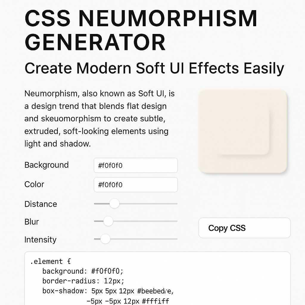
What Is the CSS Neumorphism Generator?
The CSS Neumorphism Generator is a free online developer tool that helps you create soft UI components with ease. You can visually adjust colors, shadow distance, blur, and intensity — and get the ready-to-use CSS instantly.
Main Features of the Tool
- 🎨 Real-time preview: See your neumorphic design as you adjust settings.
- ⚙️ Customizable controls: Change background, color, blur, and shadow offset.
- 🧾 Instant CSS output: Copy the generated CSS directly for your project.
- 🌗 Light/Dark mode: Toggle between modes for contrast testing.
- 📱 Responsive UI: Works perfectly on mobile and desktop.
This tool is part of KnowAdvance’s developer tools collection, which includes other handy web design tools like:
Together, these tools make front-end development faster, easier, and more creative — all within one platform.
How to Use the CSS Neumorphism Generator (Step-by-Step)
Using the CSS Neumorphism Generator is incredibly straightforward. Here’s how you can create your first soft UI element:
Step 1: Visit the Tool
Go to https://knowadvance.com/css-neumorphism-generator.
Step 2: Choose Your Background Color
Pick a soft, neutral background — typically pastel grays or off-whites work best (e.g., #e0e0e0 or #f5f5f5).
Step 3: Adjust Shadow Settings
Use the sliders to set the horizontal and vertical offsets, blur radius, and spread. The tool automatically previews the result.
Step 4: Customize Light and Dark Shadows
Fine-tune both light and dark shadow colors to match your background tone. Proper shadow contrast is key to realistic neumorphism.
Step 5: Copy the CSS Code
Once satisfied, simply click “Copy CSS” and paste it into your stylesheet. That’s it — you’ve created a professional neumorphic UI element without writing a line of code manually.
Understanding the CSS Behind Neumorphism
To fully appreciate neumorphism, it helps to understand the CSS properties behind it. The main property that makes this effect possible is box-shadow. However, instead of one shadow, neumorphism uses two shadows — one light and one dark — to simulate elevation.
Sample Neumorphism Code Breakdown
.neu-card { background: #e0e0e0; border-radius: 10px; box-shadow: 8px 8px 16px #bebebe, -8px -8px 16px #ffffff; }
Here’s how it works:
- 8px 8px 16px #bebebe: Creates the dark shadow (bottom-right).
- -8px -8px 16px #ffffff: Creates the light shadow (top-left).
- background: Sets the surface color, matching the overall page background.
- border-radius: Gives a soft, rounded look consistent with the style.
When combined, these properties create the illusion that the element is “extruded” from the background surface. The subtle lighting gives the UI a natural, tactile depth — making it visually pleasing and modern.
Best Practices for Neumorphic Design
While neumorphism creates visually stunning UI components, it must be used thoughtfully. Poor contrast, excessive shadowing, or inconsistent lighting can easily break the soft illusion. Here are some essential best practices for implementing neumorphism effectively in your projects.
1. Maintain Subtlety
The magic of neumorphism lies in its subtle shadows and gradients. Avoid harsh or overly dark shadows — the goal is to make elements look like they’re part of the same surface, not floating above it.
Stick with soft gray tones, pastel backgrounds, and light blurs. Typically, a blur radius between 10px–25px and low opacity shadows produce the best results.
2. Choose the Right Background
Neumorphism relies heavily on background color. A good rule of thumb is to use a mid-tone background (not pure white or pure black). Examples include:
#e0e0e0– Classic soft gray#f0f0f3– Slightly lighter, minimalistic tone#1e1e1e– Ideal for dark mode neumorphism
Matching your background tone with your element’s base color ensures the shadows and highlights look natural.
3. Balance Light and Dark Shadows
In neumorphism, both light and dark shadows are equally important. The balance between the two determines whether the object looks raised or pressed.
For example:
A darker bottom-right shadow and lighter top-left shadow create a raised effect. Reversing them makes the element look pressed or indented (useful for toggles or switches).
/* Raised button */ .box { box-shadow: 8px 8px 16px #bebebe, -8px -8px 16px #ffffff; } /* Pressed button */ .box:active { box-shadow: inset 8px 8px 16px #bebebe, inset -8px -8px 16px #ffffff; }
This simple trick creates a beautiful soft press effect — something you can preview instantly in the CSS Neumorphism Generator.
4. Keep Text and Icons Legible
One of the biggest challenges with neumorphism is **low contrast**. While soft visuals look elegant, they can make text, icons, or inputs difficult to read. Always ensure there’s enough contrast between foreground and background elements.
To fix this, consider:
- Using slightly darker text colors (
#333or#555) - Adding subtle inner shadows for icon buttons
- Combining neumorphism with flat UI for critical components
5. Use Neumorphism Sparingly
While neumorphism is visually appealing, it should be used in moderation. Overusing it across an entire interface can make the design monotonous or hard to scan.
Use it strategically for:
- Buttons and toggles
- Cards and panels
- Input fields and switches
- Loading indicators
Pair neumorphism with CSS gradients or flat elements for visual balance.
Accessibility Considerations in Neumorphism
Accessibility is a key factor in modern web design. Unfortunately, neumorphism isn’t inherently accessible due to its subtle contrast and heavy reliance on shadow depth. Let’s explore how to make it more inclusive.
1. Ensure Sufficient Contrast
Follow WCAG (Web Content Accessibility Guidelines) for contrast ratios. Use a tool like the Color Contrast Checker to verify that your text meets the minimum contrast standards (4.5:1 for normal text).
2. Add Clear Focus States
Neumorphic elements can sometimes make it hard to see focus indicators (especially for keyboard navigation). Use strong focus outlines or glows when users interact with elements.
.button:focus { outline: 2px solid #4a90e2; outline-offset: 3px; }
This ensures accessibility while maintaining design consistency.
3. Don’t Rely Solely on Shadows
Some users with vision impairments might not perceive subtle shadows. Combine neumorphism with other visual cues such as border lines, color changes, or animations to indicate state changes.
Neumorphism vs Flat Design: Which Is Better?
Since its rise, designers often compare neumorphism with the widely adopted flat design. Both have their strengths and use cases.
| Feature | Neumorphism | Flat Design |
|---|---|---|
| Visual Style | Soft, 3D, tactile | Clean, minimal, 2D |
| Use of Shadows | Heavy (dual shadows) | Minimal or none |
| Readability | Low contrast (can be tricky) | High contrast, easy to read |
| Best For | Buttons, cards, toggles | Text-heavy interfaces |
| Complexity | More design fine-tuning | Simpler to implement |
Ultimately, the choice depends on your project goals. If you’re building a modern dashboard or minimal web app, neumorphism can add a sophisticated, futuristic touch. For content-heavy platforms, flat design is often more readable and performant.
When Not to Use Neumorphism
Even though it’s trendy, neumorphism isn’t the right fit for every UI. Here are situations where you should avoid it:
- When accessibility is a top priority (e.g., government or educational sites)
- When designing for high-contrast interfaces
- When performance matters (many shadows can be GPU-intensive)
- When readability is more important than visual appeal
In such cases, consider using a hybrid approach — soft UI for decorative components and flat UI for critical sections.
Real-World Use Cases for Neumorphism
Despite its limitations, neumorphism shines in specific applications where aesthetics matter. Here are some real-world examples:
- Portfolio websites: Designers and developers use neumorphism for buttons, social icons, and project cards.
- Mobile app UIs: Perfect for minimalist settings or control apps like timers, alarms, or smart home interfaces.
- Dashboard panels: Adds subtle depth to data cards and toggles, improving hierarchy without distraction.
- Landing pages: Great for showcasing products or call-to-action buttons with a sleek, modern look.
With the CSS Neumorphism Generator, developers can experiment with these styles quickly and integrate the results directly into production-ready CSS.
Performance Tips for Neumorphic CSS
Because neumorphism relies heavily on shadow effects, it can sometimes impact rendering performance on low-end devices. Here’s how to optimize your code:
- Reduce shadow blur radius and limit multiple box-shadows per element.
- Use
will-change: box-shadow;to optimize animations. - Test performance across devices before deploying.
Combining neumorphic effects with CSS variables and utility classes (like Tailwind CSS) can also make your code cleaner and reusable.
Combining Neumorphism with Other CSS Techniques
Neumorphism doesn’t have to exist alone. You can combine it with other CSS effects for a more dynamic UI experience.
1. Gradients + Neumorphism
Adding a soft gradient to your background enhances the lighting illusion.
background: linear-gradient(145deg, #f0f0f0, #cacaca);
Try generating gradients with the CSS Gradient Generator on KnowAdvance.
2. Animations and Hover Effects
Use slight transformations and shadow changes to simulate tactile feedback.
.neu-btn:hover { box-shadow: 5px 5px 10px #bebebe, -5px -5px 10px #ffffff; transform: translateY(-2px); transition: 0.2s ease-in-out; }
Conclusion: The Future of Neumorphism in Web Design
Neumorphism is more than just a trend — it’s a bridge between the tactile world and digital minimalism. When used correctly, it brings sophistication and softness to web interfaces. However, like all design techniques, balance is key. Overuse or poor contrast can harm usability.
With tools like the CSS Neumorphism Generator, developers can quickly prototype, experiment, and implement these effects without manually crafting complex shadow rules.
If you’re building modern dashboards, portfolio sites, or sleek web apps — neumorphism might be the perfect style to elevate your design.
Related Tools on KnowAdvance
Explore more at KnowAdvance.com — your all-in-one platform for developer tools, web utilities, and technical interview resources.