CSS Grid vs Flexbox: When to Use Which (With Practical Examples)
Introduction
In modern web development, creating responsive, well-structured layouts is one of the most critical skills for front-end developers. Two CSS layout systems dominate the scene today — CSS Grid and Flexbox. While both can create powerful and flexible designs, understanding when to use which can save you time, reduce code complexity, and improve maintainability.
In this blog, we’ll explore the key differences between CSS Grid and Flexbox, practical use cases for each, and examples to help you decide which one fits your layout needs. By the end, you’ll know exactly when to reach for Grid and when to rely on Flexbox for building modern, responsive web layouts.
What Is CSS Flexbox?
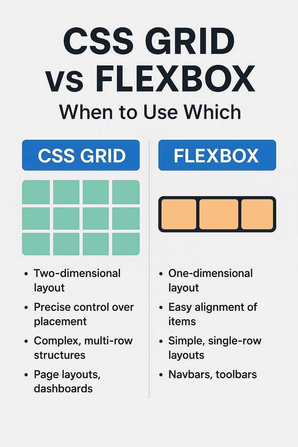
Flexbox (short for Flexible Box Layout) is a one-dimensional layout system introduced in CSS3 that helps developers align and distribute space among items within a container. It excels in laying out elements either in a row or a column.
Flexbox is ideal for small-scale layouts where you need precise control over alignment, spacing, and order of items — for example, navigation bars, card layouts, or buttons.
Basic Flexbox Example
div.container {
  display: flex;
  justify-content: space-between;
  align-items: center;
}

div.container div {
  background: #e3f2fd;
  padding: 10px;
  border-radius: 5px;
}
This layout will place the child items evenly across the container while keeping them vertically centered. Flexbox simplifies alignment without relying on floats or positioning hacks — a common pain point in pre-CSS3 layouts.
Key Features of Flexbox
- One-dimensional layout (works on a single axis: horizontal or vertical)
- Easy alignment and distribution of space
- Supports content reordering using
order - Responsive by default when using flexible widths and wrapping
- Perfect for UI components like toolbars, nav menus, and form layouts
What Is CSS Grid?
CSS Grid Layout is a two-dimensional layout system that allows developers to design web pages using both rows and columns simultaneously. It offers a grid-based structure that can adapt responsively to different screen sizes without heavy use of media queries.
Unlike Flexbox, which focuses on content flow, Grid provides a structure-first approach — you define rows and columns first, then place elements within them.
Basic Grid Example
div.grid-container {
  display: grid;
  grid-template-columns: repeat(3, 1fr);
  gap: 20px;
}

div.grid-container div {
  background: #e8f5e9;
  padding: 15px;
  border-radius: 5px;
}
This code creates a simple three-column layout with equal-width columns and uniform spacing. It’s a cleaner and more scalable approach for page-level structures like dashboards, portfolios, or blog grids.
Key Features of CSS Grid
- Two-dimensional layout (rows and columns)
- Precise control over positioning using
grid-template - Supports named areas for semantic layouts
- Responsive layouts using
frunits andminmax()functions - Perfect for complex page structures and multi-section layouts
CSS Grid vs Flexbox: Core Differences
Although both Grid and Flexbox can handle alignment, spacing, and responsiveness, they differ fundamentally in their purpose and behavior. Here’s a side-by-side comparison:
| Feature | Flexbox | CSS Grid |
|---|---|---|
| Layout Type | One-dimensional (row or column) | Two-dimensional (rows and columns) |
| Main Use Case | Content alignment and small layouts | Page-level and complex grid structures |
| Alignment Control | Easy alignment on one axis | Independent control over both axes |
| Responsiveness | Requires wrapping or media queries | Built-in responsiveness with auto-fit and minmax() |
| Content Reordering | Supports order |
Supports grid-area and order |
When to Use Flexbox
Flexbox shines in cases where you need to manage alignment or space distribution along a single direction. It’s the go-to choice for small components, navigation bars, or lists where the layout adjusts dynamically based on content size.
Best Scenarios for Flexbox
- Navigation Menus: Align menu items horizontally or vertically.
- Card Layouts: Create dynamic, flexible card rows that wrap automatically.
- Form Controls: Align labels and input fields neatly.
- Buttons and Toolbars: Maintain consistent spacing and alignment.
Example — A simple navigation bar:
nav {
  display: flex;
  justify-content: space-around;
  background: #212121;
  color: white;
}

nav a {
  text-decoration: none;
  padding: 10px 20px;
  color: white;
}
This makes navigation bars easy to manage across screen sizes without complex CSS rules.
Flexbox and Responsive Design
Flexbox can automatically adjust the width and position of items when used with flex-wrap and percentage-based widths. For example:
.cards {
  display: flex;
  flex-wrap: wrap;
  gap: 20px;
}

.cards div {
  flex: 1 1 300px;
}
Each card takes up a minimum of 300px but can grow to fill available space — a perfect example of a responsive, adaptive layout.
When to Use CSS Grid
CSS Grid is best suited for building entire web page layouts or components that require both row and column control. It’s ideal for dashboards, galleries, or layouts where content needs to align in both directions.
Best Scenarios for Grid
- Web Page Layouts: Define header, sidebar, main content, and footer areas.
- Image Galleries: Easily create uniform grids for photos or cards.
- Landing Pages: Arrange content sections in precise grid positions.
- Complex UI Layouts: Dashboards, admin panels, and responsive grids.
For example, a simple webpage layout using CSS Grid:
.layout {
  display: grid;
  grid-template-areas:
    "header header"
    "sidebar main"
    "footer footer";
  grid-template-columns: 200px 1fr;
  grid-gap: 20px;
}

header { grid-area: header; }
aside { grid-area: sidebar; }
main { grid-area: main; }
footer { grid-area: footer; }
This pattern is easy to maintain and modify, even when adding more components.
To learn more about how semantic tags improve layouts and structure, check out What Is Semantic HTML and Why It Matters.
Performance Considerations
Both Flexbox and Grid are optimized for modern browsers and perform well for most use cases. However, Flexbox may have a slight advantage for smaller, simpler layouts because of its one-dimensional design, while Grid’s power comes with a bit more computational overhead.
For example, if you’re building a simple row of cards or buttons, Flexbox will likely perform better and require less code. But for a multi-row layout or full-page structure, Grid’s clarity and scalability make it the better choice.
Real-World Use Case Example
Imagine you’re designing a portfolio page:
- Use Flexbox for the navigation bar and contact section (simple alignment).
- Use Grid for the gallery or project showcase (multi-row layout).
This hybrid approach gives you the best of both worlds — flexibility and structure — while keeping the codebase clean and easy to maintain.
Next, in Part 2, we’ll dive deeper into combining both Grid and Flexbox effectively, explore real-world layout patterns, and wrap up with a helpful FAQ section.
Combining CSS Grid and Flexbox in Real Projects
In many real-world projects, you don’t have to choose only one — CSS Grid and Flexbox work perfectly together. Each tool has strengths that complement the other. Developers often use Grid for defining large-scale layouts and Flexbox for aligning small elements within those grid areas.
Example: Dashboard Layout Using Grid + Flexbox
.dashboard {
  display: grid;
  grid-template-areas:
    "header header"
    "sidebar main"
    "footer footer";
  grid-template-columns: 250px 1fr;
  grid-template-rows: 70px 1fr 50px;
  gap: 20px;
}

header, footer, aside, main {
  background: #f8f9fa;
  padding: 20px;
  border-radius: 8px;
}

header {
  grid-area: header;
  display: flex;
  justify-content: space-between;
  align-items: center;
}

aside {
  grid-area: sidebar;
}

main {
  grid-area: main;
}

footer {
  grid-area: footer;
}
In the above example, the overall layout is controlled using CSS Grid, but the header uses Flexbox to align the logo and navigation horizontally. This hybrid model is clean, scalable, and semantically meaningful.
Why This Approach Works
- Grid defines the major structure (macro layout).
- Flexbox refines content alignment inside those sections (micro layout).
- This combination keeps CSS simple and modular, reducing code repetition.
For instance, if you’re creating a responsive card grid, you might use Grid for the main layout and Flexbox to center text or buttons within each card. This layered approach produces efficient and elegant designs.
Building Responsive Layouts with CSS Grid and Flexbox
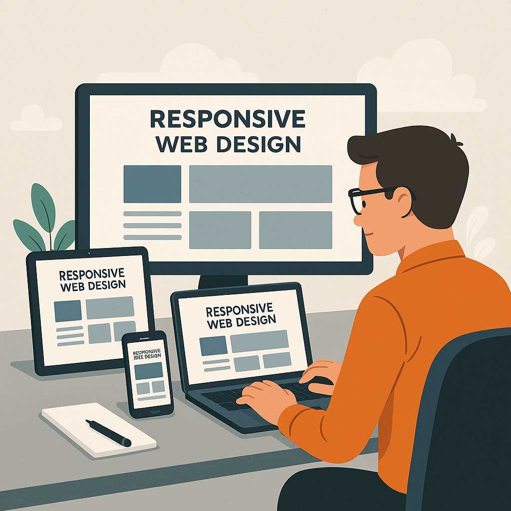
Responsiveness is a core requirement of modern websites. Both Grid and Flexbox provide native ways to adapt layouts for various screen sizes without relying too heavily on media queries.
Using Grid’s auto-fit and minmax()
Grid introduces smart functions that make responsive design much easier:
.gallery {
  display: grid;
  grid-template-columns: repeat(auto-fit, minmax(250px, 1fr));
  gap: 20px;
}
This setup ensures each item in the gallery takes up at least 250px width, automatically adjusting the number of columns depending on the available space. It’s a clean and powerful approach that removes the need for multiple breakpoints.
Using Flexbox for Mobile Alignment
Flexbox can also manage responsive layouts by allowing elements to wrap or re-stack on smaller screens:
.flex-layout {
  display: flex;
  flex-wrap: wrap;
}

.flex-layout div {
  flex: 1 1 300px;
}
Each block takes up a flexible width, stacking naturally as the viewport narrows. This is ideal for responsive rows of cards or feature lists.
Combining Media Queries (Optional)
While both systems can handle responsiveness on their own, adding media queries allows for fine-tuned control. For example:
@media (max-width: 768px) {
  .dashboard {
    grid-template-areas:
      "header"
      "main"
      "sidebar"
      "footer";
    grid-template-columns: 1fr;
  }
}
This ensures your dashboard gracefully collapses into a single-column view on mobile devices while maintaining design hierarchy.
Common Mistakes to Avoid
When working with CSS Grid and Flexbox, developers sometimes misuse these tools, resulting in messy or inconsistent layouts. Here are common pitfalls and how to avoid them:
1. Using Grid for Simple Alignments
Don’t use Grid for single-row or single-column tasks. If you’re aligning a few buttons or list items, Flexbox is the simpler and more efficient choice.
2. Nesting Flexbox or Grid Excessively
Too many nested layout containers can slow performance and complicate maintenance. Stick to one layout level per component when possible.
3. Ignoring Browser Support
Modern browsers fully support both systems, but if you’re designing for legacy environments (like IE11), Grid may need fallbacks. Flexbox generally offers better backward compatibility.
4. Overusing Fixed Units
Avoid pixel-based widths for responsive designs. Use flexible units like fr, %, or auto for smoother scaling across devices.
5. Forgetting Accessibility and Semantics
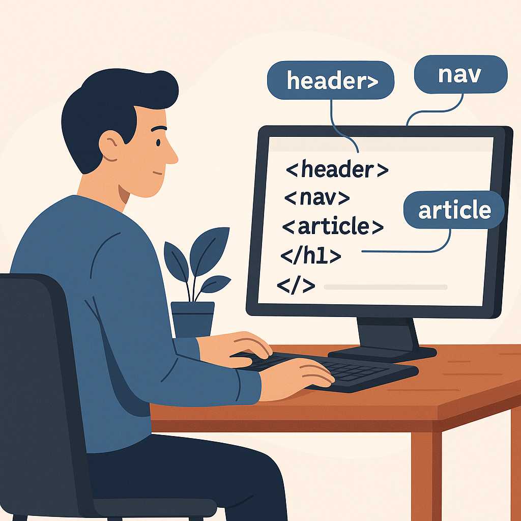
Grid and Flexbox should enhance, not replace, meaningful HTML structure. Always use proper tags (like <header>, <main>, <footer>) to maintain good semantics. To dive deeper into this, see Semantic HTML and Why It Matters.
Practical Tips for Developers
- Use Grid for major page structure — headers, footers, and content areas.
- Use Flexbox inside grid items — for buttons, icons, and inline alignment.
- Leverage
gapinstead of margins for consistent spacing. - Use
grid-template-areasto improve readability. - Try combining
minmax()withauto-fitfor adaptive layouts.
When Not to Use CSS Grid or Flexbox
Sometimes, traditional layout techniques or simple inline-block elements are enough. Avoid overcomplicating small designs. For example:
- Use simple inline elements for text alignment.
- Use CSS positioning for absolute elements (like modals or tooltips).
- Don’t use Grid if you only need linear flow or Flexbox if you need precise cell-based control.
Browser Support and Performance
As of 2025, all modern browsers — including Chrome, Firefox, Safari, and Edge — fully support CSS Grid and Flexbox. Mobile browsers also render both layout systems efficiently. Flexbox has been around longer, so it may have better support in older versions, but for new projects, both are safe to use.
Performance Tips
- Minimize deeply nested layout containers.
- Test layouts on multiple screen sizes early.
- Use browser DevTools to visualize grids and flex alignments.
- Combine Grid and Flexbox strategically rather than redundantly.
Developer Insights
Many front-end developers prefer to start with Flexbox when prototyping because it’s faster to implement and easy to reason about. Once the design scales to multiple dimensions (rows and columns), switching to Grid becomes natural.
Frameworks like Bootstrap and Tailwind CSS internally use both Grid and Flexbox utilities. For example, Tailwind’s grid-cols-3 and flex classes let developers mix these systems seamlessly.
Further Reading
- What Is Semantic HTML and Why It Matters
- Difference Between div and span in HTML
- Top 5 Free Code Editors for Web Developers
- How to Create Responsive Websites Easily
FAQs
1. Is CSS Grid better than Flexbox?
Not necessarily. CSS Grid is better for two-dimensional layouts (rows and columns), while Flexbox is best for one-dimensional layouts (a single row or column). Most modern designs combine both systems for flexibility.
2. Can I use CSS Grid and Flexbox together?
Yes! In fact, combining them is a best practice. Use Grid for the overall structure and Flexbox for smaller elements within each section.
3. Which is easier to learn — Grid or Flexbox?
Flexbox is simpler to start with since it handles one dimension. CSS Grid takes longer to master but offers more control for complex page designs.
4. Does Grid replace Flexbox?
No, Grid doesn’t replace Flexbox. They solve different problems. Grid focuses on layouts; Flexbox handles alignment within layouts.
5. Which layout system is faster for browsers to render?
Performance differences are minimal for most use cases. Flexbox can be slightly faster for simpler layouts, but both perform well in modern browsers.
Conclusion
Both CSS Grid and Flexbox have revolutionized how developers build web layouts. Grid excels at creating two-dimensional structures — perfect for complex web pages and dashboards — while Flexbox shines at aligning items neatly within those structures.
The key takeaway is simple: use Grid for layout, Flexbox for alignment. Combining them strategically results in scalable, maintainable, and responsive designs. Whether you’re building a minimalist blog or a dynamic web app, mastering both tools will make you a more efficient and creative front-end developer.
