How to Create Responsive Websites Easily (Step-by-Step Guide)

Introduction
In today’s mobile-first world, having a responsive website is no longer optional — it’s a necessity. Whether you're a beginner web developer or an experienced designer, learning how to create responsive websites easily can dramatically improve user experience and SEO performance. A responsive website automatically adjusts its layout and elements to fit different screen sizes — from desktop monitors to smartphones.
In this guide, you’ll learn how to build responsive websites step-by-step using HTML, CSS, and popular frameworks. We'll explore concepts like flexible grids, media queries, responsive typography, and much more — all explained in a beginner-friendly yet professional tone.
What Is Responsive Web Design?
Responsive web design (RWD) ensures that web pages look and function perfectly on all devices. The core idea is that your site should adapt dynamically to various screen sizes and resolutions without breaking its structure or readability. This approach eliminates the need for separate desktop and mobile versions of your site.
Key Principles of Responsive Design
- Fluid Grids: Layouts based on percentage widths instead of fixed pixels.
- Flexible Images: Images that resize automatically according to their container.
- Media Queries: CSS techniques to apply different styles for different devices.
- Responsive Typography: Font sizes and line heights that adapt to screen size.
- Mobile-First Approach: Designing for smaller screens first and scaling up.
Why Responsive Design Matters
Search engines like Google prioritize mobile-friendly websites. If your site isn’t responsive, it may lose ranking in mobile search results. Responsive websites also improve engagement, reduce bounce rates, and ensure consistent branding across devices.
Benefits of Responsive Websites
- Better user experience across all devices.
- Improved SEO rankings due to Google’s mobile-first indexing.
- Faster page loading and easier maintenance.
- Increased conversion rates and accessibility.
Core Building Blocks of a Responsive Website
Creating a responsive website doesn’t require advanced coding skills. With proper use of HTML structure, CSS layout systems, and a few responsive design strategies, anyone can build a professional site. Let’s dive into the main components.
1. HTML Structure
The foundation of every responsive website starts with semantic HTML. Using proper HTML tags helps browsers and search engines understand your layout. Elements like <div>, <section>, and <article> are commonly used to organize content.
To understand the difference between elements like <div> and <span>, check out our related article:
Difference Between div and span in HTML.
<div class="container">
  <header>
    <h1>My Responsive Website</h1>
  </header>
  <section>
    <p>Welcome to my website that looks great on any device!</p>
  </section>
</div>
2. CSS for Responsiveness
CSS controls how your HTML looks. To make layouts responsive, we use flexible units like percentages (%), viewport width (vw), and viewport height (vh) instead of pixels (px).
img {
  max-width: 100%;
  height: auto;
}

.container {
  width: 90%;
  margin: 0 auto;
}
Using CSS Media Queries
Media queries are the backbone of responsive design. They allow you to apply CSS rules only when certain conditions (like screen width) are met.
@media (max-width: 768px) {
  body {
    background-color: #f5f5f5;
  }
  h1 {
    font-size: 24px;
  }
}
With this approach, your website layout automatically adjusts based on the user’s device width. You can also combine media queries with modern CSS features like flexbox and grid for advanced layouts.
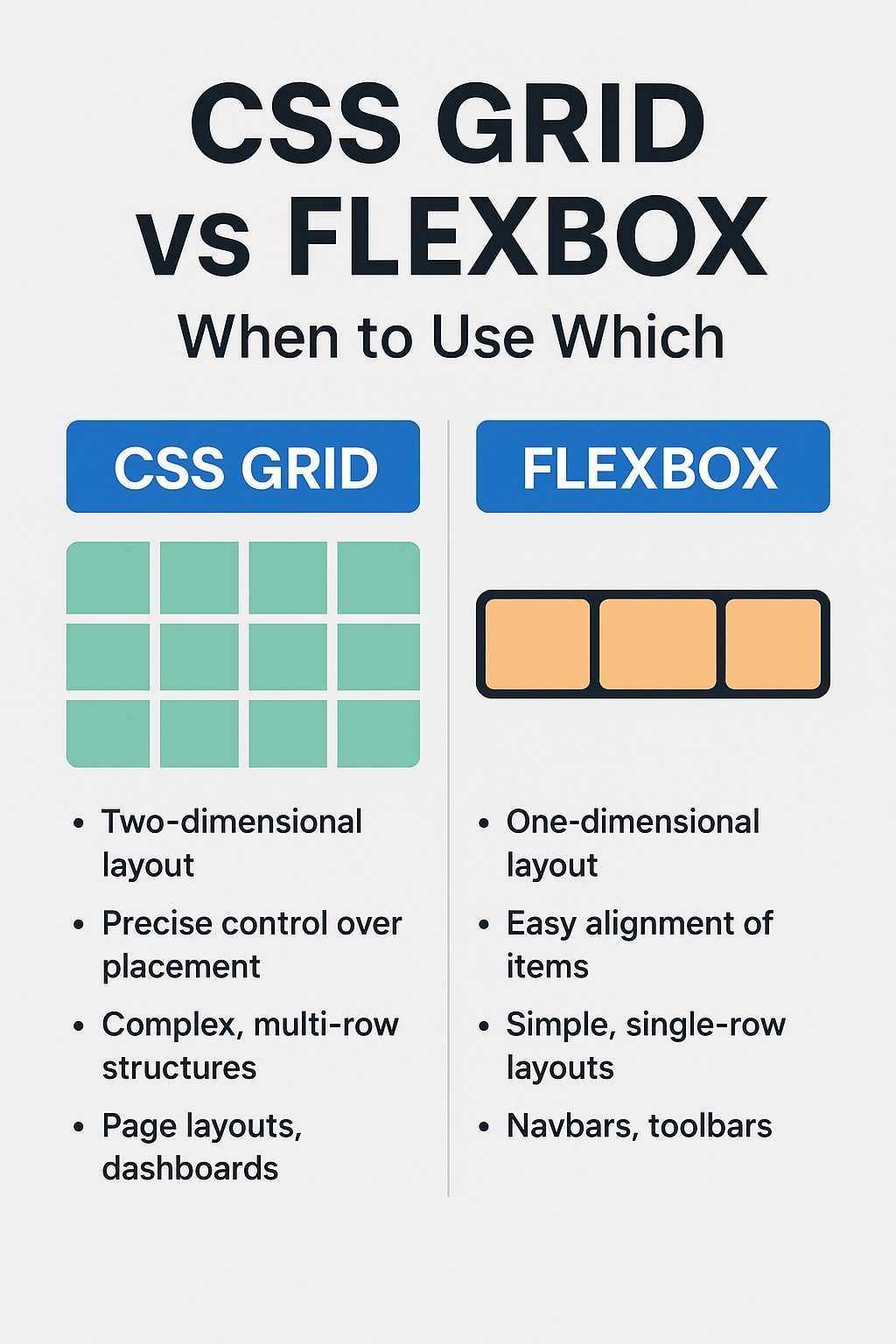
Building a Flexible Grid System
Grids are essential in responsive web design. They help divide the page into columns that rearrange themselves on different devices. CSS Grid and Flexbox are the two most popular techniques for building flexible layouts.
Flexbox Example
.flex-container {
  display: flex;
  flex-wrap: wrap;
}

.flex-item {
  flex: 1 1 300px;
  margin: 10px;
}
Grid Example
.grid-container {
  display: grid;
  grid-template-columns: repeat(auto-fit, minmax(300px, 1fr));
  gap: 20px;
}
Both Flexbox and Grid systems make it easy to create adaptive layouts that look good on all devices. You can even mix them for complex designs.
Responsive Images and Videos
Images and videos often cause layout issues if not optimized for responsiveness. Using max-width: 100% ensures they shrink appropriately within their containers. You can also use the picture element to serve different image sizes based on screen resolution.
<picture>
  <source srcset="image-large.jpg" media="(min-width: 800px)">
  <source srcset="image-small.jpg" media="(max-width: 799px)">
  <img src="image-small.jpg" alt="Responsive Example">
</picture>
For more HTML techniques, read our detailed post: 10 Useful HTML Tags Every Developer Should Know.
Responsive Typography
Typography plays a big role in readability across devices. Responsive typography scales according to screen width, ensuring users can easily read content on any device.
h1 {
  font-size: clamp(1.5rem, 2.5vw, 3rem);
}

p {
  font-size: clamp(1rem, 1.5vw, 1.2rem);
}
The clamp() function sets a minimum, preferred, and maximum font size, making text adapt smoothly to screen changes.
Testing Your Responsive Website
Testing is crucial before deploying your website. Always check how it appears on various devices and browsers. You can use browser developer tools or online testing platforms like BrowserStack or Responsinator.
Checklist for Testing Responsiveness
- Check on multiple screen sizes: desktop, tablet, mobile.
- Ensure all navigation links are accessible.
- Verify images and text do not overflow the screen.
- Test form inputs and buttons for touch interactions.
If you’re using a code editor, make sure it supports live preview for easy testing. You can explore our guide on Top 5 Free Code Editors for Web Developers for recommendations.
Next Steps
Now that you understand the fundamentals, the next part of this article will walk you through practical implementation — using frameworks like Bootstrap and Tailwind CSS to create responsive websites effortlessly. We’ll also cover optimization techniques, accessibility improvements, and performance best practices.
Building Responsive Websites with Frameworks
While writing responsive code manually gives you full control, it can also be time-consuming. Modern frameworks like Bootstrap and Tailwind CSS make the process faster and easier. These tools provide prebuilt responsive classes and utilities that automatically adapt your layout for multiple devices.
1. Creating Responsive Layouts with Bootstrap
Bootstrap is one of the most popular front-end frameworks for responsive web development. It uses a mobile-first grid system that divides your layout into 12 columns. You can easily specify how many columns each section should occupy on different devices.
<div class="container">
  <div class="row">
    <div class="col-md-6 col-sm-12">
      <h2>Responsive Column 1</h2>
      <p>This column takes half the width on medium screens and full width on small screens.</p>
    </div>
    <div class="col-md-6 col-sm-12">
      <h2>Responsive Column 2</h2>
      <p>The second column behaves the same way, ensuring consistent responsiveness.</p>
    </div>
  </div>
</div>
Bootstrap’s responsive classes make it incredibly easy to adjust designs without writing custom media queries. It also provides prebuilt components like navigation bars, buttons, and modals that automatically scale across devices.
2. Responsive Design Using Tailwind CSS
Another modern framework that simplifies responsive design is Tailwind CSS. Instead of predefined components, Tailwind gives you utility classes to style elements directly in your HTML.
<div class="grid grid-cols-1 md:grid-cols-2 gap-4">
  <div class="p-4 bg-gray-100">Responsive Box 1</div>
  <div class="p-4 bg-gray-200">Responsive Box 2</div>
</div>
In this example, Tailwind’s grid-cols-1 class sets one column by default, and md:grid-cols-2 adds a second column on medium screens and above. This syntax makes it easy to visualize how layouts change at different breakpoints.
Why Frameworks Help You Build Faster
- Predefined responsive breakpoints save time.
- Consistent styling and grid alignment across all pages.
- Lightweight and customizable according to your project’s needs.
- Excellent community support and documentation.
Optimizing Responsive Websites for Performance
Designing a responsive website is only half the battle — optimizing it for speed and user experience is equally important. A slow or bloated site will frustrate visitors and hurt your SEO rankings. Here’s how to optimize your responsive design.
1. Compress Images and Use Modern Formats
Images often take up the majority of a webpage’s load time. Always compress them before uploading. Use next-gen formats like WebP and AVIF to reduce file size without losing quality.
<img src="image.webp" alt="Optimized image" loading="lazy" width="600" height="400">
Additionally, always include the loading="lazy" attribute so that images outside the viewport load only when needed, improving initial page speed.
2. Minimize CSS and JavaScript
Too many large CSS or JavaScript files can slow down your responsive site. Use tools like CSS Minify or UglifyJS to compress files. Avoid loading unnecessary scripts or libraries.
If possible, combine your styles and scripts into single files to reduce HTTP requests. Frameworks like Bootstrap and Tailwind also allow you to customize which utilities to include, trimming unused code.
3. Use a Content Delivery Network (CDN)
Hosting your static assets (CSS, JS, images) on a CDN reduces latency and ensures faster loading worldwide. CDNs cache files in multiple global locations, serving users from the nearest server.
4. Prioritize Mobile Performance
Since most traffic today comes from mobile users, always test load times on smartphones. Use Google’s PageSpeed Insights to analyze your website and follow its performance recommendations.
Making Responsive Websites Accessible
Responsiveness isn’t only about adjusting layouts — it’s also about ensuring accessibility for all users, including those with disabilities. Here’s how to make your responsive website inclusive:
- Use semantic HTML elements like
<header>,<main>, and<footer>. - Provide descriptive
alttext for images. - Ensure color contrast meets accessibility standards (WCAG).
- Allow users to zoom without breaking the layout.
- Use ARIA roles and labels where necessary.
By following these best practices, you ensure that your responsive website not only looks good but also serves a broader audience effectively.
Common Mistakes to Avoid in Responsive Design
Even experienced developers make mistakes when designing responsive websites. Here are some pitfalls you should avoid:
- Fixed-width layouts: Always use relative units like
%orvw. - Large unoptimized images: They drastically slow down mobile performance.
- Neglecting touch interactions: Ensure buttons and links are large enough for touch devices.
- Ignoring testing: Always test on real devices, not just browser emulators.
- Hiding content: Don’t hide essential information on smaller screens.
Responsive Design Best Practices for 2025
As technology evolves, so does responsive design. In 2025, developers are adopting modern techniques to enhance UX further. Here are a few trends to keep in mind:
- Container Queries: A new CSS feature that allows elements to adapt based on their parent container’s size, not just the viewport.
- CSS Subgrid: Provides more control in complex grid layouts.
- Dark Mode Support: Ensures your website looks good in both light and dark themes.
- Fluid Responsive Design: Combining min/max breakpoints for smoother scaling.
- Performance-Driven Responsiveness: Focusing on speed and minimal DOM complexity.
Further Reading
- How to Center Anything in CSS
- 10 Useful HTML Tags Every Developer Should Know
- Top 5 Free Code Editors for Web Developers
- Difference Between div and span in HTML
FAQs
1. What is a responsive website?
A responsive website automatically adjusts its layout, images, and content to fit the screen size of any device — desktop, tablet, or mobile — ensuring an optimal viewing experience.
2. How can I make my website responsive quickly?
You can use frameworks like Bootstrap or Tailwind CSS to apply prebuilt responsive layouts and utilities without manually writing complex CSS.
3. What are media queries in CSS?
Media queries are CSS rules that apply styles based on specific conditions like screen width, orientation, or resolution. They are the foundation of responsive web design.
4. Do responsive websites improve SEO?
Yes. Google prioritizes mobile-friendly sites in search results. A responsive design improves usability, decreases bounce rate, and boosts your website’s SEO ranking.
5. Can I make an existing static website responsive?
Absolutely. You can refactor your current website by adding flexible grid layouts, media queries, and percentage-based units to make it fully responsive without rebuilding from scratch.
Conclusion
Responsive design is at the heart of modern web development. With users accessing content from countless devices, ensuring your website looks and performs perfectly everywhere is vital. By understanding the principles of responsive design and leveraging tools like Bootstrap or Tailwind CSS, you can create professional, mobile-friendly websites that load fast and deliver excellent user experiences.
Always remember — a truly responsive website isn’t just about adjusting layouts. It’s about building a seamless, accessible, and optimized experience for everyone, regardless of their device or network speed. Start small, test frequently, and keep improving your design for the best results.