Practical Ways Developers Reduce Front-End Friction Every Day
Some days as a front-end developer feel like a long chain of tiny decisions—none dramatic on their own, yet each capable of shaping how smoothly a user interacts with your product. Friction rarely shows up as one huge obstacle. It appears as slow transitions, uneven spacing, flickering states, or the extra second someone waits while JavaScript recalculates layout. Over time, you start noticing how much these small rough edges matter, both for users and for your own sanity while shipping features.
What’s interesting is that many developers don’t reduce friction through big architectural choices alone. Most of the real progress happens in the quiet, daily practices that make codebases predictable and interfaces calmer. Below are some practical habits that often shape a smoother front-end without drawing too much attention.
Cleaning up the invisible clutter
Friction often hides behind the scenes in places that users never see directly—unused styles, duplicated logic, or scripts left behind from experiments. When those pieces accumulate, the browser ends up doing more work than necessary. Developers who regularly examine small pockets of the codebase tend to notice patterns early, long before they become performance issues.
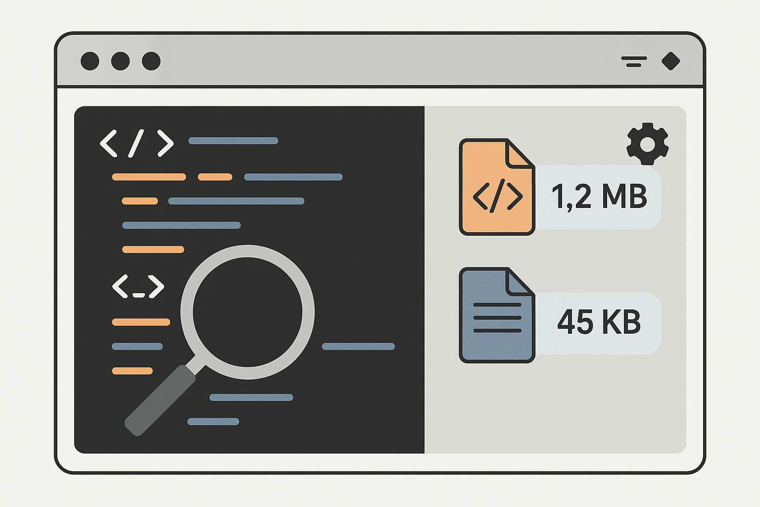
A simple example: removing stale CSS. Over time, components evolve and class names drift, leaving behind selectors that no longer match anything in the UI. These unused rules slow down style calculations, especially on complex layouts. Some teams even set aside a few minutes at the end of a feature to skim styles and trim what no longer belongs. During that kind of cleanup, it's common to pass large files through a quick minifier like https://www.knowadvance.com/css-minifier just to see how lean the output becomes.
Building components that don’t fight you later
Front-end friction isn’t only about performance; it’s also about how much resistance you face when extending an interface. A component might look great today and still cause frustration next month if it tries to do too many things. Developers who aim for clarity instead of cleverness usually avoid this trap.
One habit that helps: deliberately designing components around predictable state transitions. Instead of burying logic in event handlers, everything flows through a single source of truth. When a teammate revisits that component weeks later, they don’t need to understand the entire history of the feature—just how the state changes. The smoother the mental model, the less friction everyone feels.
Another subtle improvement comes from aligning components with natural UI expectations. When a modal opens, the rest of the page should behave as if it knows—scroll locking, focus trapping, and clear escape routes all help users navigate without stumbling. These polish moments rarely take long, yet they dramatically reduce small annoyances.
The art of gradual performance tuning
Developers often talk about performance as if it is a one-time project, but in practice, tuning happens in shorter, informal passes. You spot a layout shift during a code review. You notice a heavy re-render while testing a new feature. You add a missing key to a list. These tiny adjustments stack up.
For instance, rendering lists is one of those areas where friction sneaks in as the product grows. A list of ten items works fine during development, but a thousand items can make the UI hesitate. Virtualized lists, memoized components, and lighter data objects help stabilize performance, yet you rarely introduce all of them at once. The best improvements appear gradually, when the pain becomes noticeable.
Even the choice of animation timing can influence perceived speed. A snappy 150ms transition feels responsive, while 400ms can feel sluggish if used everywhere. Many developers keep a mental library of timing values that “feel right,” adjusting them based on context instead of sticking to a rigid system.
Making debugging less of a chore
Debugging is one of the biggest sources of friction for developers, though users indirectly experience the effects. A codebase that’s pleasant to debug generally leads to fewer bugs escaping into production.
Readable logs, clear error boundaries, and descriptive variable names aren’t just niceties. They shorten the distance between noticing something is wrong and knowing where to look. Some developers also rely heavily on browser performance tools, not just to diagnose bottlenecks but to form an intuition about how the app behaves under load.
Another understated technique is leaving temporary visual hints during debugging. Highlighting a component border, logging layout values, or using a quick test color helps developers see the real state of the UI. While these snippets are removed later, the practice itself keeps small issues from spiraling into larger ones.
The small habits that shape UI consistency
Even the simplest interface can feel inconsistent if spacing, color contrast, or interaction feedback varies too widely. A UI that “flows” well rarely happens by accident. Developers build that consistency from repeated small decisions.
Shared spacing scales are a good starting point. When margins and paddings follow a predictable rhythm, pages feel less chaotic. The same goes for typography. Sticking with a well-chosen set of sizes helps content read more comfortably without drawing attention to itself.
Design tokens and component libraries amplify this effect, especially when multiple teams work on the same product. But even without a formal design system, thoughtful reuse goes a long way. Developers who regularly scan existing components before building new ones naturally reduce friction by avoiding reinvention.
Sometimes an internal note or a short message during a pull request is enough to keep standards aligned. These conversations feel casual but shape the long-term comfort of the interface. If you’ve ever compared two buttons and felt that something was “just slightly off,” you already know how influential these details can be.
Keeping interactions understandable
Users move quickly, and the interface should keep pace with their intuition. Friction appears when interactions behave differently than expected. A dropdown that closes too aggressively, a form that resets after one field error, or a button that doesn’t acknowledge a click—all of these small moments can unsettle a user.
Developers often reduce this friction by grounding interactions in predictable patterns. Button presses get immediate feedback. Form errors appear where the user is looking, not hidden off screen. Hover states make interactive elements feel alive without distracting from the content. These details guide users gently through the interface.
It’s also common to reference previous project lessons or even browse through related topics—like comparing patterns in an article on CSS architecture habits or skimming techniques from a piece about front-end performance tweaks. Ideas often transfer naturally from one context to another.
A calmer mindset toward improvements
Perhaps the biggest difference in developers who consistently reduce front-end friction is not a specific tool or technique, but a mindset. They treat the interface as something that evolves, not something that must be perfected in one go. Every improvement—large or small—makes the next improvement easier.
A calmer UI begins with calmer development habits. Reviewing code with fresh eyes. Questioning whether a component needs all the logic it contains. Noticing when a layout feels unsteady. These tiny checkpoints become part of the daily rhythm.
Friction disappears gradually, almost quietly, as developers keep refining the small details that shape a user’s experience. And while these habits rarely earn dramatic headlines, they’re often the reason an interface feels pleasant long after someone closes the browser.