CSS Flexbox Complete Guide with Examples (2025 Edition)
Introduction
In modern web development, CSS Flexbox has revolutionized how developers create layouts. Before Flexbox, managing alignment, spacing, and responsiveness with floats and tables was a nightmare. With Flexbox, building responsive, clean, and maintainable layouts has become effortless.
Flexbox, short for Flexible Box Layout, is a CSS module designed to align and distribute space among items in a container — even when their size is dynamic or unknown. In this CSS Flexbox Complete Guide, we’ll explore its key concepts, properties, and real-world examples that help you build professional and adaptive layouts in 2025 and beyond.
What is CSS Flexbox?
CSS Flexbox is a one-dimensional layout system that allows you to align and distribute space among items within a container along a single axis — either horizontally or vertically. The main goal of Flexbox is to provide flexibility and control when building layouts that adapt across devices and screen sizes.
Unlike traditional CSS layout techniques such as floats or inline-blocks, Flexbox offers built-in alignment and spacing control without relying on external hacks or frameworks.
How Flexbox Works
At its core, Flexbox consists of two main components:
- Flex Container: The parent element that holds flex items.
- Flex Items: The child elements inside the flex container that are affected by the Flexbox properties.
To activate Flexbox, you simply set the container’s display property to display: flex; or display: inline-flex;.
.container {
  display: flex;
}
Once you do this, all direct child elements of the container become flex items.
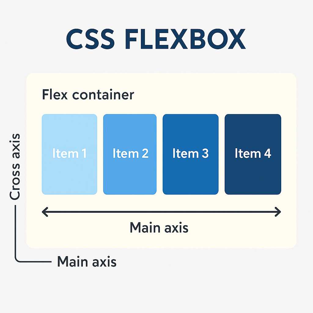
Flexbox Axes Explained
Flexbox layouts are based on two main axes:
- Main Axis: The primary direction in which flex items are laid out. It can be horizontal or vertical depending on
flex-direction. - Cross Axis: The perpendicular direction to the main axis, used for alignment and spacing.
Example:
.container {
  display: flex;
  flex-direction: row;
}
In the above code, the main axis is horizontal (left to right), and the cross axis is vertical (top to bottom).
Essential Flexbox Properties
Let’s look at the most important Flexbox properties you’ll use as a developer:
1. display
This property activates Flexbox.
display: flex; /* block-level container */
display: inline-flex; /* inline-level container */
2. flex-direction
Defines the direction of the main axis.
flex-direction: row;        /* default */
flex-direction: row-reverse;
flex-direction: column;
flex-direction: column-reverse;
3. justify-content
Controls the alignment of flex items along the main axis.
justify-content: flex-start; /* default */
justify-content: center;
justify-content: flex-end;
justify-content: space-between;
justify-content: space-around;
justify-content: space-evenly;
4. align-items
Aligns flex items along the cross axis.
align-items: stretch; /* default */
align-items: flex-start;
align-items: flex-end;
align-items: center;
align-items: baseline;
5. flex-wrap
By default, all flex items fit into one line. You can make them wrap onto multiple lines using:
flex-wrap: nowrap; /* default */
flex-wrap: wrap;
flex-wrap: wrap-reverse;
6. align-content
Controls the spacing between multiple lines when wrapping occurs.
align-content: flex-start;
align-content: center;
align-content: space-between;
align-content: space-around;
align-content: stretch;
Practical Example: Responsive Navigation Bar
Let’s see how Flexbox can simplify building a responsive navigation bar.
<nav class="navbar">
  <div class="logo">KnowAdvance</div>
  <ul class="menu">
    <li>Home</li>
    <li>Blog</li>
    <li>About</li>
    <li>Contact</li>
  </ul>
</nav>

<style>
.navbar {
  display: flex;
  justify-content: space-between;
  align-items: center;
  padding: 10px 20px;
  background: #0077ff;
  color: white;
}

.menu {
  display: flex;
  gap: 20px;
  list-style: none;
}
</style>
This simple Flexbox example centers and distributes elements perfectly on any screen size. It’s far more efficient than using floats or manual positioning.
Why Use Flexbox in 2025?
Flexbox continues to be a core part of modern web design because it provides a perfect balance between simplicity and power. Whether you’re a beginner or an advanced developer, Flexbox allows you to build clean, responsive interfaces quickly.
Some of the main advantages include:
- Effortless horizontal and vertical centering.
- Automatic responsive adjustment across screen sizes.
- Less dependency on frameworks like Bootstrap.
- Cleaner, more maintainable CSS code.
- Perfect alignment for dynamic content.
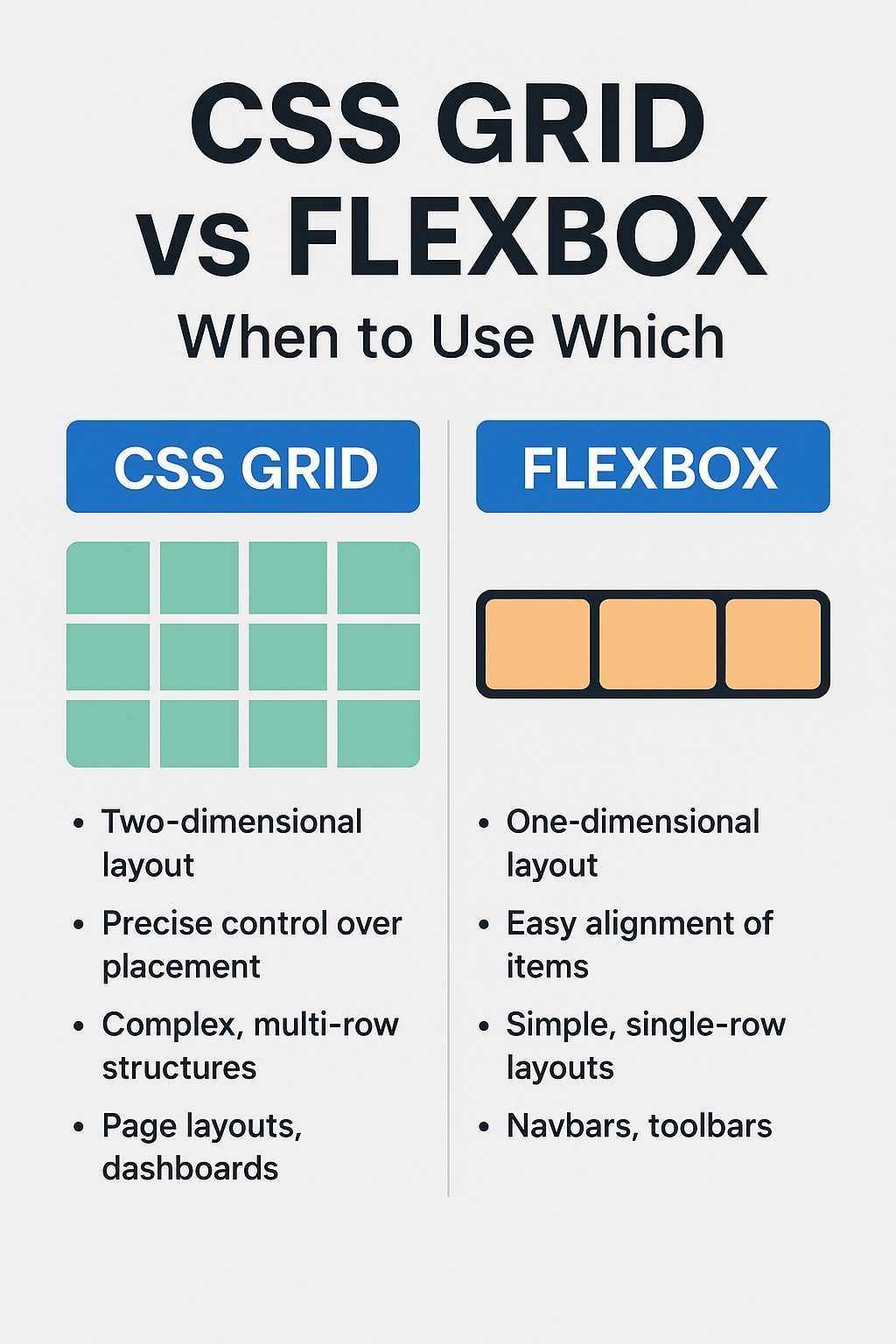
Flexbox vs Grid
Developers often wonder whether to use Flexbox or CSS Grid. The difference lies in their design philosophy:
- Flexbox is one-dimensional — great for linear layouts like navigation bars or rows of cards.
- Grid is two-dimensional — ideal for full-page layouts and complex arrangements.
For example, a blog listing layout might use Grid, while a single card’s content alignment inside that grid would use Flexbox.
To learn more about how modern web technologies evolve, check out our post on Top 10 Web Development Trends 2025 — it explores how Flexbox, Grid, and modern frameworks are shaping the future of front-end design.
Browser Support for Flexbox
Flexbox enjoys nearly universal support across modern browsers, including Chrome, Firefox, Safari, Edge, and even recent versions of Internet Explorer. You can safely use Flexbox for production websites in 2025.
However, when designing for older browsers or legacy enterprise systems, it’s still good practice to include fallback CSS for essential layouts.
Understanding the Flex Item Properties
While the container defines layout rules, each child item can also control its own behavior using item-specific properties:
1. order
Defines the order in which items appear inside the container, regardless of their HTML structure.
.item1 { order: 2; }
.item2 { order: 1; }
2. flex-grow
Defines how much an item should grow relative to others when extra space is available.
.item { flex-grow: 1; }
3. flex-shrink
Defines how much an item should shrink when space is limited.
.item { flex-shrink: 1; }
4. flex-basis
Sets the default size of an element before the remaining space is distributed.
.item { flex-basis: 200px; }
5. flex (shorthand)
The flex shorthand combines grow, shrink, and basis properties.
.item { flex: 1 1 200px; }
This means the item can grow and shrink as needed, with an initial width of 200px.
Real-World Example: Flexible Card Layout
<div class="card-container">
  <div class="card">Card 1</div>
  <div class="card">Card 2</div>
  <div class="card">Card 3</div>
</div>

<style>
.card-container {
  display: flex;
  flex-wrap: wrap;
  justify-content: space-around;
}
.card {
  background: #f0f0f0;
  padding: 20px;
  width: 30%;
  margin: 10px;
  text-align: center;
  border-radius: 10px;
}
</style>
Using Flexbox, the cards automatically adjust to the screen width — perfect for responsive design without media query overload.
Advanced Flexbox Techniques
Once you master the basics, Flexbox becomes a powerful ally for crafting sophisticated and responsive designs. Let’s dive into some advanced techniques that professional developers use to make layouts efficient and scalable.
1. Centering Elements Both Vertically and Horizontally
One of the most common challenges in web design is centering an element. With Flexbox, this becomes incredibly easy using just two properties:
.center-box {
  display: flex;
  justify-content: center;
  align-items: center;
  height: 300px;
  background: #e0e0e0;
}
This technique centers any element perfectly within its parent, regardless of its dimensions. This method replaces dozens of older CSS hacks that relied on margins, absolute positioning, or transforms.
2. Building Equal-Height Columns
Before Flexbox, achieving equal column heights required complicated workarounds. Flexbox simplifies this with align-items: stretch; — all items in a row automatically stretch to match the tallest element.
.columns {
  display: flex;
  align-items: stretch;
}
.column {
  flex: 1;
  padding: 20px;
  background: #f5f5f5;
}
Now each column will naturally balance height — perfect for feature grids, pricing tables, or testimonials.
3. Reordering Elements for Mobile Layouts
Flexbox allows you to visually reorder content without changing the HTML structure. This is extremely useful in responsive design when you want content to appear differently on smaller screens.
.sidebar { order: 2; }
.main-content { order: 1; }
Using the order property, you can move the sidebar below the main content on mobile screens — without duplicating markup or modifying HTML structure.
4. Nesting Flex Containers
Complex layouts often need multiple levels of Flexbox containers. You can nest Flexbox structures for more control.
<div class="outer">
  <div class="inner">
    <div>Item 1</div>
    <div>Item 2</div>
  </div>
</div>

<style>
.outer {
  display: flex;
  justify-content: center;
}
.inner {
  display: flex;
  gap: 10px;
}
</style>
This allows you to create deeply structured layouts — such as dashboards, grids, or modular UI systems — with full alignment control at each level.
5. Using gap Property
Modern Flexbox supports the gap property, originally part of CSS Grid. It provides an easy way to define spacing between flex items without adding extra margins.
.flex-container {
  display: flex;
  gap: 20px;
}
The gap property improves code readability and avoids collapsing margins, ensuring consistent spacing across browsers.
Flexbox for Responsive Web Design
Flexbox is a cornerstone of responsive design strategies in 2025. It naturally adapts to different screen sizes, meaning fewer media queries and more flexible layouts. You can use Flexbox to build:
- Responsive navigation menus
- Dynamic card grids
- Sidebar and content layouts
- Footer sections that auto-stack on mobile
Here’s an example of a responsive layout using Flexbox and minimal media queries:
.layout {
  display: flex;
  flex-wrap: wrap;
}
.sidebar {
  flex: 1 1 25%;
  min-width: 250px;
}
.content {
  flex: 3 1 75%;
}
@media (max-width: 768px) {
  .layout {
    flex-direction: column;
  }
}
This creates a two-column layout on desktop that automatically becomes a single column on mobile devices — clean and intuitive.
Common Flexbox Mistakes to Avoid
Even experienced developers occasionally misuse Flexbox. Here are some common pitfalls and best practices:
- Overusing Flexbox: Not every layout needs Flexbox. Use Grid for complex two-dimensional designs.
- Forgetting about the flex-basis: Setting
widthon items can conflict with Flexbox’s sizing logic — preferflex-basis. - Combining floats with Flexbox: Avoid mixing older layout methods with Flexbox, as it can lead to inconsistent rendering.
- Ignoring browser prefixes: Although most browsers support Flexbox natively, include prefixes if you target legacy systems.
Performance and Maintainability
One hidden advantage of Flexbox is how it simplifies CSS structure, making stylesheets more readable and maintainable. Fewer nested containers and clearfix hacks mean less CSS bloat, which leads to faster load times — a crucial factor for SEO and user experience.
Optimized CSS also helps improve Core Web Vitals, which directly impact your Google ranking and AdSense performance.
Practical Use Case: Product Card Layout
Let’s see how Flexbox simplifies UI layout for an eCommerce product card section.
<div class="product-list">
  <div class="product">
    <img src="product1.jpg" alt="Product 1">
    <h3>Smartwatch 2025</h3>
    <p>Next-gen wearable with AI features</p>
  </div>
  <div class="product">
    <img src="product2.jpg" alt="Product 2">
    <h3>Wireless Earbuds</h3>
    <p>Crystal clear sound and long battery life</p>
  </div>
</div>

<style>
.product-list {
  display: flex;
  flex-wrap: wrap;
  justify-content: space-evenly;
}
.product {
  flex: 1 1 250px;
  background: #fff;
  margin: 15px;
  padding: 20px;
  border-radius: 10px;
  box-shadow: 0 0 10px rgba(0,0,0,0.1);
}
.product img {
  width: 100%;
  border-radius: 8px;
}
</style>
This layout automatically adjusts the number of visible products per row depending on screen width, keeping consistent spacing and alignment.
Flexbox in Combination with CSS Grid
Modern web developers often combine Flexbox and Grid for maximum flexibility. A common pattern is to use Grid for the overall page layout and Flexbox for components inside grid cells.
For example, your blog listing page can use Grid for layout and Flexbox for aligning individual post content.
To understand how HTML and CSS evolution supports these trends, check our detailed comparison of HTML5 vs HTML4 differences.
Further Reading
- Top 10 Web Development Trends 2025
- HTML5 vs HTML4 Difference
- Best Programming Languages to Learn 2025
FAQs
What is Flexbox used for in CSS?
Flexbox is used for building flexible and responsive layouts. It helps align, space, and distribute elements efficiently without relying on floats or complex positioning.
What is the difference between Flexbox and Grid?
Flexbox handles one-dimensional layouts (rows or columns), while Grid handles two-dimensional layouts (rows and columns). Many modern designs use both together for best results.
Is Flexbox better than Bootstrap?
Flexbox is a CSS feature, while Bootstrap is a framework. Flexbox is lighter and gives more direct control, whereas Bootstrap provides pre-built components using Flexbox internally.
Can I use Flexbox with older browsers?
Yes, Flexbox is supported by all major browsers, including Chrome, Firefox, Edge, and Safari. For very old versions (like IE10), you may need vendor prefixes.
How do I debug Flexbox layouts?
Modern browsers like Chrome and Firefox include Flexbox visualization tools in their developer panels. These help you inspect alignment, spacing, and distribution interactively.
Conclusion
CSS Flexbox remains one of the most important layout tools for developers in 2025. Its ability to simplify alignment, responsiveness, and visual order makes it a cornerstone of modern front-end development. Whether you’re building navigation bars, cards, or full-page layouts, mastering Flexbox can drastically improve your workflow and website performance.
As the web continues evolving, Flexbox — combined with Grid, modern CSS features, and frameworks — will remain a foundation for building dynamic, accessible, and responsive interfaces that perform well on every device.