“CSS Clip Path Generator – Create Unique Shapes, Masks & Layouts Instantly”
CSS Clip Path Generator – Create Unique Shapes, Masks & Layouts Instantly
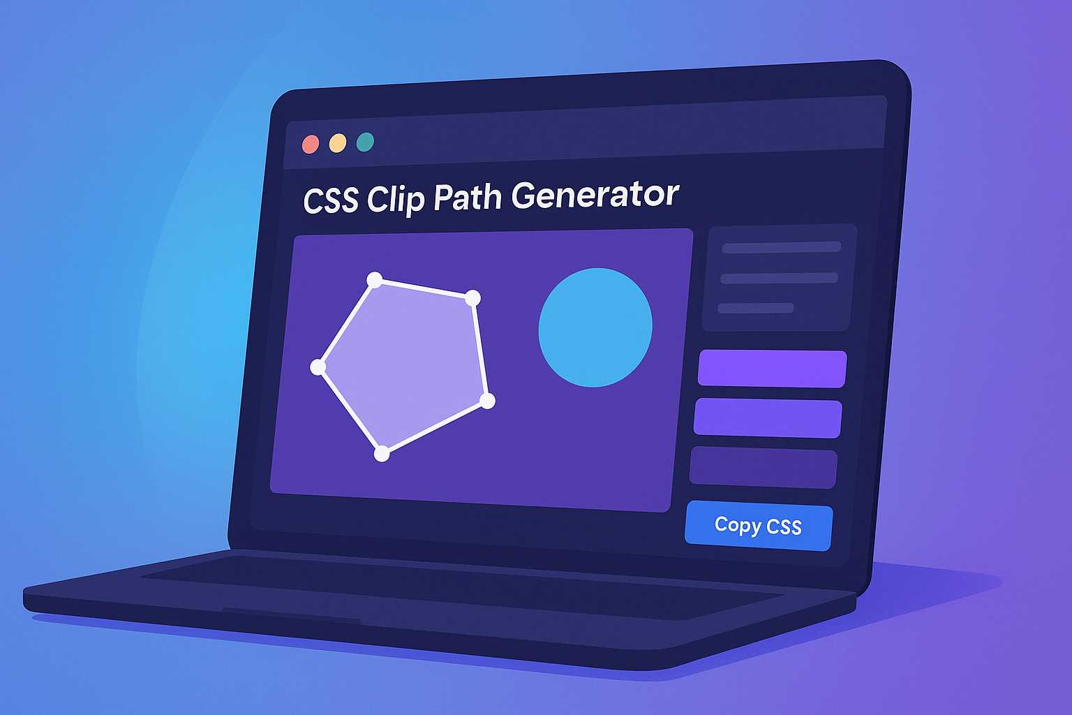
When designing modern web interfaces, traditional rectangular layouts often feel limiting. That’s where the CSS Clip Path Generator comes into play — a powerful tool that empowers developers and designers to create creative, custom-shaped elements without using images or SVGs.
From circular images to hexagonal buttons and irregular hero sections, the CSS clip-path property opens up endless visual possibilities. But writing those complex polygon coordinates by hand? Not fun at all. That’s exactly why the CSS Clip Path Generator is your best friend.
In this in-depth guide, we’ll explore what clip paths are, how they work, and how you can use our generator to create advanced designs in seconds — even if you’re not a CSS expert.
What is a CSS Clip Path?
The clip-path property in CSS allows you to define a specific visible area of an element. It’s like cutting a piece of paper into a particular shape — anything outside that shape becomes invisible.
.clip-example {
  clip-path: circle(50% at 50% 50%);
}
In the example above, the element is clipped into a perfect circle. The shape is defined using a circle() function, which is one of many available clip path functions.
Common Clip Path Shapes
- circle() – Perfect circular shapes, great for profile images.
- ellipse() – Oval-shaped elements for banners or highlights.
- polygon() – Completely customizable shapes using coordinates.
- inset() – Rectangular clipping with rounded corners.
- path() – Use SVG-like paths for ultimate flexibility.
By combining these shapes, you can create dynamic layouts that stand out — from diagonal section dividers to custom call-to-action buttons.
Why Use a CSS Clip Path Generator?
While clip-path is powerful, writing polygon points manually can be tedious. For example:
clip-path: polygon(50% 0%, 100% 50%, 50% 100%, 0% 50%);
That code represents a diamond shape — but it’s not easy to visualize or tweak manually. This is exactly why the CSS Clip Path Generator from KnowAdvance exists. It converts your visual edits (dragging, resizing, reshaping) directly into clean CSS.
Key Benefits of Using the Generator
- Visual editing: Draw and adjust shapes in real time.
- Copy-ready CSS: Instantly copy valid
clip-pathcode. - Supports multiple shapes: Circle, polygon, ellipse, and more.
- Browser compatibility: Ensures prefixes where needed.
- No installation: Runs directly in your browser.
Whether you’re a front-end developer, UI designer, or student learning CSS, this tool will save you hours of trial and error.
How to Use the CSS Clip Path Generator (Step-by-Step)
Let’s walk through how to use the tool effectively. You can access it directly here: CSS Clip Path Generator.
Step 1: Choose Your Shape Type
Select from predefined shapes such as circle, ellipse, polygon, or custom path. You’ll see a preview on the canvas immediately.
Step 2: Adjust Points or Coordinates
Drag shape points around to match your design idea. For polygons, you can add or remove points easily. The visual feedback helps fine-tune your shape quickly.
Step 3: Copy the CSS Code
Once satisfied, click Copy CSS to get the generated clip-path code. Example:
.my-shape {
  clip-path: polygon(20% 0%, 100% 0%, 80% 100%, 0% 100%);
}
Step 4: Apply It to Your Element
Use the CSS code in your stylesheet. For instance:
<div class="my-shape">Content here</div>
Voilà! Your element now has a unique clipped shape — no images, no external files, just pure CSS.
Advanced CSS Clip Path Examples
Once you understand the basics of clip-path, you can start experimenting with more advanced and creative uses. The CSS Clip Path Generator lets you visualize and tweak these complex shapes effortlessly.
1. Hexagonal Profile Image
Hexagonal avatars are a trendy UI pattern, especially in dashboards and portfolios. Here's how you can create one:
.profile-hex {
  clip-path: polygon(25% 5%, 75% 5%, 100% 50%, 75% 95%, 25% 95%, 0% 50%);
}
<img src="profile.jpg" alt="User profile" class="profile-hex">
This shape cuts your image into a perfect hexagon — without needing any SVGs or Photoshop magic.
2. Diagonal Hero Section
To make a landing page more dynamic, diagonal hero backgrounds are a great way to break the monotony of horizontal sections.
.hero-section {
  clip-path: polygon(0 0, 100% 0, 100% 85%, 0 100%);
  background: linear-gradient(135deg, #007bff, #00bcd4);
  color: white;
  padding: 100px 0;
}
<section class="hero-section">
  <h1>Welcome to KnowAdvance</h1>
  <p>Empowering developers with smart tools.</p>
</section>
This is a perfect use case for the CSS Clip Path Generator — simply drag the bottom edge to create your desired slope, and the tool will output your CSS automatically.
3. Custom Polygon Buttons
You can also create buttons with creative shapes to grab attention. For example, a diamond-shaped button:
.btn-diamond {
  clip-path: polygon(50% 0, 100% 50%, 50% 100%, 0 50%);
  background: #f44336;
  color: white;
  border: none;
  padding: 1rem 2rem;
  cursor: pointer;
  transition: transform 0.3s ease;
}
.btn-diamond:hover {
  transform: scale(1.05);
}
Use this kind of creative clipping in call-to-action areas to make your interface pop.
Browser Support and Fallbacks
The clip-path property is well-supported across modern browsers, including Chrome, Firefox, Edge, and Safari. However, if you’re targeting older browsers, you might want to add a fallback.
Basic Fallback Example
.my-shape {
  background-color: #4CAF50;
  /* Fallback for older browsers */
  clip-path: polygon(0 0, 100% 0, 100% 80%, 0 100%);
}
.no-clip-path .my-shape {
  clip-path: none;
  border-radius: 8px;
}
With the .no-clip-path class, you can provide a more standard rectangular design for unsupported browsers using feature detection.
Performance Tips for Using Clip Path
Like any CSS feature, improper use can affect performance. Here are some practical tips:
- Avoid animating complex polygons: Animations with many points can be CPU-heavy.
- Use GPU acceleration: Combine
clip-pathwithtransform: translateZ(0);for smoother transitions. - Minimize repainting: Limit the number of elements using clip paths simultaneously.
- Test on multiple devices: Ensure mobile and desktop browsers render the shapes correctly.
When used wisely, clip paths are lightweight and can dramatically improve your site’s visual appeal without compromising speed.
Real-World Use Cases for CSS Clip Paths
Designers and developers are using clip paths to bring life to everyday web components. Here are some real-world examples and inspirations you can replicate using our generator:
1. Image Masks and Overlays
Use clip paths to apply irregular masks on images for portfolio sections or product showcases.
2. Unique Section Dividers
Clip paths can divide your sections with angled, wavy, or zigzag edges — great for landing pages.
3. Creative Cards or Grids
Make your cards stand out with geometric or asymmetrical clipping effects.
4. Hover and Transition Effects
Animate the clip path to create cool hover transitions — perfect for interactive components.
5. Shaped Backgrounds for Text
Highlight headlines or quotes with polygonal text backgrounds instead of using plain rectangles.
Integrating Clip Path with CSS Frameworks
If you’re using frameworks like Tailwind CSS or Bootstrap, you can easily integrate clip-path properties using custom classes or inline styles.
Example with Tailwind
<div class="w-64 h-64 bg-blue-400 [clip-path:circle(50%_at_50%_50%)]"></div>
Tailwind supports arbitrary CSS values, allowing you to insert [clip-path:value] directly into your classes. You can generate these values using the CSS Clip Path Generator and paste them in seamlessly.
CSS Clip Path vs. Mask Image
Developers often confuse clip-path with mask-image. Let’s clarify:
| Feature | clip-path | mask-image |
|---|---|---|
| Purpose | Defines visible region using geometric shapes | Uses an image or gradient to mask visibility |
| Ease of Use | Simple syntax, shape-based | More flexible but complex |
| Performance | Lightweight | Can be heavier depending on image |
| Best For | Shapes, diagonals, section cuts | Soft fades, gradient transparency |
If your goal is geometric design — use clip-path. For gradients or image-based effects, mask-image is better.
Pro Tips for Designers and Developers
- Combine with CSS filters: Add
blur(),brightness(), ordrop-shadow()effects for depth. - Use transparency smartly: Combine
clip-pathwithbackground-blend-modefor layered visuals. - Test responsiveness: Some shapes may look distorted on smaller screens — test with percentages instead of pixels.
- Save presets: Our generator allows saving your favorite shapes for reuse in projects.
Internal Tools You May Also Like
At KnowAdvance, we offer a suite of developer tools that complement the CSS Clip Path Generator. Try these next:
- CSS Glassmorphism Generator – Create modern frosted glass effects easily.
- CSS Gradient Generator – Design stunning gradient backgrounds visually.
- CSS Box Shadow Generator – Craft perfect shadows for UI components.
- CSS Border Radius Generator – Generate smooth corner styles.
Related Tools
Conclusion
The CSS Clip Path Generator is more than just a visual playground — it’s a productivity booster for every front-end developer and designer. With this tool, you can build innovative layouts, experiment with custom shapes, and bring creativity to your web designs without touching Photoshop or Illustrator.
Whether you’re designing portfolios, landing pages, or dashboards, KnowAdvance’s CSS Clip Path Generator gives you the power to clip, shape, and design with precision and ease. Start exploring today and elevate your CSS skills to the next level!