Create Stunning Frosted UI Effects with CSS Glassmorphism Generator (Free Online Tool)
CSS Glassmorphism Generator – Create Beautiful Frosted Glass UI Effects
Glassmorphism has taken the web design world by storm. The soft, frosted-glass look adds elegance, depth, and a modern touch to web interfaces. But writing the CSS code for glassmorphism effects manually can be tedious — calculating transparency, blur, and color layers correctly isn’t always simple.
That’s where the CSS Glassmorphism Generator from KnowAdvance comes in. This free online tool lets you design and preview your glassmorphism effects instantly, then copy the generated CSS code for your projects.
What Is Glassmorphism in CSS?
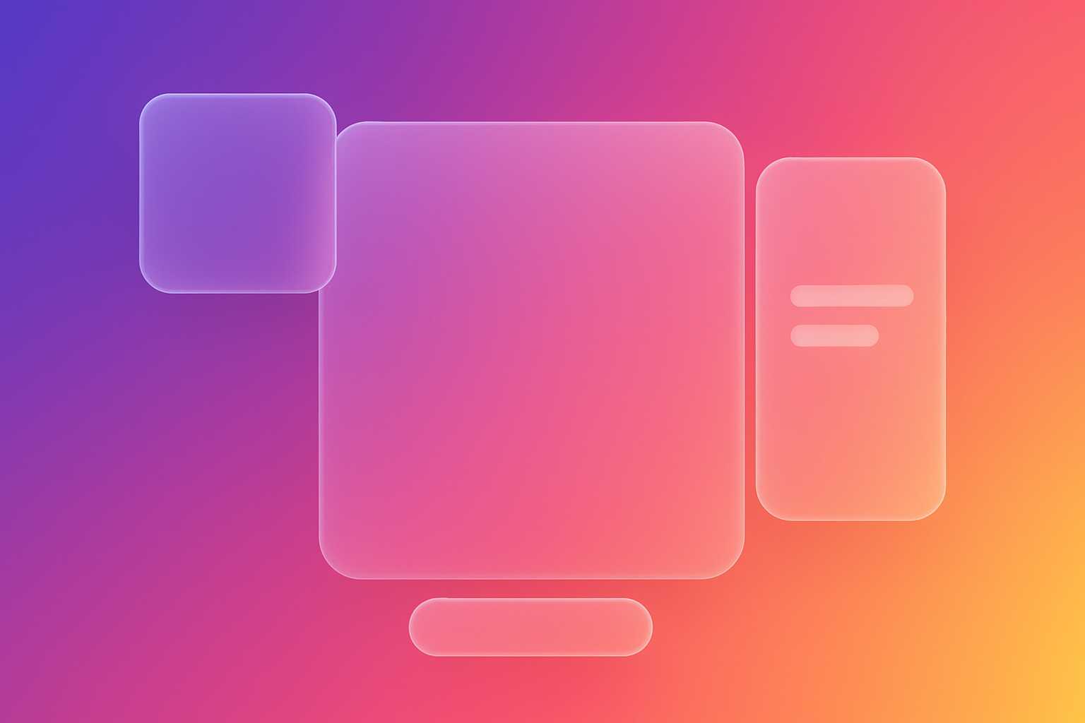
Glassmorphism is a UI design trend that mimics the appearance of frosted or translucent glass surfaces. It’s characterized by transparency, blurred backgrounds, and soft light effects. The design style became popular after Apple’s macOS Big Sur and Windows Fluent Design introduced it in their interfaces.
In CSS, glassmorphism is typically achieved using a combination of:
backdrop-filter: blur()to create the frosted blur effect.background-colorwith transparency (using RGBA or HSLA values).borderandbox-shadowfor depth and light reflection.border-radiusfor smooth, glass-like edges.
Example of a Simple Glassmorphism Card
.glass-card {
  background: rgba(255, 255, 255, 0.15);
  border-radius: 16px;
  box-shadow: 0 4px 30px rgba(0, 0, 0, 0.1);
  backdrop-filter: blur(10px);
  -webkit-backdrop-filter: blur(10px);
  border: 1px solid rgba(255, 255, 255, 0.3);
}
The result? A beautifully blurred card that looks like frosted glass — subtle, elegant, and ideal for modern UI dashboards, portfolios, and landing pages.
Why Use a CSS Glassmorphism Generator?
While you can hand-code a glassmorphism effect, finding the perfect combination of blur intensity, transparency, and color tone takes trial and error. The CSS Glassmorphism Generator eliminates this guesswork.
You simply adjust sliders for:
- Background blur
- Transparency (opacity)
- Border radius
- Shadow intensity
- Color and gradient
As you tweak the values, you can instantly see how your glass effect looks on different backgrounds. Once satisfied, just click “Copy CSS” — your clean, ready-to-use CSS code is instantly copied to your clipboard.
Time-Saving for Developers and Designers
Whether you’re a frontend developer creating a dashboard UI or a designer working on a product landing page, this generator helps you produce consistent and pixel-perfect glass effects within seconds.
How Glassmorphism Works Under the Hood
Glassmorphism leverages CSS properties introduced in modern browsers, especially backdrop-filter. This property allows you to blur or apply effects to the area behind an element — just like looking through frosted glass.
Key CSS Properties Explained:
background:Sets the base translucent layer. Use RGBA or HSLA for partial transparency.backdrop-filter:Applies visual effects (like blur) to elements behind your target element.box-shadow:Adds realistic depth and contrast.border:Creates the illusion of glass edges by defining a subtle outline.
.glass-button {
  background: rgba(255, 255, 255, 0.2);
  border: 1px solid rgba(255, 255, 255, 0.3);
  border-radius: 12px;
  backdrop-filter: blur(8px);
  box-shadow: 0 4px 20px rgba(0, 0, 0, 0.2);
  color: white;
  padding: 10px 20px;
}
Browser Compatibility and Fallbacks
While glassmorphism looks amazing, it’s worth noting that the backdrop-filter property isn’t fully supported by all browsers — especially older ones. As of 2025, modern versions of Chrome, Edge, Safari, and Firefox support it with minimal differences.
For better compatibility, you can add fallback styles, such as solid backgrounds or reduced transparency:
.glass-card {
  background: rgba(255, 255, 255, 0.15);
  border-radius: 16px;
  box-shadow: 0 4px 30px rgba(0, 0, 0, 0.1);
  border: 1px solid rgba(255, 255, 255, 0.3);
}

/* Fallback for unsupported browsers */
@supports not ((backdrop-filter: blur(10px))) {
  .glass-card {
    background: rgba(255, 255, 255, 0.5);
  }
}
Tip:
You can use the KnowAdvance CSS Glassmorphism Generator to preview how your design looks both with and without the blur effect, making it easy to ensure graceful degradation.
How to Use the CSS Glassmorphism Generator
- Visit https://knowadvance.com/css-glassmorphism-generator.
- Adjust the sliders for blur, opacity, border-radius, and shadows.
- Choose your preferred background color or gradient.
- Preview the result instantly.
- Click “Copy CSS” to use the code in your project.
The tool provides developer-friendly output with clean CSS syntax — ready to paste directly into your stylesheet.
Design Principles Behind Glassmorphism
Glassmorphism isn’t just a visual gimmick — it’s built around real design principles that enhance user interface clarity and aesthetics. When used properly, it helps separate layers, emphasize content, and make UI components stand out elegantly against a blurred background.
Key Characteristics of Glassmorphism
- Transparency: Subtle translucency allows background elements to show through, creating visual depth.
- Blur: The blur softens background details, focusing attention on the foreground content.
- Light Borders: Semi-transparent borders simulate light reflecting through glass.
- Vibrant Backgrounds: Works best on colorful or gradient backgrounds, where the blur effect shines.
When combined thoughtfully, these principles produce UIs that feel light, futuristic, and easy on the eyes.
Glassmorphism vs. Neumorphism: What’s the Difference?
Developers often confuse glassmorphism and neumorphism, but they’re distinct design styles with different goals.
| Aspect | Glassmorphism | Neumorphism |
|---|---|---|
| Visual Style | Transparent, blurred, light-glass look | Soft, embossed or extruded 3D elements |
| Background | Colorful, gradient, often vibrant | Monotone or pastel with subtle shadows |
| Use Case | Cards, overlays, modals, dashboard panels | Buttons, toggles, switches |
| Accessibility | Better contrast; easier to read | Sometimes poor contrast and usability |
In short, Glassmorphism = Transparency + Blur + Depth, while Neumorphism = Shadows + Softness + Depth. Both can coexist, but glassmorphism tends to be more flexible for modern UIs.
Best Use Cases for Glassmorphism in Web Design
The CSS Glassmorphism Generator is versatile enough for all kinds of UI components. Here are common use cases where it truly shines:
- Dashboard Cards: Make analytics panels and widgets look futuristic and clean.
- Login Forms: Add elegance to modal or overlay login pages.
- Profile Sections: Great for user cards and bio components.
- Hero Sections: Combine with colorful gradients for landing pages.
- Navigation Bars: Semi-transparent navbars look great with parallax backgrounds.
Using this tool ensures your design remains consistent and responsive across devices.
Example: Glassmorphic Login Form
Welcome Back
Login
.login-card {
  width: 320px;
  padding: 20px;
  background: rgba(255, 255, 255, 0.15);
  border-radius: 20px;
  backdrop-filter: blur(15px);
  border: 1px solid rgba(255, 255, 255, 0.3);
  box-shadow: 0 4px 25px rgba(0, 0, 0, 0.2);
}
When paired with a gradient background, this card creates a sophisticated frosted-glass interface perfect for sign-in modals or user dashboards.
Accessibility and Readability Tips
Although glassmorphism is visually appealing, developers must ensure readability and contrast are not sacrificed. Here are some best practices:
- Always maintain a minimum contrast ratio between text and the background.
- Use semi-opaque overlays or darker backgrounds for text-heavy components.
- Limit the number of blurred layers to prevent visual clutter.
- Combine glassmorphism subtly with flat or material design elements for balance.
Accessibility Example
.glass-accessible {
  background: rgba(255, 255, 255, 0.25);
  color: #222;
  text-shadow: 0 1px 1px rgba(255, 255, 255, 0.6);
}
This ensures text remains readable even over semi-transparent glass layers.
Combining Glassmorphism with Gradients
For truly eye-catching UIs, try blending glassmorphism with colorful gradients. The contrast between the blurred layer and vivid backgrounds adds life to your page.
body {
  background: linear-gradient(135deg, #4158D0 0%, #C850C0 46%, #FFCC70 100%);
}

.glass-panel {
  background: rgba(255, 255, 255, 0.2);
  backdrop-filter: blur(12px);
  border: 1px solid rgba(255, 255, 255, 0.3);
}
The CSS Glassmorphism Generator allows you to experiment with different gradients and instantly preview how your glass effects will interact with them.
Performance Considerations
While backdrop-filter is powerful, it’s also resource-intensive. Overusing blur effects can cause performance drops on lower-end devices. To optimize:
- Use fewer blurred layers per viewport.
- Keep blur radius moderate (8–15px usually looks best).
- Combine multiple glass elements using shared containers.
Testing your UI on mobile and desktop browsers ensures smooth scrolling and consistent rendering.
Integrating Glassmorphism in Frameworks
The generated CSS works seamlessly with frameworks like React, Next.js, Angular, or Tailwind CSS. You can easily incorporate glassmorphism into your component library or design system.
Example: Using Glassmorphism in React
export default function GlassCard({ children }) {
  return (
    <div style={{
      background: 'rgba(255, 255, 255, 0.2)',
      backdropFilter: 'blur(10px)',
      borderRadius: '15px',
      padding: '20px',
      border: '1px solid rgba(255,255,255,0.3)'
    }}>
      {children}
    </div>
  );
}
Or in Tailwind CSS:
This makes it easy to integrate glassmorphic effects in modern web apps and components.
Other Useful CSS Tools on KnowAdvance
If you found the Glassmorphism Generator useful, you’ll love other CSS tools from KnowAdvance that enhance your web design workflow:
- CSS Gradient Generator – Create smooth gradients with ease.
- CSS Box Shadow Generator – Generate complex shadows instantly.
- CSS Border Radius Generator – Craft rounded corners visually.
- CSS Text Shadow Generator – Add glowing and layered text effects.
Related Tools
- CSS Gradient Generator
- CSS Box Shadow Generator
- CSS Border Radius Generator
- CSS Text Shadow Generator
Conclusion
Glassmorphism is more than just a design trend — it’s a powerful visual language that adds elegance and depth to modern web interfaces. By using the CSS Glassmorphism Generator, developers and designers can save time, maintain design consistency, and instantly create pixel-perfect frosted-glass effects.
Whether you’re designing a dashboard, login page, or landing section, this tool lets you focus on creativity — while it handles the complex CSS for you. Try it now and elevate your web designs with the magic of glassmorphism!