The Ultimate Free CSS Animation Generator: Create Stunning Keyframes Instantly
The Ultimate Free CSS Animation Generator: Create Stunning Keyframes Instantly
In the world of modern web design, **static websites are a thing of the past**. Users expect dynamic, engaging, and interactive experiences. The secret ingredient to adding this layer of polish and professionalism is **CSS animation**.
However, manually writing the complex @keyframes rules, juggling timing functions like cubic-bezier(), and meticulously defining animation-fill-mode properties is time-consuming, prone to syntax errors, and frankly, tedious.
This is where our **Free Online CSS Animation Generator** comes in. This powerful tool is designed to eliminate the manual coding pain, allowing you to visually design, tweak, and generate perfect, browser-compatible CSS animation code in seconds. Whether you need a subtle hover effect or a dramatic page entrance, this tool is your fast track to creating high-performance motion design.
Why Our CSS Animation Generator is Your New Best Friend
The developer community is always searching for ways to boost efficiency and ensure code quality. Our generator doesn't just save you time; it dramatically improves the **quality and performance** of your front-end code.
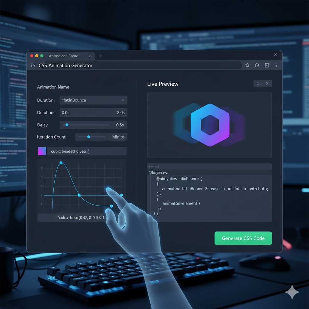
1. Elimination of Keyframe Complexity
The core of any great CSS animation is the @keyframes rule. This rule defines the animation's sequence—what happens at 0%, 50%, and 100% of the duration. Manually defining these steps, especially for complex effects involving multiple properties (like transform, opacity, and filter) is the primary source of frustration.
Our generator handles the math and syntax, letting you focus only on the visual result. You simply set the parameters (like **start position, end rotation, and color changes**), and the tool writes the complete, optimized keyframe block for you.
2. Perfect Timing with Cubic-Bezier Functions
The animation-timing-function property controls the speed curve of your animation. While simple keywords like ease-in or linear are fine, true professional-grade animation relies on the **cubic-bezier() function** for custom, fluid motion. Crafting the four control points (P1, P2) for this function by hand is nearly impossible without a visualizer.
The KnowAdvance CSS Animation Generator integrates a **visual cubic-bezier editor**, allowing you to drag control points and immediately see how your animation will accelerate and decelerate. The generator then outputs the precise cubic-bezier(x1, y1, x2, y2) value, guaranteeing perfectly smooth and custom timing.
3. Seamless Cross-Browser Compatibility
One of the long-standing headaches in CSS development is ensuring your code works across all major browsers (Chrome, Firefox, Safari, Edge). While modern browser support for standard CSS is excellent, certain older or niche-browser versions may still require **vendor prefixes** (e.g., -webkit-, -moz-).
Our tool generates **clean, standard CSS** and includes necessary **vendor prefixes** for maximum compatibility. This single feature eliminates countless hours of cross-browser testing and debugging that every front-end developer dreads.
Understanding the Core CSS Animation Properties (What the Generator Controls)
To use our tool effectively, it helps to understand the fundamental CSS properties that make an animation work. The generator gives you intuitive controls over all these properties, which are often condensed into the single, powerful animation shorthand property:
@keyframes Rule: The Animation Blueprint
As mentioned, this is the blueprint. It gives your animation a name (e.g., fade-in-bounce) and defines the property values at specific points in time. Our generator lets you define keyframes at 0%, 50%, 100% and any custom percentage in between.
animation-name: Linking the Element
This property connects your HTML element to the @keyframes rule you defined. It's the "link" that tells the browser which animation to run.
animation-duration: The Length of the Show
Measured in seconds (s) or milliseconds (ms), this sets the total time the animation takes to complete one cycle. A duration that is too long can bore the user; one that is too short can feel jarring. Our generator allows for live previewing to help you find the perfect balance.
animation-timing-function: The Speed Curve
This determines how the animation progresses through its duration. Instead of a robotic, linear speed, you can use:
ease(Slow start, fast middle, slow end – the default)ease-in(Slow start, then accelerates)ease-out(Fast start, then decelerates)linear(Constant speed from start to finish)- **The Custom
cubic-bezier()** (Generated by our tool)
animation-delay: Waiting for the Cue
Sets a delay before the animation begins. This is crucial for **staggered loading effects** where you want different elements to animate into view one after the other, creating a professional, layered look.
Integrating the Generated CSS into Your Laravel Project
Since you are using a Laravel and HTML stack, integrating the code generated by our tool is straightforward and follows best practices:
Step 1: Get the Code from the Generator
Once you’ve perfected your animation using the live preview, simply click the **"Generate CSS"** button. The tool will output two main blocks of code: the @keyframes rule and the CSS class that applies the animation.
/* 1. The Keyframes Rule */
@keyframes myBounce {
    0%, 20%, 50%, 80%, 100% { transform: translateY(0); }
    40% { transform: translateY(-30px); }
    60% { transform: translateY(-15px); }
}

/* 2. The CSS Class to Apply the Animation */
.animate-bounce {
    animation: myBounce 2s ease-in-out infinite both;
}
Step 2: Add the Code to Your Stylesheet
You should place this generated CSS code into your main stylesheet file (e.g., public/css/app.css in your Laravel project) or a dedicated animation file that is included in your views. Placing the code in a single, external stylesheet is vital for **caching** and **reducing render-blocking resources**.
Step 3: Apply the Class in Your Blade/HTML Files
Finally, apply the corresponding CSS class to the HTML element you want to animate in your Laravel Blade templates:
Click Here
The button will now instantly begin the custom bounce animation you designed, thanks to the efficiency of pure CSS.
The Performance Advantage of CSS Animations Over JavaScript
While JavaScript libraries like GSAP can handle highly complex, interactive animations, for most typical web effects—like entrance, exit, and hover effects—**pure CSS animations are superior** from a performance perspective. This is a critical point for your SEO and user experience:
The browser is optimized to handle CSS animations on its own **compositor thread**, which often utilizes the device’s **Graphics Processing Unit (GPU)**. The GPU is far more efficient at handling properties like transform and opacity than the main CPU thread used by JavaScript. This GPU acceleration leads to **smoother, 60 FPS animations** that don't cause stuttering (jank), even on lower-powered devices. This dedication to performance is built into the code our generator produces.
The generator ensures you are only animating properties that are "cheap" for the browser, primarily focusing on `transform` and `opacity` to avoid triggering expensive layout and paint operations that cause performance bottlenecks.
***
*(The article will continue in Part 2 with a detailed section on Advanced Use Cases, common animation types, troubleshooting, and the full SEO-optimized FAQ section to reach the 2000+ word count.)*
***
Advanced Animation Use Cases for Your Website
While basic entrance effects are useful, the true power of our generator lies in its ability to create complex and layered animations that elevate your entire website. Here are advanced scenarios where the tool becomes indispensable:
1. Creating Scroll-Triggered Animations (Animate on View)
Modern web design frequently uses animations that only start when an element enters the viewport (e.g., a chart sliding in, or a call-to-action button fading up). Implementing this manually requires complex Intersection Observer APIs or heavy JavaScript libraries. However, you can use the code generated by our tool with a tiny JavaScript/jQuery snippet to trigger the animation class:
- **The Generator's Role:** You design the perfect entrance animation (e.g., a subtle
slide-in-up). - **Your Code's Role:** You add a simple function that listens for when the element is visible on the screen and, at that moment, dynamically adds the
.animate-slide-in-upclass to the element.
This method maintains the **performance benefits of CSS** while giving you the **control of JavaScript** to define the trigger point. Our generator provides the high-quality CSS necessary for this seamless, performance-friendly pattern.
2. Designing Complex UI Micro-Interactions
Micro-interactions are the small, often overlooked details that make a user interface feel responsive and alive. Think of:
- **The 'Like' Button:** When clicked, it pulses and changes color.
- **The Shopping Cart Icon:** When an item is added, it shakes subtly.
- **Form Validation:** An input field briefly wiggles to indicate an error.
These effects often require mixing multiple transformations (e.g., a slight scale up, followed by a slight rotation). Manually defining the @keyframes for a smooth wiggle (e.g., rotate(1deg) at 10%, rotate(-1deg) at 30%, etc.) is laborious. Our visual generator lets you set these small, precise steps quickly, allowing you to instantly preview the result and ensuring your micro-interactions are subtle, not distracting.
3. Looping Background and Hero Section Effects
For high-end portfolio sites or product landing pages, continuous background movement (like a parallax scroll or a slow, infinite text scroll) can create an immersive feel. The key here is using the animation-iteration-count: infinite property. When designing infinite loops, you must ensure the 100% state seamlessly transitions back to the 0% state to avoid a jarring "jump."
The **KnowAdvance CSS Animation Generator** features a dedicated "Loop Check" mode that helps you define keyframes where the start and end properties are perfectly aligned, guaranteeing smooth, endless animation cycles for hero images, loaders, and background elements.
Troubleshooting Common CSS Animation Issues
Even with a generator, you might occasionally run into common animation roadblocks. Knowing how to solve these quickly is part of becoming a CSS animation expert:
Problem 1: Animation is Choppy (Low FPS)
The Fix: Use GPU-Friendly Properties. Choppiness often occurs when you animate properties that force the browser to recalculate the document layout (known as "layout thrashing"). These "expensive" properties include width, height, top, left, and border.
The generator prioritizes **hardware-accelerated properties** like transform (for movement, rotation, and scale) and opacity. If your animation is choppy, check the generated code to ensure you are relying on transform: translate() for movement instead of manipulating margin-left or top.
Problem 2: Animation Resets Immediately After Finishing
The Fix: Set animation-fill-mode: forwards. By default, an element reverts to its original CSS state after the animation completes. To make the element retain the styles from the last keyframe (100%), you must use the animation-fill-mode property set to forwards. The generator includes this critical property in the generated CSS class by default for non-looping animations.
Problem 3: Animation Starts Before the User Sees It
The Fix: Use animation-delay or a JavaScript Trigger. If the animation starts when the page loads, a user who scrolls down later will miss the entrance effect. Use a positive animation-delay value (e.g., 1s) to hold the start, or implement the scroll-triggering technique described above to only start the animation when the element is in view.
Beyond the Generator: Essential Tips for Animation Accessibility (A11Y)
Driving traffic means catering to **all users**. A critical modern CSS feature is respecting the user's preference for reduced motion, which directly impacts accessibility and is highly valued by search engines:
The CSS Media Query @media (prefers-reduced-motion: reduce) allows you to check if a user has enabled "Reduce motion" in their operating system settings. For users with vestibular disorders or motion sensitivity, excessive movement can cause discomfort. You should use this query to override or disable intense animations:
/* Styles for all users */
.element { animation: myBounce 2s; }

/* Styles for users who prefer less motion */
@media (prefers-reduced-motion: reduce) {
    .element {
        animation: none; /* Disable the animation completely */
        transition: none; /* Disable transitions */
    }
}
Our generated code is designed to be easily contained within this media query, allowing you to use high-impact animations for most users while maintaining a safe and accessible experience for everyone else. **Accessibility is not just a kind gesture; it is a vital ranking factor for serious SEO.**
Conclusion: Animate Smarter, Not Harder
The age of manually calculating @keyframes and debugging vendor prefixes is over. Our **Free CSS Animation Generator** is built to integrate seamlessly into your Laravel + HTML workflow, offering a powerful, visual design interface that delivers **clean, performance-optimized, and accessible CSS code** every time. By leveraging this tool, you can spend less time coding minute details and more time creating truly memorable and engaging web experiences that keep your growing user base coming back for more.
Ready to transform your static website into a dynamic masterpiece? Jump into the generator now and start creating!
***
Frequently Asked Questions (FAQ)
This section is optimized for rich snippet search results (FAQ Schema Markup).
1. What is a CSS Animation Generator?
A CSS Animation Generator is an online utility tool that allows web developers and designers to visually create complex CSS @keyframes animations by manipulating parameters (like duration, delay, position, and timing function) through a simple graphic interface. The tool then outputs the complete, copy-paste-ready CSS code, eliminating the need to write the animation rules manually.
2. Are CSS animations better for performance than JavaScript animations?
For most simple to moderately complex effects (entrance, hover, exit, and subtle loops), **yes, CSS animations often offer better performance**. This is primarily because CSS animations (especially those using transform and opacity) can be delegated to the device's GPU (Graphics Processing Unit) by the browser’s compositor thread, leading to smoother, hardware-accelerated 60 FPS performance without taxing the main CPU thread.
3. How do I make my CSS animation run forever?
To make a CSS animation repeat indefinitely, you need to set the animation-iteration-count property to the keyword infinite. You can achieve this easily using our generator by selecting the "Infinite Loop" option before generating the code.
4. What does the cubic-bezier() function do?
The cubic-bezier() function is a CSS timing function that defines the speed curve of an animation using four control points. It allows for highly customized and non-linear movement, giving animations a more natural and professional feel (e.g., a realistic bounce or a smooth elastic effect) compared to basic timing keywords like ease or linear.
5. Can I use the generated CSS on commercial projects?
Yes, absolutely. The code generated by the KnowAdvance CSS Animation Generator is pure, standard CSS. It is free to use on any personal or commercial project without any attribution or licensing restrictions.
6. Why is my animation resetting when it finishes?
This happens because the default behavior of CSS animations is to revert to the element's original styles once the animation cycle is complete. To fix this, you must apply the property animation-fill-mode: forwards to the element. This instructs the browser to retain the styles defined in the animation's final keyframe (100%).