Preparing Visual Assets Efficiently for Blogs, Portfolios, and Documentation
Anyone who works with visual content eventually discovers that preparing images takes more time than expected. A photo looks great on your desktop, but once you upload it, the file feels too large, the colors look slightly off, or the layout breaks the page. Whether you're writing a blog post, assembling a portfolio, or polishing technical documentation, visuals tend to shape the first impression long before the text does. That’s why having a simple, reliable process for preparing them can save a surprising amount of time.
The challenge isn’t just editing images—it’s figuring out what each platform actually needs. A portfolio page might require wide, polished images. Documentation often benefits from clean, annotated screenshots. Blog graphics typically need to load quickly without losing clarity. Once you start noticing these patterns, preparing assets becomes less of a chore and more of a natural part of your creative flow.
Understanding the purpose behind each visual
Before adjusting size or format, it helps to ask what the visual is meant to do. A banner image is usually there to set tone, while a step-by-step graphic is meant to guide attention. Treating all visuals the same leads to inconsistent quality or oversized files.
A good habit is to decide the “job” of each image before exporting it. If it’s decorative, you can be more flexible with compression. If it’s instructional, clarity matters more than aesthetic polish. These decisions shape the entire preparation process.
Right-sizing images without turning it into a technical task
Most creators already know that massive images slow down pages, but resizing often becomes an afterthought. The trick is to match dimensions to the platform's layout rather than guessing. For example, a blog that displays images at 1200px wide doesn't benefit from a 5000px photo. Portfolios, especially those with full-width galleries, deserve more room to breathe.
Screenshots are a different story. They rarely need to be huge, and trimming away unnecessary edges can help keep attention on what actually matters. These minor adjustments improve clarity without feeling like extra work.
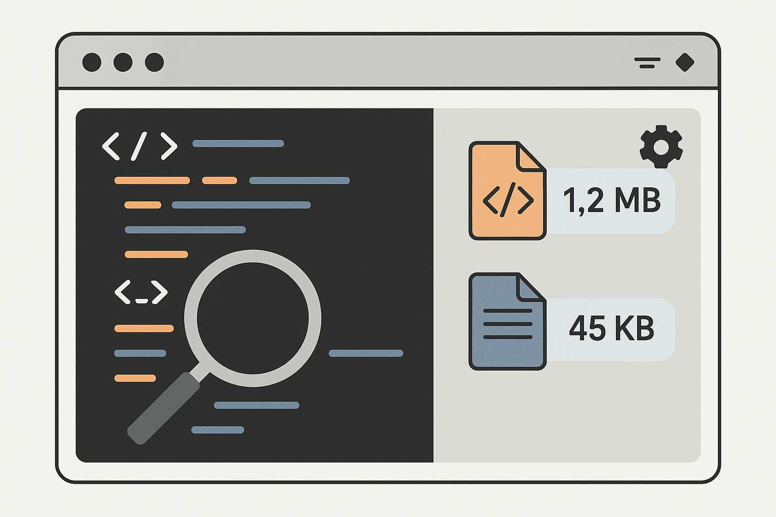
A lightweight approach to compression
Compression often makes people nervous because they imagine grainy results or washed-out colors. In practice, moderate compression usually looks identical to the original but loads significantly faster. I’ll sometimes drop images into a simple online tool like this one before publishing, especially when preparing multiple visuals at once.
This small step can dramatically improve how a page feels. When everything loads smoothly, readers focus on the content instead of waiting for assets to catch up.
Creating visual consistency without forcing a strict style
You don’t need a formal design system to keep your visuals cohesive. A few soft guidelines—consistent margins, similar color tones, and a predictable layout—make blogs and portfolios feel more intentional. Even documentation benefits from a bit of consistency, especially when screenshots appear throughout a long tutorial.
One approach is to apply the same background or light shadow to images that sit side by side. Another is to keep text labeling minimal so the visuals stay timeless. These subtle choices build a sense of rhythm as someone scrolls.
Keeping editable versions for future updates
We’ve all experienced the frustration of needing to update a visual and realizing the original layered file is missing. A small collection of source files—PSD, SVG, or raw screenshots—saves hours later. Portfolios evolve. Documents change. Blogs get updated. Having editable versions means you can refresh visuals without rebuilding them from scratch.
This habit pairs nicely with tools that streamline related tasks. For instance, creators who format long articles often rely on a quick word counter, while workflow guides such as this note on speeding up your design process help refine broader systems.
Preparing visuals for different viewing environments
Blogs, portfolios, and documentation pages are viewed across screens of every size. An image that looks crisp on a laptop might feel cramped on a phone. Responsive design reduces some of this tension, but thoughtful preparation helps even more.
When possible, use aspect ratios that scale neatly. Horizontal images work well for blog headers; square or slightly vertical images behave predictably in galleries and portfolios. Documentation often calls for clear, rectangular screenshots that leave enough room for text to wrap cleanly.
Using annotations and callouts sparingly
Annotations can be helpful, especially in guides or technical write-ups. But too many arrows and labels overwhelm the reader. A simple highlight or a short caption often communicates the point without clutter. When the story becomes easier to understand at a glance, the visual has done its job.
This also makes translation or future editing easier, since heavily annotated graphics require more work to update.
Building a repeatable workflow you can trust
The best workflows rarely start as rigid checklists. They evolve from doing the same tasks repeatedly and noticing small improvements. Maybe you find that exporting at 80% quality gives the right balance every time. Or that adding a slight border helps screenshots pop. These habits eventually form a lightweight personal system.
A repeatable workflow doesn’t just speed things up—it reduces decision fatigue. The fewer micro-choices you make per asset, the more creative energy you retain for the actual project.
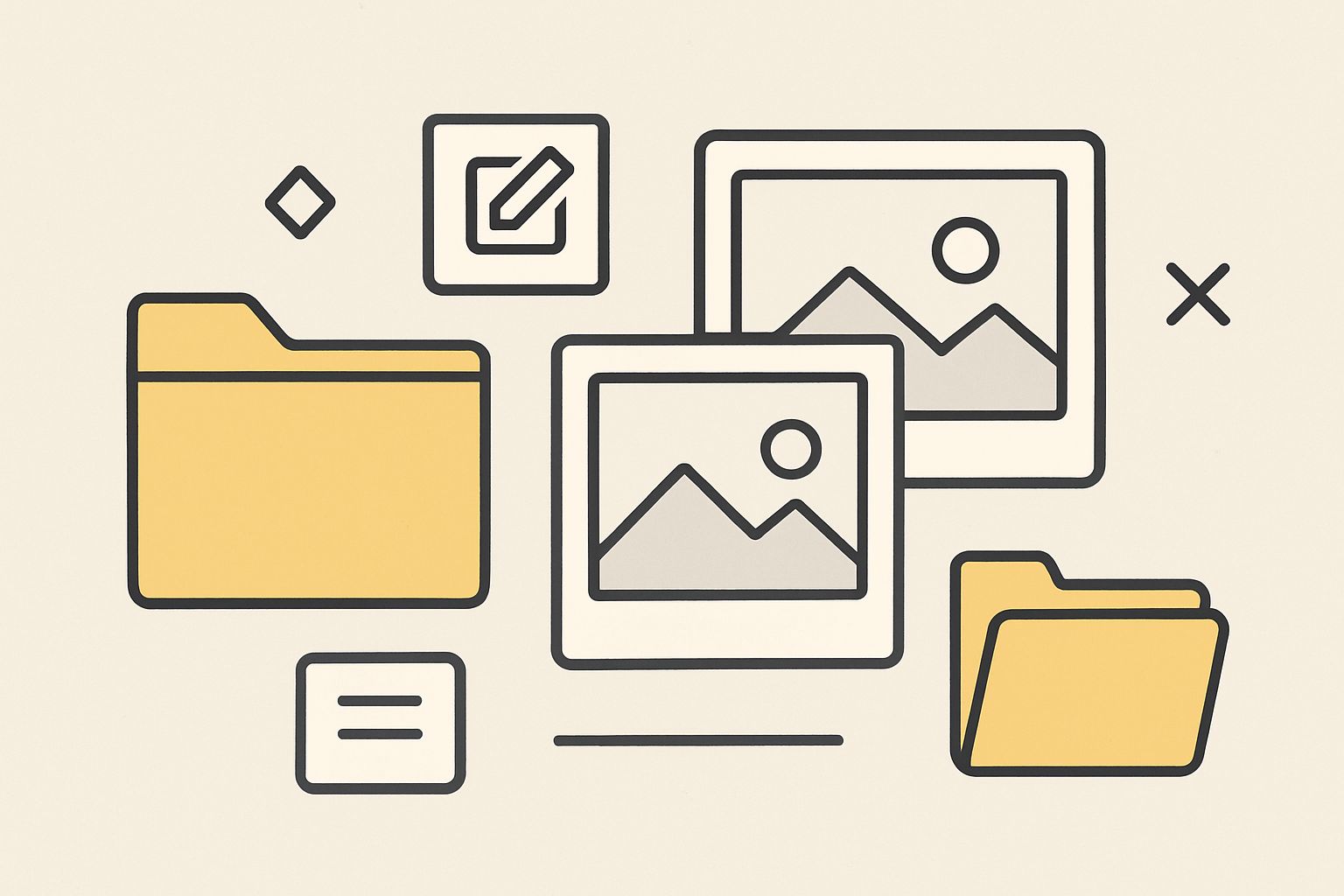
Keeping everything organized behind the scenes
Once visuals are prepared, storing them neatly prevents future confusion. A simple folder structure—by project, date, or type of asset—keeps things easy to locate. Naming files descriptively helps too, especially when revisiting projects months later.
Some creators prefer a single library with subfolders for exports and source files. Others maintain separate folders for website assets, portfolio pieces, and documentation graphics. There’s no right answer; the goal is to build something that feels natural to you.
Closing thoughts
Preparing visual assets efficiently isn’t about being hyper-organized or mastering advanced tools. It’s about developing a comfortable rhythm that supports your writing, design, or documentation work. With a few thoughtful habits—right-sizing images, light compression, consistent styling, and simple organization—you create visuals that feel polished without consuming your entire workflow. When the preparation becomes effortless, the work around it becomes more enjoyable too.