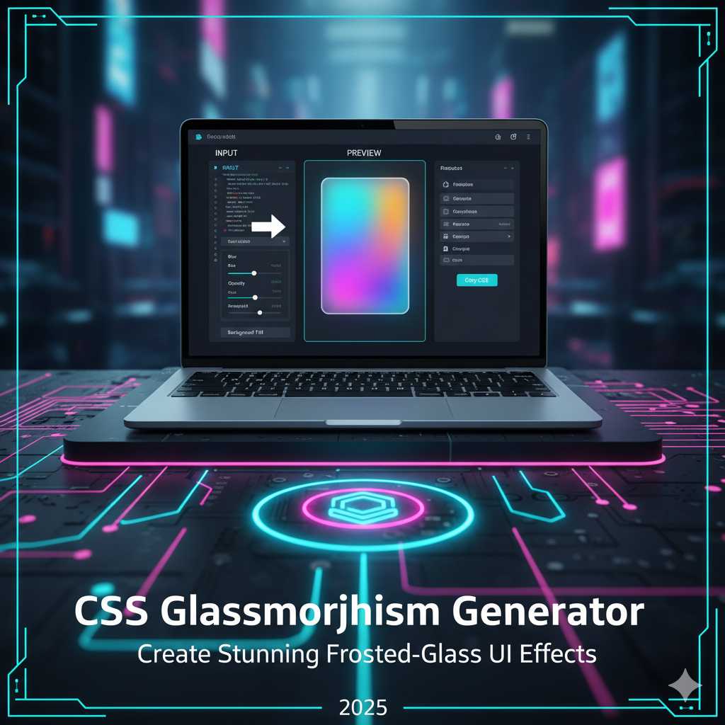
CSS Glassmorphism Generator – Create Stunning Frosted-Glass UI Effect
Introduction
In modern web and app design, creating a polished, premium look often means adding subtle details—translucent layers, blur effects, floating cards, and background imagery that peeks through. One powerful technique that captures all of these is the “glass” or frosted-glass effect, commonly called glassmorphism. With the right CSS you can design UI components that look like they’re made of semi-transparent glass, sitting above a colorful or textured background.
Instead of writing the CSS from scratch—experimenting with blur values, transparency, borders, shadows, and vendor-prefixes—you can use the KnowAdvance CSS Glassmorphism Generator. This tool lets you visually adjust the parameters, preview the effect live, and copy production-ready CSS with one click. No more guesswork. Just beautiful design in seconds.
What Is a CSS Glassmorphism Generator?
A CSS Glassmorphism Generator is an interactive online tool that helps you craft the frosted-glass UI effect by adjusting properties like:
- Backdrop blur (using
backdrop-filter: blur()and often-webkit-backdrop-filter) - Background transparency (semi-transparent background colors like
rgba(255,255,255,0.2)) - Border radius and border styling (rounded corners and subtle borders)
- Saturation, brightness, shadow, and optionally animations or hover states
- Live preview and easy “copy CSS” capability
Rather than writing something like this manually:
.glass-card {
  background: rgba(255,255,255,0.15);
  backdrop-filter: blur(8px) saturate(150%);
  -webkit-backdrop-filter: blur(8px) saturate(150%);
  border: 1px solid rgba(255,255,255,0.3);
  border-radius: 16px;
  box-shadow: 0 8px 32px rgba(31,38,135,0.1);
}
...you just use the generator, tweak the sliders, observe the preview, and copy the CSS. That’s the power of the tool.
Why Use a CSS Glassmorphism Generator?
Here are several compelling reasons why using the glassmorphism tool makes your design workflow faster and better:
- Speed and convenience: Skip hours of manual tweaking and browser refreshes—visual editing means you see results immediately.
- Precision: The generated CSS is accurate, includes necessary vendor prefixes (for Safari etc.), and is ready to drop into your project. :contentReference[oaicite:1]{index=1}
- Consistency: If you standardize your glass style across cards, modals, overlays, you maintain unified design language and UI coherence.
- Modern look: Glassmorphism is trendy, modern, and can give your site or app a sleek, layered feel—perfect for high-quality UI. :contentReference[oaicite:2]{index=2}
- Better user engagement: When UI looks modern and polished, users feel more confident, stay longer, and the result is better engagement metrics—good for SEO and eventual AdSense monetization.
How Glassmorphism Works (CSS Under the Hood)
Before you generate code, it’s helpful to understand the underlying CSS so you can tweak if needed. The main ingredients are:
background-color: A semi-transparent color, e.g.,rgba(255,255,255,0.2), lets background show through.backdrop-filter(and-webkit-backdrop-filter): Applies blur and saturation to the backdrop of the element (i.e., everything behind it) to create frosted glass effect. :contentReference[oaicite:3]{index=3}border&border-radius: To create the visual frame and rounded corners that often accompany glass cards.box-shadow: Optional but adds subtle depth so the card feels above the background rather than flat.saturate()orcontrast(): Sometimes you’ll seesaturate()applied inside backdrop-filter to enhance or mute color behind. :contentReference[oaicite:4]{index=4}
Example usage:
.frosty-panel {
  background: rgba(255,255,255,0.25);
  backdrop-filter: blur(12px) saturate(200%);
  -webkit-backdrop-filter: blur(12px) saturate(200%);
  border: 1px solid rgba(255,255,255,0.18);
  border-radius: 16px;
}
It’s this combination of transparency, blur, and layering that creates the illusion of glass floating over content.
Step-by-Step: Using the CSS Glassmorphism Generator Tool
Here’s how you use the tool on KnowAdvance to create your glass-effect element:
.glass-card {
  background: rgba(255, 255, 255, 0.25);
  backdrop-filter: blur(10px) saturate(150%);
  -webkit-backdrop-filter: blur(10px) saturate(150%);
  border: 1px solid rgba(255, 255, 255, 0.3);
  border-radius: 12px;
  box-shadow: 0 4px 30px rgba(0, 0, 0, 0.1);
}
- Visit https://knowadvance.com/css-glassmorphism-generator (or your tool’s URL).
- Pick the background context: You may choose a background image, gradient or solid color behind the glass panel so you can see how the effect works.
- Use sliders/inputs to set key parameters:
- Blur amount (e.g., 8-20px)
- Transparency / opacity of background color (e.g., 0.1-0.4)
- Saturation/brightness if the tool supports it
- Border radius, border thickness, and border color opacity
- Box shadow or additional depth if available
- Preview the effect in real time. Adjust until you find a look that works with your background and UI design.
- Click “Generate CSS” (or similar) to get the code. For example:
- Copy the CSS, paste it into your stylesheet or inline style, apply the class (e.g.,
.glass-card) to your element, and test it on desktop and mobile.
Best Practices for Using Glassmorphism
Using the generator is easy, but using it well means following certain design and performance guidelines:
- Use readability at front: Since the background is visible through the glass panel, ensure text and UI elements have enough contrast and are legible.
- Don’t over-blur: Heavy blur (e.g., 30px) may look cool but can degrade performance on low-end devices or make content unreadable.
- Keep it subtle: Glassmorphism is most effective when used sparingly—overuse may reduce its impact and slow down rendering. :contentReference[oaicite:5]{index=5}
- Test across devices: Especially mobile and older browsers; some may not support
backdrop-filterfully. Use fallbacks if needed. :contentReference[oaicite:6]{index=6} - Layer wisely: Use glass panels in hero areas, cards, overlays rather than the entire page background—this preserves performance and visual clarity.
- Optimize background content: Since the blur effect depends on what’s behind the element, make sure your background doesn’t have extremely heavy or distracting visual noise; a subtle background or gradient often works best.
Advanced Techniques for Glassmorphism Effects
Once you’re comfortable generating simple glass panels, you can push your design further. The CSS Glassmorphism Generator helps you experiment with advanced combinations to achieve stunning, professional-grade UI layers.
1. Layering Multiple Glass Panels
Stacking multiple glass panels with varying levels of transparency can create a beautiful depth effect. For example, your header can have a light 10px blur, while your floating card below can use 20px blur. Adjust each in the generator, and you’ll notice a dynamic layered interface that feels like real glass sheets placed at different distances.
2. Combining with Gradients and Shadows
To enhance realism, combine the frosted-glass panel with subtle gradients and inner shadows. Gradients simulate light passing through glass, while inner shadows create a faint edge highlight. Try using the generator to export CSS, then manually add something like:
background: linear-gradient(135deg, rgba(255,255,255,0.25), rgba(255,255,255,0.1));
box-shadow: 0 8px 32px rgba(31,38,135,0.1), inset 0 0 0 1px rgba(255,255,255,0.2);
This brings a subtle but elegant realism that can make your UI look truly premium.
3. Adding Animation to Glass Elements
Glassmorphism can also come alive with animation. Try adding fade-in or float effects using CSS transitions or keyframes. Example:
.glass-card {
  animation: floatIn 0.8s ease-in-out;
}
@keyframes floatIn {
  from { transform: translateY(30px); opacity: 0; }
  to { transform: translateY(0); opacity: 1; }
}
This subtle movement gives your frosted glass card a luxurious, interactive feel when it loads on the screen.
4. Integrating Glassmorphism with Frameworks
If you’re using frameworks like Bootstrap, Tailwind CSS, or React, integrating your generated glass effect is easy:
- Tailwind CSS: Use
backdrop-blur-lg,bg-white/30, androunded-xlclasses to mimic your generator’s output. - Bootstrap: Add your custom CSS class from the generator to any
.cardor.container. - React/Vue Components: Create a reusable component like
<GlassPanel>that imports your generated CSS so your design remains consistent throughout your app.
Performance Considerations
While glassmorphism looks fantastic, it can impact performance if overused—especially on mobile devices. The backdrop-filter property requires browser rendering power because it constantly re-renders the blurred background behind the element.
- Use smaller blurred areas rather than full-page overlays.
- Test on low-end devices to ensure smooth scrolling.
- Use media queries to disable or reduce blur on mobile if necessary.
For example:
@media (max-width: 768px) {
  .glass-card {
    backdrop-filter: blur(4px);
    -webkit-backdrop-filter: blur(4px);
  }
}
SEO & UI/UX Benefits of Glassmorphism
Even though CSS effects are visual, they indirectly boost your SEO when implemented wisely. A visually appealing, professional UI leads to longer user sessions, reduced bounce rate, and improved engagement—all of which are user behavior signals that search engines like Google value.
Additionally, if your glassmorphism-based tool (like your generator page) ranks for popular keywords such as “CSS Glassmorphism Generator” or “Glass Effect CSS Tool,” you can attract a consistent flow of developers, designers, and students—helping you earn AdSense revenue over time.
Tips to Boost Blog Traffic
- Include clear examples, like a “Copy CSS” demo.
- Add live previews in your tool section.
- Use FAQ schema and headings for better Google snippet visibility.
- Link internally to related tools like “CSS Gradient Generator” or “CSS Shadow Generator.”
Real-World Use Cases
Let’s explore where glassmorphism is most effective:
- Login Forms: Place login cards on vibrant background images for a premium look.
- Navigation Bars: Sticky translucent navbars look modern and blend into the page seamlessly.
- Modals and Dialogs: Glass backgrounds make modal windows feel less intrusive.
- Cards and Widgets: Dashboards benefit from layered transparency—perfect for visual analytics or user profiles.
Top tech brands like Apple and Microsoft have been using similar glass effects in macOS, iOS, and Windows Fluent Design—so your website instantly feels more contemporary when you use it.
Common Mistakes to Avoid
- Too Much Transparency: Low contrast makes text hard to read. Use darker overlays for text areas.
- Ignoring Fallbacks: Not all browsers support
backdrop-filter. Provide a solid color fallback. - Overusing Shadows: Too many layers of shadow reduce realism—keep it subtle.
Conclusion
The CSS Glassmorphism Generator empowers you to design visually stunning frosted-glass UI components without any manual CSS trial and error. It’s fast, intuitive, and essential for designers who want to create interfaces that look both futuristic and elegant. Whether you’re designing dashboards, portfolios, landing pages, or mobile apps—glassmorphism can elevate your user experience dramatically.
Try it today at KnowAdvance’s CSS Glassmorphism Generator and transform your UI with just a few clicks.
Frequently Asked Questions (FAQs)
1. What is glassmorphism in CSS?
Glassmorphism is a modern UI design trend that creates a frosted-glass appearance using CSS properties like backdrop-filter: blur() and semi-transparent backgrounds.
2. Does glassmorphism work in all browsers?
Most modern browsers like Chrome, Safari, and Edge support backdrop-filter, but older browsers might not. Always test compatibility and provide fallbacks.
3. Can I use glassmorphism in mobile apps or responsive layouts?
Yes, but reduce blur values for better performance on smaller screens. The generator helps you preview both desktop and mobile versions.
4. How does the CSS Glassmorphism Generator help developers?
It eliminates guesswork—allowing designers and developers to tweak sliders, visualize results, and copy production-ready CSS instantly.
5. Is glassmorphism good for SEO or page speed?
While it doesn’t directly improve SEO, a visually pleasing interface can enhance user engagement metrics, which supports better SEO performance over time.
6. How can I monetize a glassmorphism tool?
By targeting relevant keywords and ranking for them, you can attract developer traffic and earn through ads, affiliate links, or subscriptions.
7. Are there similar tools I can try?
Yes, tools like CSS Gradient Generator, CSS Shadow Generator, and Border Radius Generator work great alongside your Glassmorphism Generator.
Start using the CSS Glassmorphism Generator now — create modern, elegant, and visually stunning frosted-glass effects that transform your web design instantly.