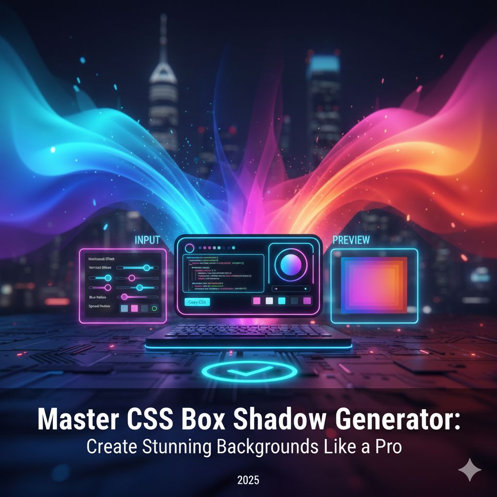
Master CSS Box Shadow Generator: Create Realistic Shadows Like a Pro
What is a CSS Box Shadow Generator?
The CSS Box Shadow Generator is an online tool that helps web designers and developers create perfect shadow effects for HTML elements using visual controls. Instead of manually tweaking code, this tool allows you to adjust shadow parameters like blur, spread, color, and position, and instantly preview the result. Once you’re satisfied, you can copy the generated box-shadow CSS code and apply it directly to your project.
Shadows play a vital role in modern UI design. They give elements a sense of depth and hierarchy, helping users focus on what matters most. Whether you’re designing a card layout, button, or navigation bar, adding the right shadow can make your interface look realistic and professional.
Our CSS Box Shadow Generator on KnowAdvance makes it simple to create clean, elegant, and dynamic shadows that perfectly complement your design style — from minimalist flat UI to 3D neumorphism.
Understanding the CSS box-shadow Property
The box-shadow property in CSS allows developers to apply one or multiple shadows to an element. It’s defined using several parameters:
box-shadow: offset-x offset-y blur spread color;
Each of these values controls a specific part of the shadow:
- offset-x: Horizontal distance of the shadow (positive → right, negative → left).
- offset-y: Vertical distance (positive → down, negative → up).
- blur-radius: Determines how soft or sharp the shadow edges appear.
- spread-radius: Expands or contracts the size of the shadow.
- color: Defines the shadow color. It can include transparency (e.g., rgba).
You can even add multiple shadows by separating each with a comma. Example:
box-shadow: 2px 4px 10px rgba(0, 0, 0, 0.2), inset 1px 1px 3px rgba(255, 255, 255, 0.1);
This allows designers to simulate real-world lighting conditions or create advanced effects like inner shadows, glowing highlights, or soft layered depth.
Why Shadows Are Important in Modern Web Design
Shadows are one of the most subtle yet powerful tools in design. They establish depth, create hierarchy, and make elements feel touchable and interactive. In modern UI/UX, shadows are used not just decoratively but functionally — to guide attention and provide visual cues.
Here are some reasons why shadows are crucial:
- Depth & Realism: Shadows simulate light, giving the illusion of elevation and layering.
- Focus: Elements with shadows stand out naturally, drawing user attention to important areas.
- Modern Aesthetic: Subtle shadows add sophistication and professionalism to any design.
- Interactivity: Buttons, cards, and modals look more clickable and tactile with the right shadow.
How to Use the CSS Box Shadow Generator
The KnowAdvance CSS Box Shadow Generator is extremely easy to use. It’s designed for both beginners and professionals who want precise results quickly.
Steps to Generate Shadows:
- Visit the CSS Box Shadow Generator tool.
- Choose your desired color for the shadow.
- Adjust the X (horizontal) and Y (vertical) offsets.
- Modify the blur and spread levels to soften or intensify the shadow.
- Preview the live result instantly.
- Copy the ready-to-use CSS code and apply it to your project.
That’s it — no need to write complex code or refresh browsers repeatedly. This visual approach saves time and ensures consistent design quality across all projects.
Basic CSS Shadow Examples
Let’s go through a few quick examples to understand how different parameters affect your shadow.
Simple Shadow
box-shadow: 3px 3px 10px rgba(0, 0, 0, 0.2);
This adds a clean, soft shadow commonly used for cards or input boxes.
Deep Shadow
box-shadow: 8px 8px 25px rgba(0, 0, 0, 0.3);
Creates a larger, deeper shadow that gives the element a more elevated look.
Inset Shadow
box-shadow: inset 2px 2px 5px rgba(0, 0, 0, 0.2);
This places the shadow inside the element, making it appear sunken or pressed.
Multiple Shadows
box-shadow: 3px 3px 5px rgba(0,0,0,0.3), -3px -3px 5px rgba(255,255,255,0.5);
This dual-shadow style is perfect for creating soft neumorphic designs.
Trends: Shadows in Modern UI Design (2025)
In 2025, shadows are no longer flat and uniform — they’re dynamic, layered, and often animated. Designers are leveraging new techniques to make their interfaces more realistic and visually engaging.
1. Neumorphism (Soft UI)
Neumorphism blends light and shadow to create soft, extruded elements. The shadows are subtle and mimic natural light, giving buttons and cards a 3D feel.
box-shadow: 6px 6px 12px #d1d9e6, -6px -6px 12px #ffffff;
This style looks particularly good on light backgrounds and is used in dashboards, toggles, and minimalist designs.
2. Glassmorphism
In glassmorphism, shadows are combined with transparency and blur. The result is a frosted-glass look where the shadow provides gentle separation between layers.
box-shadow: 0 8px 32px rgba(31, 38, 135, 0.37);
3. Material Design Shadows
Google’s Material Design introduced structured shadow systems. Different elevation levels define how far an element is from the surface. The box-shadow value increases as elevation rises, simulating natural light behavior.
4. Animated Shadows
Animated shadows are growing popular. By using CSS transitions, designers can create hover effects where shadows dynamically move or soften when a user interacts with an element.
.button:hover {
  box-shadow: 6px 6px 20px rgba(0, 0, 0, 0.25);
  transition: box-shadow 0.3s ease;
}
Choosing the Right Shadow Color
Color selection is as crucial as placement and blur. The key is to complement your background. Dark backgrounds typically need lighter, diffused shadows, while light backgrounds use darker, soft shadows.
Pro Tip: Use RGBA colors for better control over opacity. For example:
box-shadow: 0 4px 10px rgba(0, 0, 0, 0.15);
This allows subtle shadows without overwhelming the visual design.
When to Use Shadows
Not every element needs a shadow. Overusing shadows can lead to clutter. Use them strategically in these scenarios:
- Cards and Containers: To distinguish content sections.
- Buttons and Inputs: To make interactive elements stand out.
- Modals and Tooltips: To create depth and layer separation.
- Floating Elements: To indicate elevation and focus.
Benefits of Using the CSS Box Shadow Generator
Designers and developers can waste hours tweaking shadow values manually. That’s where our online generator comes in handy. Here are its top benefits:
- Instant Preview: See your shadow changes in real-time.
- Precise Control: Adjust offsets, blur, and spread visually instead of guessing values.
- Time Efficient: Save hours by avoiding manual coding.
- Consistent Design: Maintain design uniformity across all UI components.
- Beginner Friendly: No CSS experience required — just drag, drop, and copy the code.
Examples of Real-World Shadow Usage
Let’s explore how developers use shadows in modern web layouts:
1. Card Layouts
Cards are a common design pattern, and a subtle shadow beneath them helps create hierarchy.
box-shadow: 0 4px 8px rgba(0, 0, 0, 0.1);
2. Floating Action Buttons (FAB)
Rounded buttons with bold shadows instantly attract user attention.
box-shadow: 0 8px 16px rgba(0, 0, 0, 0.25);
3. Header or Navbar Shadows
Subtle bottom shadows in headers add separation from the content below.
box-shadow: 0 2px 6px rgba(0, 0, 0, 0.1);
4. Image Hover Effects
Shadows can also create hover animations for images, giving them a “pop” effect.
.image:hover {
  box-shadow: 0 10px 20px rgba(0,0,0,0.3);
  transition: all 0.3s ease;
}
Advanced Shadow Techniques for Professional Designers
Once you’ve mastered the basics, it’s time to explore advanced shadow techniques. These techniques help you achieve more realistic and appealing designs that stand out. Understanding light sources, shadow layering, and context can take your design from good to world-class.
1. Simulating Natural Light
In real life, light comes from a specific direction. When designing, you should maintain a consistent imaginary light source — typically from the top-left or top-right corner. Shadows should fall opposite that direction for visual realism.
box-shadow: 6px 6px 12px rgba(0, 0, 0, 0.2);
This example creates a natural, subtle offset that mimics sunlight coming from above.
2. Layered Shadows
Real objects rarely cast a single shadow. You can simulate realistic depth by stacking multiple shadows with varying opacity and blur:
box-shadow:
  2px 2px 4px rgba(0, 0, 0, 0.1),
  4px 6px 12px rgba(0, 0, 0, 0.15);
This technique is commonly used in material design and adds smooth transitions between light and dark areas.
3. Inner and Outer Shadows Combined
For elements like input fields or pressed buttons, you can mix inset and outer shadows to simulate a more tactile surface:
box-shadow:
  inset 2px 2px 3px rgba(0, 0, 0, 0.15),
  2px 2px 5px rgba(255, 255, 255, 0.2);
This creates a subtle 3D illusion that’s visually pleasing and interactive.
4. Glowing Shadow Effects
Using bright colors with higher blur radii can create glow-like effects for icons or call-to-action buttons. This technique is popular in modern dark-themed interfaces.
box-shadow: 0 0 20px rgba(0, 255, 255, 0.6);
Glowing shadows are excellent for hover states, neon-style designs, or tech-based UI concepts.
CSS Box Shadow Generator Tips for Designers
Even though tools make it easier to generate shadows, design still requires intuition. Here are expert tips for creating stunning shadows using the generator:
- Stick to Soft Shadows: Hard shadows look unnatural in UI. Use higher blur values for a modern look.
- Reduce Opacity: Overly dark shadows can overpower the design. Start with 0.15–0.25 opacity.
- Maintain Consistent Light: Ensure all shadows point in the same direction across the interface.
- Mind the Spread: Negative spread values can create inner glow effects, while positive ones add depth.
- Test in Different Screens: What looks good on a desktop might appear heavy on mobile. Adjust accordingly.
CSS Box Shadow Generator for Developers
Developers often focus on clean, reusable code. The Box Shadow Generator helps by offering quick snippets that can be directly integrated into frameworks like React, Vue, or Tailwind CSS.
Using Shadows in Tailwind CSS
If your project uses Tailwind CSS, you can apply shadows with simple utility classes:
Your content here
Tailwind also allows you to customize shadow intensity in your tailwind.config.js file for brand consistency.
Adding Shadows in React Components
In React, simply apply inline styles or use styled-components:
const Card = styled.div`
  box-shadow: 0 4px 12px rgba(0, 0, 0, 0.15);
  border-radius: 12px;
  padding: 20px;
`;
This keeps your UI clean and consistent with the design system.
Performance Considerations
Although shadows are purely visual, using too many complex shadows can affect performance — especially on lower-end devices. Here are tips to keep your pages smooth:
- Limit the number of layers or overlapping shadows.
- Avoid large blur values on multiple animated elements.
- Use CSS variables to reuse common shadow definitions.
- Leverage GPU acceleration for animations.
SEO Benefits of Using CSS Box Shadow Generator Content
Writing about tools like the CSS Box Shadow Generator can significantly boost your website’s traffic potential. Here’s why:
- High Search Volume Keywords: “CSS shadow generator” and “box shadow tool” attract thousands of monthly searches globally.
- Developer & Designer Audience: These users have high engagement rates and backlink potential.
- Evergreen Topic: CSS techniques remain relevant for years, keeping the article valuable long-term.
- Tool Integration: Linking your actual tool increases dwell time and click-through rates.
Box Shadow vs. Drop Shadow
It’s important to distinguish between box-shadow (CSS property) and filter: drop-shadow() (CSS filter). Both create shadows, but they work differently:
- box-shadow: Works on rectangular elements, respecting box boundaries.
- drop-shadow: Applies to shapes and transparent areas of images or SVGs.
Example:
img {
  filter: drop-shadow(5px 5px 10px rgba(0, 0, 0, 0.3));
}
This method is excellent for icons and logos with transparent backgrounds.
Common Mistakes to Avoid
Even experienced designers make shadow-related mistakes. Avoid these pitfalls to maintain professional quality:
- Using pure black (#000000) shadows — always add transparency.
- Overlapping multiple strong shadows without balance.
- Inconsistent light direction across components.
- Applying shadows on every element, making the layout cluttered.
Testing and Refining Your Shadows
Always test your design across multiple devices and screen sizes. Shadows can look darker on certain monitors or blend poorly on colored backgrounds. The CSS Box Shadow Generator helps you preview your design in real time, making adjustments effortless.
Combining Shadows with Other Effects
For even more visually rich designs, combine shadows with effects like gradients, borders, and transitions:
box-shadow: 0 6px 20px rgba(0, 0, 0, 0.25);
background: linear-gradient(135deg, #f0f4ff, #ffffff);
transition: all 0.3s ease;
This creates a premium, layered appearance that modern websites love.
Best Practices for Modern Shadow Design
- Use consistent shadow distances (usually 4px–12px range).
- Use fewer, softer shadows for minimal UI designs.
- Pair shadows with subtle transitions for interactive elements.
- Ensure accessibility — high-contrast designs help users with vision impairments.
- Experiment with shadow colors matching your brand palette.
Conclusion: Bring Your UI to Life with the CSS Box Shadow Generator
Shadows are not just visual decoration — they’re a storytelling tool in web design. They define depth, interaction, and emotion in a digital environment. By using the KnowAdvance CSS Box Shadow Generator, you can transform simple shapes into dynamic, elegant UI components effortlessly.
Whether you’re a beginner exploring design or a professional fine-tuning a production interface, this tool gives you the freedom to experiment and innovate. From neumorphism to glassmorphism, glowing buttons to material layouts — everything is possible with a few visual tweaks and the right shadow configuration.
So, open the tool today, play with settings, and bring your creativity to life. The perfect shadow might just be the missing layer between a good design and a great one.
Frequently Asked Questions (FAQs)
1. What is the CSS Box Shadow Generator used for?
It helps you create CSS shadows visually without manual coding. You can preview and copy ready-to-use shadow code instantly.
2. Can I generate multiple shadows with this tool?
Yes! You can stack multiple shadows by adjusting parameters and combining results for complex effects.
3. Is the CSS Box Shadow Generator free?
Absolutely. The KnowAdvance CSS Box Shadow Generator is completely free to use for designers and developers worldwide.
4. Can I use it for Neumorphism or Glassmorphism effects?
Yes. The tool supports advanced shadow styling, including neumorphic, glassmorphic, and glowing effects.
5. Does the generated CSS work on all browsers?
Yes, the box-shadow property is supported across all major browsers including Chrome, Firefox, Safari, and Edge.
6. How do I export my generated shadow?
Simply click the “Copy CSS” button on the generator page and paste it directly into your stylesheet.
With this guide and the powerful generator tool at your disposal, creating professional-level shadows is no longer a challenge — it’s an art form you can master.