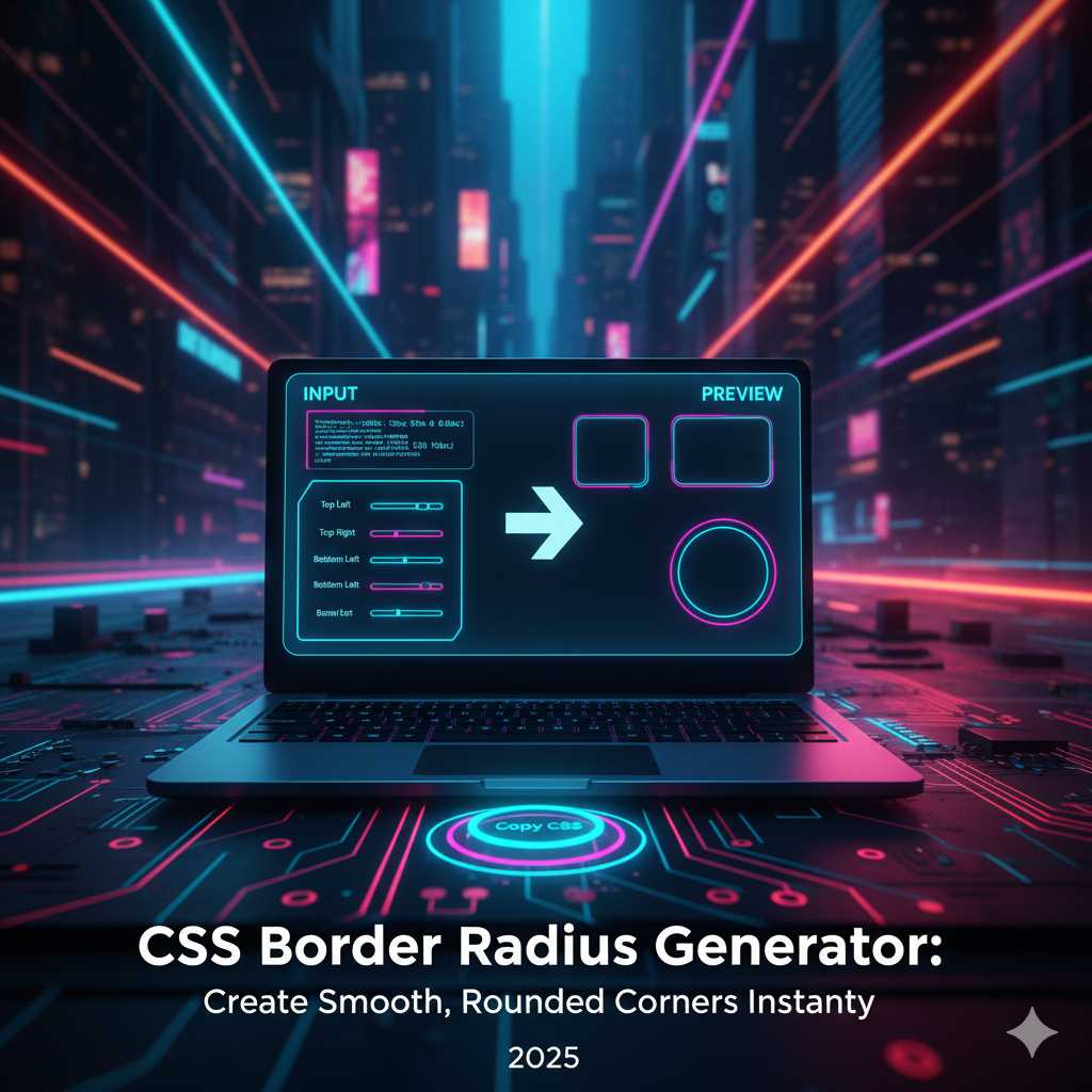
CSS Border Radius Generator: Create Smooth, Rounded Corners Instantly
Understanding CSS Border Radius: The Foundation of Modern UI Design
In modern web design, rounded corners are everywhere — from mobile app cards and buttons to images and containers. This simple yet powerful effect adds a sense of smoothness, softness, and approachability to digital interfaces. The CSS border-radius property is the key to creating those beautiful curves and shapes. But instead of manually testing values and writing code, you can now instantly generate and preview perfect results using the CSS Border Radius Generator.
This online tool makes it incredibly easy to design, preview, and copy border-radius styles for any element. You can experiment visually — dragging sliders, adjusting corners individually, or generating unique organic shapes. Whether you're building a sleek button, a modern card layout, or a creative blob-style container, this generator gives you the exact CSS you need in seconds.
What is Border Radius in CSS?
The border-radius property in CSS allows developers to define how rounded the corners of an element should be. It can be applied to any element that has a defined box model — such as a div, button, or image. You can create soft curves, circular images, or even interesting asymmetric designs.
div {
  border-radius: 10px;
}
In this example, all four corners of the div will be rounded equally with a radius of 10 pixels. You can also target each corner individually:
div {
  border-top-left-radius: 10px;
  border-top-right-radius: 20px;
  border-bottom-right-radius: 30px;
  border-bottom-left-radius: 40px;
}
This gives designers full control to create dynamic layouts that break away from rigid rectangular boxes. Rounded corners have become synonymous with modernity, comfort, and accessibility in digital interfaces.
Why Rounded Corners Matter in Design
Rounded corners are not just a stylistic choice — they impact how users feel when interacting with your design. Research in user interface psychology shows that curves are perceived as more friendly, safe, and visually pleasing than sharp angles. That’s one reason major tech brands like Apple, Google, and Microsoft consistently use rounded design elements in their products.
- Better Focus: Smooth corners guide the eye naturally, creating visual harmony.
- Modern Look: Curves are part of contemporary design trends like neumorphism and glassmorphism.
- Improved Usability: Rounded corners subtly indicate interactivity on buttons and input fields.
- Cross-Platform Consistency: Works beautifully on mobile, tablet, and desktop layouts.
With the CSS Border Radius Generator, you can implement all these design principles visually — seeing the results in real-time.
How the CSS Border Radius Generator Works
The tool allows you to modify each corner’s curve independently or uniformly using simple controls. Here’s how you can use it effectively:
- Step 1: Open the Border Radius Generator on KnowAdvance.
- Step 2: Adjust the sliders or enter pixel values for each corner (top-left, top-right, bottom-right, bottom-left).
- Step 3: Preview your element in real-time with live updates.
- Step 4: Copy the generated CSS code and paste it into your stylesheet.
It’s fast, intuitive, and eliminates the guesswork of manually testing border-radius combinations.
Examples of Border Radius in Action
Let’s explore some popular use cases where border-radius can elevate your design:
1. Rounded Buttons
Buttons with smooth corners are an essential component of UI design. They create a tactile, clickable feel and fit perfectly in mobile interfaces.
button {
  background-color: #007bff;
  color: white;
  padding: 12px 24px;
  border: none;
  border-radius: 8px;
}
2. Circular Profile Images
Want to make profile photos appear as circles? Simply set the border-radius to 50%:
img {
  border-radius: 50%;
}
3. Card Containers
Rounded cards are trending in web design — they create friendly and soft visual blocks perfect for blogs, portfolios, or dashboards.
.card {
  background: #fff;
  border-radius: 16px;
  box-shadow: 0 4px 12px rgba(0,0,0,0.1);
}
4. Neumorphism and Glassmorphism Effects
Border-radius is the foundation of neumorphic and glassmorphic designs. These effects combine rounded corners with shadows and transparency to create depth and realism.
.neumorphic {
  background: #e0e0e0;
  border-radius: 20px;
  box-shadow: 8px 8px 16px #bebebe,
              -8px -8px 16px #ffffff;
}
These examples show how a simple property like border-radius can completely transform your UI aesthetics.
Exploring the Border Radius Syntax
The border-radius property is more versatile than most designers realize. You can define radii in pixels, percentages, or even elliptical shapes.
Using Percentages
Percentages are often used to make elements responsive and proportionate to their size. For instance:
div {
  border-radius: 50%;
}
This turns a square into a perfect circle or a rectangle into an oval, depending on dimensions.
Elliptical Border Radius
By defining horizontal and vertical radii separated by a slash, you can create organic, blob-like shapes.
div {
  border-radius: 50% 25% / 30% 60%;
}
This syntax gives you complete creative freedom, especially when combined with gradient backgrounds and shadows.
Benefits of Using the Online Generator
While you can manually code border-radius, using a visual tool saves time and ensures accuracy. Here’s why the KnowAdvance CSS Border Radius Generator is a must-have for every designer:
- Real-Time Preview: Instantly see how your changes affect the design.
- Individual Corner Control: Adjust each corner separately for custom shapes.
- Code Copy Feature: Get ready-to-paste CSS instantly.
- No Installation: 100% browser-based — no software or extensions required.
- Responsive Design Support: Works with px, %, em, and rem units.
With these features, designers can quickly experiment with new layouts, developers can copy CSS effortlessly, and beginners can visually learn CSS border-radius behavior.
Combining Border Radius with Other CSS Properties
To create more engaging and dynamic UI elements, you can combine border-radius with gradients, shadows, and transitions.
Example 1: Gradient Rounded Button
button {
  background: linear-gradient(45deg, #6a11cb, #2575fc);
  border-radius: 12px;
  color: white;
  padding: 10px 20px;
  border: none;
  transition: 0.3s ease;
}
button:hover {
  transform: scale(1.05);
}
Example 2: Rounded Cards with Shadows
.card {
  border-radius: 20px;
  background-color: #fff;
  box-shadow: 0 8px 20px rgba(0,0,0,0.1);
  transition: all 0.3s ease;
}
.card:hover {
  box-shadow: 0 12px 30px rgba(0,0,0,0.2);
}
Rounded corners combined with gradients and shadows form the foundation of modern, soft UI design systems that feel alive and interactive.
Top UI Trends Using Border Radius
In 2025, rounded corners continue to dominate web and app design trends. Here are some popular design styles using border-radius:
- Soft UI / Neumorphism: Gentle shadows and curves creating a realistic, tactile effect.
- Glassmorphism: Translucent, frosted-glass panels with smooth borders.
- Minimal UI: Simple layouts with subtle rounding (4px–8px) for modern professionalism.
- Blob Shapes: Creative, organic sections for artistic or playful designs.
- 3D Buttons: Gradients and border-radius together to give depth and volume.
All these techniques are easy to experiment with using the Border Radius Generator. You can explore how each style looks and instantly apply it to your web components.
How to Create Complex Shapes Using Border Radius
The CSS border-radius property isn’t limited to basic rounded rectangles — it can also create advanced shapes when used with creativity. Designers often underestimate how powerful this single property can be. Let’s look at some unique shapes you can make using border-radius values.
1. Perfect Circle
If you set the width and height of an element to the same value and apply border-radius: 50%;, you get a perfect circle. This is widely used for profile photos, avatars, and icon backgrounds.
.avatar {
  width: 120px;
  height: 120px;
  border-radius: 50%;
  background: #f1f1f1;
}
2. Capsule Shape (Pill Buttons)
Pill-shaped buttons or badges are created by setting a large border-radius relative to height. This design style is popular for call-to-action buttons.
button {
  border-radius: 9999px;
  padding: 12px 30px;
  background-color: #007bff;
  color: #fff;
  border: none;
}
3. Elliptical Shape
Using different horizontal and vertical radii allows you to make soft, organic oval shapes. These can be used for creative layout backgrounds or floating sections.
.shape {
  width: 200px;
  height: 120px;
  border-radius: 50% / 30%;
  background-color: #f3f3f3;
}
4. Blob Shape
Blobs are trendy in 2025 for landing page hero sections. They give a natural and fun look, breaking the monotony of rigid blocks. Using mixed radius values can simulate blob-like results.
.blob {
  border-radius: 60% 40% 30% 70% / 60% 30% 70% 40%;
  background: linear-gradient(120deg, #74ebd5, #ACB6E5);
}
By combining these shapes with transitions, shadows, and gradients, you can build visually appealing UI patterns effortlessly using the CSS Border Radius Generator.
Common Mistakes When Using Border Radius
Even experienced developers make small mistakes when working with border-radius. Here are a few you should avoid:
- Not maintaining proportions: A high radius on uneven width/height elements may distort corners.
- Forgetting overflow hidden: If you want child elements (like images) to follow the curve, add
overflow: hidden;. - Uneven corners: Overusing mixed values can make layouts look unbalanced.
- Ignoring responsiveness: Always test how radii look across different screen sizes.
Using a visual generator helps prevent these problems by showing instant previews before applying CSS code to your live project.
Best Practices for Using Rounded Corners in UI Design
Rounded corners are aesthetically pleasing but must be used strategically to maintain consistency. Here are the best practices followed by top UX/UI designers:
- Use consistent radius values: Keep a design system where all UI components share the same corner radius scale (e.g., 4px, 8px, 16px).
- Apply logical hierarchy: Smaller elements like buttons can have smaller radius values, while containers can use larger ones.
- Pair with shadows and gradients: These combinations enhance depth and visual appeal.
- Consider accessibility: Smooth corners can guide user focus and improve usability.
- Stay minimal: Avoid over-rounded elements in professional interfaces; subtlety is key.
Using Border Radius for Responsive Web Design
When designing responsive layouts, ensure that your border radius adapts smoothly on different devices. Here’s how:
@media (max-width: 768px) {
  .card {
    border-radius: 10px;
  }
}
@media (min-width: 769px) {
  .card {
    border-radius: 20px;
  }
}
This ensures consistent aesthetic quality across screens. The KnowAdvance CSS Border Radius Generator supports both px and % units to make it easy to test responsive behavior visually.
Why Use an Online Border Radius Generator?
Manually experimenting with border-radius values in CSS can be tedious and time-consuming. With the KnowAdvance CSS Border Radius Generator, you save time and boost creativity:
- Instant Visualization: See exactly how your border-radius looks before coding.
- Custom Controls: Modify all four corners independently for unique designs.
- One-Click Copy: Instantly copy optimized CSS snippets for use in your projects.
- Browser-Based: No installations or extensions — just open and start designing.
- Free & Fast: 100% free tool built for designers, developers, and students.
How Developers and Designers Use It Differently
Different professionals leverage the tool for different goals:
For Developers:
- Quickly generate code snippets for frontend tasks.
- Test responsiveness of border-radius values.
- Integrate consistent design tokens across components.
For Designers:
- Visualize how various radii impact balance and softness.
- Create mockups for presentations or prototypes.
- Experiment with neumorphic and glassmorphic effects.
Thus, the tool bridges the gap between design and code — making the creative process smoother and more efficient.
Advanced Techniques for Creative Developers
If you want to go beyond the basics, try combining border-radius with other advanced CSS techniques like clip-path or mask-image for more dynamic results.
Rounded Image Mask
img {
  border-radius: 25% 10% 50% 30% / 30% 50% 10% 25%;
  object-fit: cover;
}
Animated Rounded Corners
.box {
  border-radius: 0;
  transition: border-radius 0.4s ease-in-out;
}
.box:hover {
  border-radius: 50%;
}
This creates smooth animations that respond beautifully on hover — adding personality to your interface.
SEO Benefits of Using CSS Border Radius Generator
Beyond design benefits, using tools like this can improve SEO indirectly. Here’s how:
- Faster Prototyping: Developers create cleaner code, leading to lighter pages and faster load times.
- Enhanced User Experience: Aesthetic appeal and visual comfort increase user engagement.
- Lower Bounce Rates: Engaging visuals keep visitors exploring your site longer.
- Mobile Optimization: Perfectly rounded, responsive designs enhance mobile SEO rankings.
Search engines favor websites that users enjoy navigating — and smooth UI contributes significantly to that experience.
Key Features of KnowAdvance CSS Border Radius Generator
- ✅ Live preview of your design.
- ✅ Adjustable sliders for all four corners.
- ✅ Supports px, em, rem, and percentage units.
- ✅ Works seamlessly on mobile and desktop.
- ✅ Instant code copy feature for developers.
- ✅ Simple, fast, and lightweight interface.
Conclusion: Elevate Your UI Design with Smooth, Rounded Corners
Rounded corners might seem like a small detail, but they define the tone of modern web design. They soften harsh lines, create visual balance, and guide user attention. With the KnowAdvance CSS Border Radius Generator, you can easily experiment with border-radius values, preview them live, and copy clean CSS code for any project.
Whether you’re designing a portfolio, an e-commerce site, or a SaaS dashboard — this tool saves time, ensures precision, and boosts creativity. It’s perfect for both beginners learning CSS and professionals building next-generation user interfaces.
Start now and create seamless, modern, and elegant corners with the CSS Border Radius Generator — your one-stop solution for designing smooth digital experiences.
Trending Keywords:
- CSS border radius generator
- border radius tool
- border-radius css examples
- rounded corners css online
- css border shape generator
- css curve generator
- ui design tools free