When Text Files Need More Structure: Practical Ways to Format Clean PDFs
Every writer, developer, or team that works with text-based documents eventually reaches the same moment of friction: the plain text file isn’t enough. Maybe the content needs to look polished. Maybe you're sending it to someone who expects structure. Or maybe you’re trying to preserve formatting that shouldn't get lost in transit. Whatever the reason, text often needs a cleaner, more structured home—typically a PDF.
What’s interesting is that this shift doesn’t happen because text is inadequate. Text is wonderfully flexible. But the moment layout, clarity, and presentation matter, PDF becomes the more reliable container. The challenge, of course, is in bridging the gap between the minimalism of a TXT file and the visual order of a well-designed PDF.
Why plain text eventually needs structure
If you spend enough time working with notes, drafts, logs, or documentation in text format, you start to notice a pattern. As long as the content is only for you, structure barely matters. A few line breaks here, a quick heading there, and you’re fine. But the moment someone else needs to read it, everything changes.
Consider a quick example. Imagine a requirements document written in a TXT file. To you, the headings make sense because you know where everything is. But send that same file to a client and suddenly every missing paragraph space, every unclear section break, every misaligned item stands out. What felt “simple” becomes messy the second the audience widens.
This is when structure becomes less of a luxury and more of a courtesy.
The small details that make a PDF look clean
Creating a clean PDF doesn’t mean designing a polished brochure. It usually comes down to a few quiet decisions—choices that help the reader follow your thoughts without distraction.
For instance, consistent spacing between paragraphs instantly changes how information feels. Even just choosing a readable font size can determine whether someone skims your document or actually reads it. Many people underestimate how much these tiny layout decisions, made either automatically or intentionally, shape the experience of a document.
Another factor is flow. Text often looks different once it’s fixed onto a page. Lines wrap, paragraphs breathe differently, and emphasis stands out more clearly. It’s easier to notice when a heading needs more space above it or when a quote feels too cramped. These adjustments are subtle but meaningful.
Simple ways to add structure before converting
You don’t need to overhaul your workflow to prepare a text file for PDF formatting. A few light touches can go a long way.
One helpful approach is to use clear section breaks. Even something as simple as an extra blank line between major ideas keeps the final PDF cleaner. Adding obvious markers for headings—rather than relying on memory or indentation—also helps you maintain coherence when the content transfers to a new format.
Some people also like using lightweight markup, such as Markdown symbols for headers and lists. These markers translate well into PDF layouts and reduce the feeling that the document is stitched together by hand. And if you occasionally need a tool to help you convert a draft, a link like https://www.knowadvance.com/text-to-pdf can fit naturally into your process without adding friction.
When structured formatting becomes essential
The shift from optional to necessary often happens the moment the audience changes. A personal note doesn’t need styling, but a project plan does. A rough idea written at midnight doesn’t need margins, but a document sent to a client absolutely does.
There are a few common situations where structured formatting becomes almost non-negotiable:
- Sharing documentation with non-technical readers
- Sending proposals, plans, or formal briefs
- Preparing study material or teaching notes
- Archiving long-term reference documents
Each scenario introduces expectations for clarity, readability, and presentation. The more formal the context, the more important those expectations become.
Readers don’t just absorb words—they absorb layout cues that tell them how to navigate the document. Headings break up complexity. Margins give space for thought. Page stability prevents formatting shifts that might occur in word processors or raw text. All of this contributes to the credibility of the message you’re sharing.
Finding a workflow that feels natural
The best formatting process is the one that doesn’t interrupt your writing. Many people write in text because it’s distraction-free. Introducing structure shouldn’t force you to abandon that simplicity. The goal is a workflow that respects both the freedom of plain text and the polish of a final PDF.
Some writers draft entirely in text and handle layout only at the end. Others gradually add structure as they go, ensuring the content will already feel organized before the final export. Neither approach is superior; what matters is choosing a rhythm that matches how you think.
If you enjoy exploring different tools or workflows, you might also find value in related resources like the guide on combining multiple PDFs cleanly or this piece about keeping PDF sizes manageable for sharing. They fit into the same ecosystem of creating documents that feel intentional rather than improvised.
A few examples from real workflows
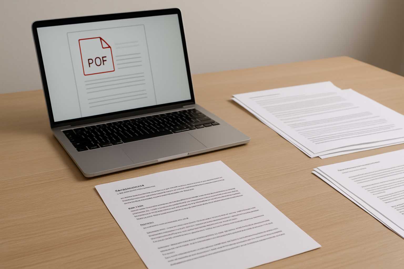
To make this a bit more tangible, consider a developer who keeps project notes in text files. When the project ends, those notes need to be shared with new team members. A simple conversion to PDF—with headings spaced properly and code snippets preserved—helps the next person pick up exactly where things were left.
Another example is a student who keeps research ideas in text format but eventually needs to create a coherent handout for a group discussion. The difference between the rough version and the final, structured PDF isn’t dramatic, but it reflects care. It tells the reader the document wasn’t just tossed together.
These small shifts—subtle, almost invisible—are what turn text into something that communicates clearly.
A calm conclusion
The beauty of working with text is that it never restricts how you think. And the beauty of PDF is that it never compromises how your work is received. Bridging the two doesn’t require perfection or design expertise—just a bit of structure, a few layout decisions, and a workflow that respects your creative rhythm. When those pieces come together, the final document feels clean, intentional, and easy to read.