How Writers Keep Plain Text Layouts Intact When Converting to PDF
Writers often rely on plain text because of its clarity. There’s nothing to distract from the words—no complex styling, no hidden formatting. But the moment that same text needs to become a PDF, keeping everything aligned can feel strangely fragile. Columns shift, spacing collapses, and the carefully shaped layout you saw in your editor suddenly looks different on a reader’s screen.
It’s a familiar moment of frustration. Yet the challenge isn’t mysterious; it comes from how plain text and PDFs each interpret space, fonts, and structure. Once you understand where the tension lies, it becomes much easier to preserve the design you intended.
Why plain text loses its form during PDF export
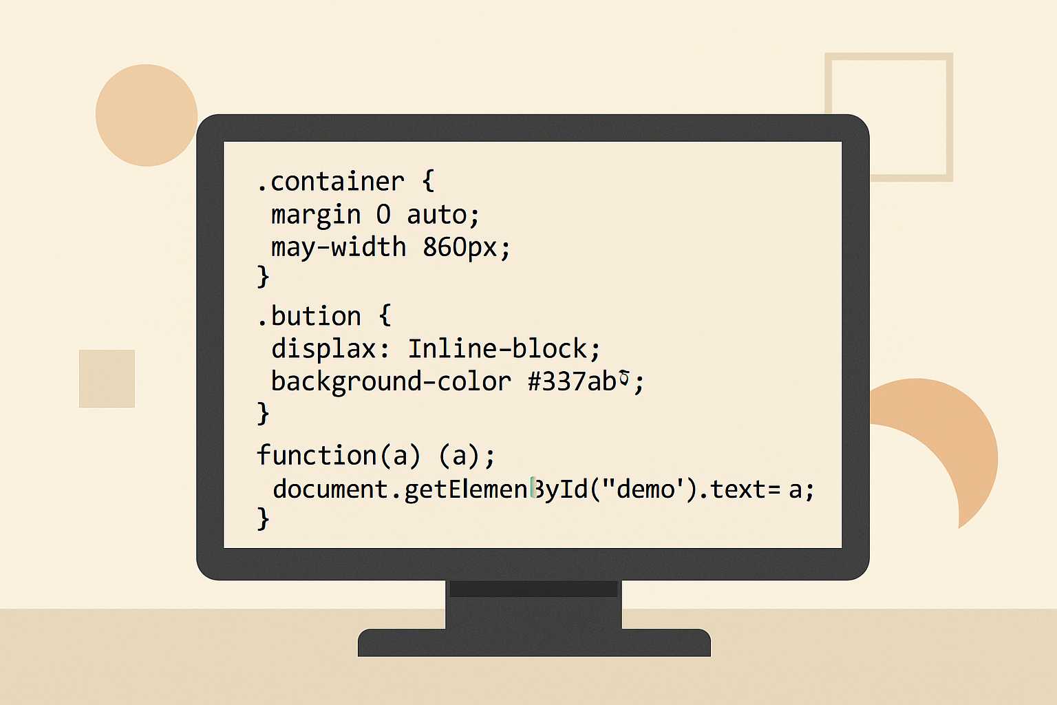
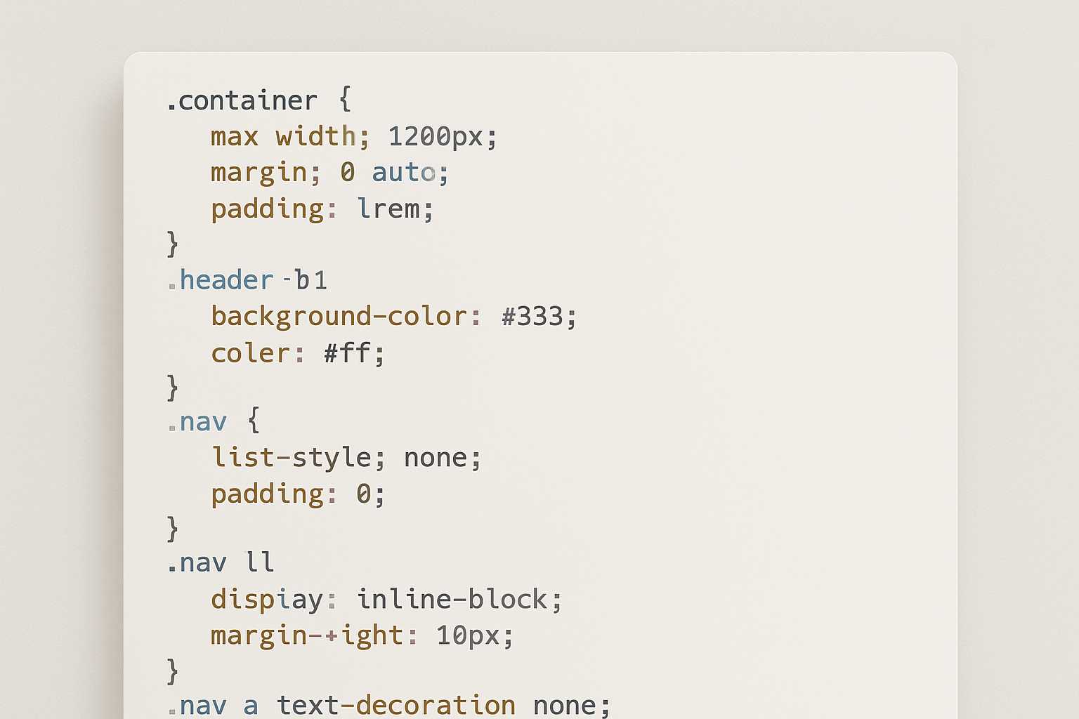
Plain text lives on the assumption that every character has equal width, as if the page were an invisible grid. A PDF doesn’t make that promise. It will happily substitute fonts, compress spacing, or optimize line breaks. When the text includes diagrams, tables built with spaces, or delicate indentation, those differences immediately show.
Imagine a writer creating a simple table of values using space characters. In a monospaced editor, the numbers line up perfectly. But with a proportional font, those neat columns collapse. That’s the heart of the problem: a layout that depends on predictable spacing is suddenly interpreted with new rules.
The role of monospaced fonts
Most layout issues vanish when the PDF uses the same monospaced font that shaped the original text. Fonts like Consolas, Courier New, Fira Code, or JetBrains Mono keep every character evenly spaced. When a writer relies on ASCII diagrams, code blocks, poetry with specific breaks, or storytelling that uses indentation as part of the narrative rhythm, monospacing is what holds everything steady.
The trick is ensuring the conversion tool doesn’t switch fonts automatically. Some editors force a default, and some PDF generators “optimize” the document by replacing the chosen font. If the PDF doesn’t embed the original typeface, the final output can shift again when opened on another device.
Spacing and invisible characters that still matter
Plain text layouts often rely on characters you barely notice—spaces, tabs, soft breaks. These invisible marks help shape structure. A single misplaced tab can cause misalignment that isn’t obvious until converted.
Writers who create layout-heavy text often prefer spaces over tabs for that reason. Spaces behave predictably; tabs assume the viewer has the same tab-stop settings. When exporting, it also helps to ensure line endings are consistent. Mixed CRLF and LF endings sometimes cause jagged spacing in certain PDF tools.
The surprising value of a preview step
It’s easy to skip the preview, especially when you’re used to your editor showing exactly what you expect. But a quick test export catches issues before they lock into a final file. Many writers keep a “layout check” PDF open in the background so they can glance at how each section is behaving.
At this point, it becomes clear why even a simple online converter can be handy. I often move a draft into a lightweight tool such as this text-to-PDF converter just to see how my spacing survives outside the editor. Watching how the layout behaves across multiple tools helps reveal which parts of the design are solid and which rely too heavily on assumptions from a single environment.
Using deliberate structure instead of accidental alignment
Writers sometimes lean on ad-hoc spacing—adding extra spaces here and there until something “looks right.” It’s a fast fix but a fragile one. When converted, those improvised alignments often fall apart. A more stable approach is to build patterns that naturally reinforce themselves.
For example, imagine documenting a folder structure. Instead of relying on haphazard indentation, use consistent patterns:
project/ src/ main/ tests/ docs/
Because the hierarchy uses the same number of spaces for each level, it travels reliably into a PDF. The structure stands on rules, not eyeballed alignment.
The same principle applies to poetry, screenplay dialogue, or technical notes. Regular spacing is more robust than incidental spacing.
Why some writers wrap their plain text in lightweight markup
While the goal is to preserve the purity of plain text, a tiny layer of markup—Markdown, RST, or even custom markers—can give the conversion tool clearer guidance. It doesn’t replace the textual feel; it simply adds a scaffolding that keeps the PDF generator from guessing the wrong thing.
For instance, triple-backtick blocks lock monospacing around technical or layout-sensitive sections. Markdown headings ensure page breaks behave more predictably. Even simple emphasis markers can help anchor spacing around certain lines.
This gentle structure feels especially helpful when producing longer PDFs that mix diagrams, notes, and narrative. It prevents small formatting accidents from spreading into bigger ones.
Handling line length and wrapping issues
Plain text doesn’t break lines automatically; what you type is what you get. But in a PDF, a long line may wrap unexpectedly unless you explicitly prevent it. That’s why some writers set a hard right margin—often around 72 or 80 characters. It keeps the visual shape of the text consistent across conversions.
If a section absolutely cannot wrap, placing it inside a code block or preformatted block is the most reliable way to enforce that boundary. This is especially true for ASCII charts, where a single wrapped line destroys the visual meaning of the diagram.
When indentation becomes part of the storytelling
Some writers use indentation as rhythm—a pause, a breath, a nonverbal cue. Fiction writers sometimes indent reflective paragraphs; nonfiction writers use it to isolate examples or quotes. These choices rely on space not just as measurement but as tone.
To preserve that texture in PDFs, the spacing must be both consistent and intentional. Uneven left margins or mixed tab widths can give paragraphs an unintended staggered look. Keeping a uniform indentation width—usually two or four spaces—maintains the emotional pacing the writer intended.
Small habits that make a big difference
Over time, writers gravitate toward habits that quietly protect their layouts. Here are a few that tend to stick:
- Choosing a monospaced font early and sticking to it
- Using spaces instead of tabs for layout-sensitive sections
- Keeping a stable line length throughout the document
- Embedding fonts when exporting to PDF
- Doing a quick test export after major layout changes
These habits don’t require strict discipline; they simply accumulate as part of the writing practice. Once they feel natural, layout surprises become rare.
Internal references that help deepen the workflow
If layout preservation is part of a larger writing workflow, it often intersects with other techniques—like shaping clean outlines or tidying text before conversion. Writers exploring structured drafts sometimes find value in tools that clean formatting quirks, the same way they might read about improving spacing strategies in a related guide on removing stray line breaks. Others look into small utilities for turning structured notes into polished outputs, similar to discussions around merging multiple PDFs after separate sections are exported.
These internal touches aren’t required, but they give writers small ways to strengthen the stability of their layouts once the text leaves the editor.
A calmer way to think about the transition to PDF
Preserving plain text layouts isn’t about controlling every pixel. It’s about understanding the handful of places where text and PDF think differently. Once those pressure points are familiar—fonts, spacing, wrapping, indentation—the process becomes predictable rather than frustrating.
A well-preserved layout feels satisfying: the same shapes you saw in the editor, carried cleanly into a format built to last. And with a few steady habits, that consistency becomes something you can trust each time you hit export.