Master CSS Transform Generator: Create Stunning 2D & 3D Effects Easily (2025 Guide)
What is CSS Transform?
The CSS Transform property is one of the most powerful tools in modern front-end development. It allows developers and designers to manipulate the position, size, and shape of HTML elements without affecting the normal document flow. With CSS transforms, you can rotate, scale, skew, or translate elements easily — bringing your static designs to life.
Whether you want to rotate an image, tilt a card slightly, or create a 3D spinning cube, the CSS transform property gives you complete control. It’s widely supported across browsers and can be combined with transitions and animations for beautiful effects.
Why Use a CSS Transform Generator?
While you can manually write transform properties like transform: rotate(45deg); or transform: scale(1.2);, it can quickly become complex when combining multiple transformations. For example, adding rotation, scaling, and translation together can make the CSS hard to read and adjust.
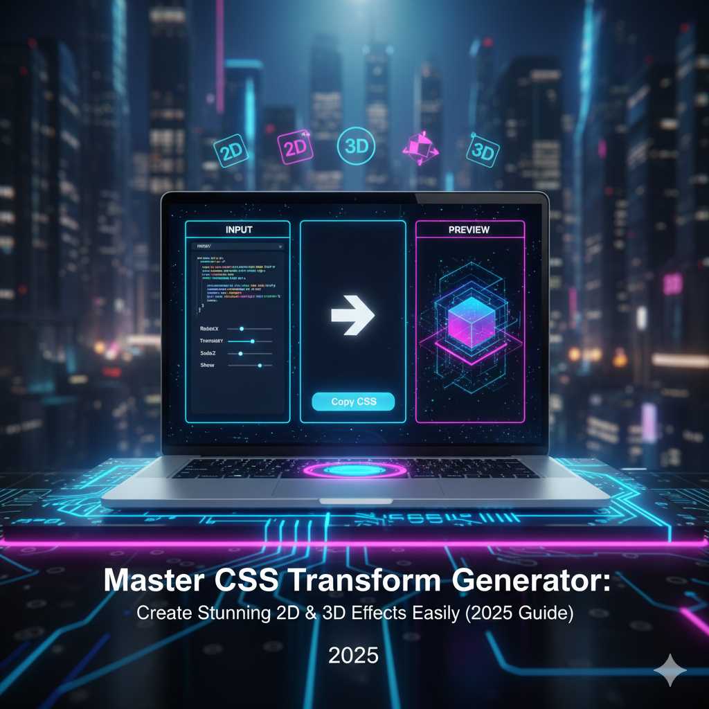
The CSS Transform Generator from KnowAdvance eliminates this difficulty by providing an interactive visual interface. You can use sliders or input boxes to rotate, skew, and scale elements and instantly see the results. The tool automatically generates clean, browser-compatible CSS code you can copy and paste into your project.
Key Benefits of Using the CSS Transform Generator
- Real-time preview: Instantly see how your transform affects the element.
- No manual coding: Generate accurate CSS code automatically.
- Cross-browser support: Compatible with all major browsers like Chrome, Edge, and Firefox.
- Perfect for designers: Ideal for non-coders who want to experiment with motion effects visually.
- Time-saving: Build transform effects in seconds rather than writing long CSS manually.
Understanding Different Transform Functions
Let’s explore some of the most commonly used transform functions you can experiment with using the CSS Transform Generator.
1. Rotate()
The rotate() function allows you to spin an element clockwise or counterclockwise. For example:
transform: rotate(45deg);
This rotates the element by 45 degrees. Negative values rotate counterclockwise. You can also rotate on 3D axes using rotateX(), rotateY(), and rotateZ() functions.
2. Scale()
Scaling resizes an element along the X and Y axes. For instance:
transform: scale(1.2);
This enlarges the element by 20%. Similarly, scale(0.8) would shrink it by 20%. You can also use scaleX() and scaleY() to stretch the element horizontally or vertically.
3. Translate()
The translate() function moves an element from its original position without affecting surrounding content. Example:
transform: translate(50px, 20px);
This moves the element 50 pixels right and 20 pixels down. You can use this for subtle hover shifts, UI movements, or parallax effects.
4. Skew()
Skewing tilts an element by the given angle. It’s great for creating dynamic-looking cards or banners. Example:
transform: skew(20deg, 10deg);
This will tilt the element 20 degrees horizontally and 10 degrees vertically.
5. Matrix()
The matrix() function is the most advanced. It combines all the above transformations in one function. While it’s rarely written manually, the CSS Transform Generator automatically calculates matrix values when you apply multiple transforms simultaneously.
Combining Multiple Transformations
CSS allows chaining multiple transform functions together. For instance:
transform: translate(50px, 0) rotate(30deg) scale(1.2);
The order matters — first it translates, then rotates, then scales. Using the KnowAdvance CSS Transform Generator, you can visually combine transformations and copy the exact CSS output with one click.
How the CSS Transform Generator Works
The tool provides an intuitive interface where you can:
- Adjust rotation angle with sliders
- Modify scale values in real-time
- Move elements precisely with translation controls
- Preview skew and 3D transformations
- Copy generated CSS instantly
This saves hours of manual trial-and-error. You can also use it as a learning tool to understand how each transform function affects an element visually.
2D vs 3D Transforms
CSS supports both 2D and 3D transformations. While 2D transformations operate on a flat plane (X and Y axes), 3D transformations add the Z-axis — giving your elements a realistic sense of depth.
Examples:
rotateX(45deg)– Rotates the element around the X-axis (vertical tilt)rotateY(45deg)– Rotates around the Y-axis (horizontal rotation)translateZ(100px)– Moves element closer or farther from the viewer
When combined with shadows, gradients, or transitions, 3D transforms can make flat web designs appear dynamic and modern.
Practical Use Cases of CSS Transforms
CSS transforms are versatile and can be used across various UI components. Here are a few common use cases:
1. Hover Animations
Add interactivity by rotating or scaling buttons and images when hovered. For example:
button:hover {
  transform: scale(1.1);
  transition: transform 0.3s ease;
}
2. 3D Cards and Product Displays
Use rotateY() and translateZ() to create card-flip or 3D product presentation effects.
3. Interactive Logos or Icons
Designers often use transform effects on logos or icons to add subtle rotations or hover feedback, enhancing brand interactivity.
4. Parallax Scrolling
Transforms can be used in parallax designs to create smooth layer movements as the user scrolls, adding depth to web experiences.
5. UI Microinteractions
Even small animations like toggles, switches, or menu icons can use transforms for satisfying feedback.
Advanced Techniques with CSS Transform
Once you’ve mastered the basics, you can take your designs further by combining transformations creatively. Advanced CSS transform techniques can help you achieve professional-grade animations and interactive effects without relying on JavaScript.
1. Layering Transformations
Instead of applying one transformation, you can stack multiple effects on a single element. For instance, a UI card might scale slightly, rotate a few degrees, and move upward on hover:
.card:hover {
  transform: translateY(-10px) rotate(3deg) scale(1.05);
  transition: all 0.3s ease-in-out;
}
This combination feels natural and creates depth, making your user interface feel more responsive and elegant.
2. Combining with CSS Transitions
While the transform property defines what changes, the transition property defines how it changes over time. When combined, they deliver smooth motion effects that capture user attention. Here’s a simple example:
img:hover {
  transform: rotate(15deg) scale(1.1);
  transition: transform 0.4s ease;
}
This effect is perfect for hover animations on images or buttons where you want to provide visual feedback without overwhelming the user.
3. Using 3D Perspective
For 3D transformations, adding perspective can make a huge difference. It defines how far the viewer is from the plane of the element, creating realistic 3D depth.
.container {
  perspective: 800px;
}

.box {
  transform: rotateY(45deg);
}
This makes the box appear to tilt in 3D space. By adjusting the perspective value, you can control the intensity of the effect. Lower values give a stronger 3D effect, while higher values make it subtler.
4. Centering the Transform Origin
By default, transformations pivot around the element’s center. However, using the transform-origin property, you can change the pivot point. For example:
transform-origin: top left;
transform: rotate(30deg);
This rotates the element around its top-left corner instead of the center. It’s particularly useful for creating swinging or door-like animations.
5. Combining Transform with Filters
One of the most creative uses of transforms is pairing them with CSS filters like blur, brightness, and contrast. Imagine a hero section background that subtly tilts and changes brightness as the user scrolls — entirely built with CSS.
.hero-section {
  transform: rotateX(10deg);
  filter: brightness(1.1);
  transition: all 0.5s ease-in-out;
}
Why Designers and Developers Love CSS Transform Generator
The CSS Transform Generator from KnowAdvance is designed for professionals and beginners alike. Here’s why it stands out among other tools:
- Intuitive Interface: A clean, minimal, and interactive layout lets you experiment freely.
- Live Preview: Instantly visualize your changes and tweak values in real time.
- Copy-Ready CSS: Generate clean, minified CSS code without extra formatting.
- Cross-Platform Compatibility: Works seamlessly on mobile and desktop browsers.
- No Sign-up Required: Start using it instantly — no account or installation needed.
SEO and Performance Advantages of CSS Transforms
Unlike older animation methods using JavaScript or GIFs, CSS transforms are lightweight and hardware-accelerated. This means they run smoothly even on low-power devices and don’t block page rendering.
1. Faster Load Times
CSS transforms use GPU acceleration, ensuring animations are rendered directly by the graphics hardware. This improves performance, especially for animation-heavy sites.
2. Better Core Web Vitals
Because transforms are lightweight and non-blocking, they have minimal impact on metrics like Largest Contentful Paint (LCP) and Cumulative Layout Shift (CLS), improving SEO and Google ranking potential.
3. Reduced JavaScript Dependency
With pure CSS transforms, you can replace many small JavaScript animations — leading to smaller scripts and faster execution.
Examples of Real-World Use Cases
Here are a few scenarios where developers commonly use CSS transforms in production:
1. Landing Page Animations
Subtle transforms can make CTAs and product images more dynamic without distracting the user. Hover effects on buttons, rotating feature cards, or sliding testimonials add life to your layout.
2. E-commerce Product Displays
Product cards can flip or scale slightly on hover, enhancing the browsing experience. Combined with shadow effects, this helps attract attention to key products.
3. Interactive Navigation Menus
Transform effects can be applied to dropdowns, mobile menus, and hamburger icons for smooth expansion and collapse animations.
4. Storytelling and Portfolios
Web designers and artists often use transforms to add cinematic transitions between sections or images, making portfolios more immersive.
5. Web Apps and Dashboards
In UI-heavy environments, transforms improve feedback — buttons compress slightly when clicked, panels slide smoothly, and loaders rotate subtly, improving the user experience.
Best Practices for Using CSS Transforms
While CSS transforms are powerful, they should be used thoughtfully to ensure optimal performance and accessibility.
- Don’t overuse transformations: Too many moving elements can distract users and strain GPU resources.
- Combine with transitions: Always add easing or transition properties for smooth effects.
- Use relative units: When possible, use percentages or viewport units to maintain responsiveness.
- Test across browsers: Always test transforms in Chrome, Safari, Firefox, and Edge to ensure consistency.
- Keep it subtle: Overly exaggerated effects can look unprofessional; small, consistent movements enhance UX.
Why Choose KnowAdvance’s CSS Transform Generator?
There are several CSS transform tools online, but KnowAdvance’s CSS Transform Generator stands out because it is tailored for real-world developer needs. It’s lightweight, fast, and focuses on generating clean, production-ready CSS code.
Unique Features:
- Simple and modern interface with smooth sliders
- Supports both 2D and 3D transform modes
- Auto-updating live preview area
- Instant copy button for generated CSS code
- Completely free to use — no sign-up or watermark
Integrating the CSS Code into Your Project
Once you’ve generated your transformation using the tool, simply copy the CSS and paste it into your stylesheet. Example integration:
.feature-box {
  transform: rotate(15deg) scale(1.1);
  transition: transform 0.5s ease;
}
Pairing this with transitions and hover states ensures the effect feels natural and interactive.
Cross-Browser Compatibility
Modern browsers support the transform property natively, but for older browser compatibility, vendor prefixes like -webkit- or -ms- can be added. The KnowAdvance generator includes optional prefix support to make your CSS fully compatible.
Accessibility Considerations
When adding motion to web interfaces, it’s important to consider accessibility. Avoid using rapid rotations or large-scale movements that can trigger motion sensitivity. Always provide consistent and user-friendly transitions that enhance usability without causing distraction.
Conclusion
CSS transforms are a game changer for modern web design. They enable designers to create engaging, dynamic, and visually appealing interfaces with minimal code. From simple rotations and scaling to immersive 3D effects, the possibilities are endless.
The CSS Transform Generator by KnowAdvance is the ultimate tool to help you build, experiment, and perfect your transformations effortlessly. With its intuitive controls and clean CSS output, it saves time while giving you professional-quality results.
Try It Now!
Start creating stunning 2D and 3D effects today with the CSS Transform Generator — and take your web designs to the next level of creativity and performance.