CSS Text Shadow Generator: Create Stunning Text Effects Online
What Is a CSS Text Shadow Generator?
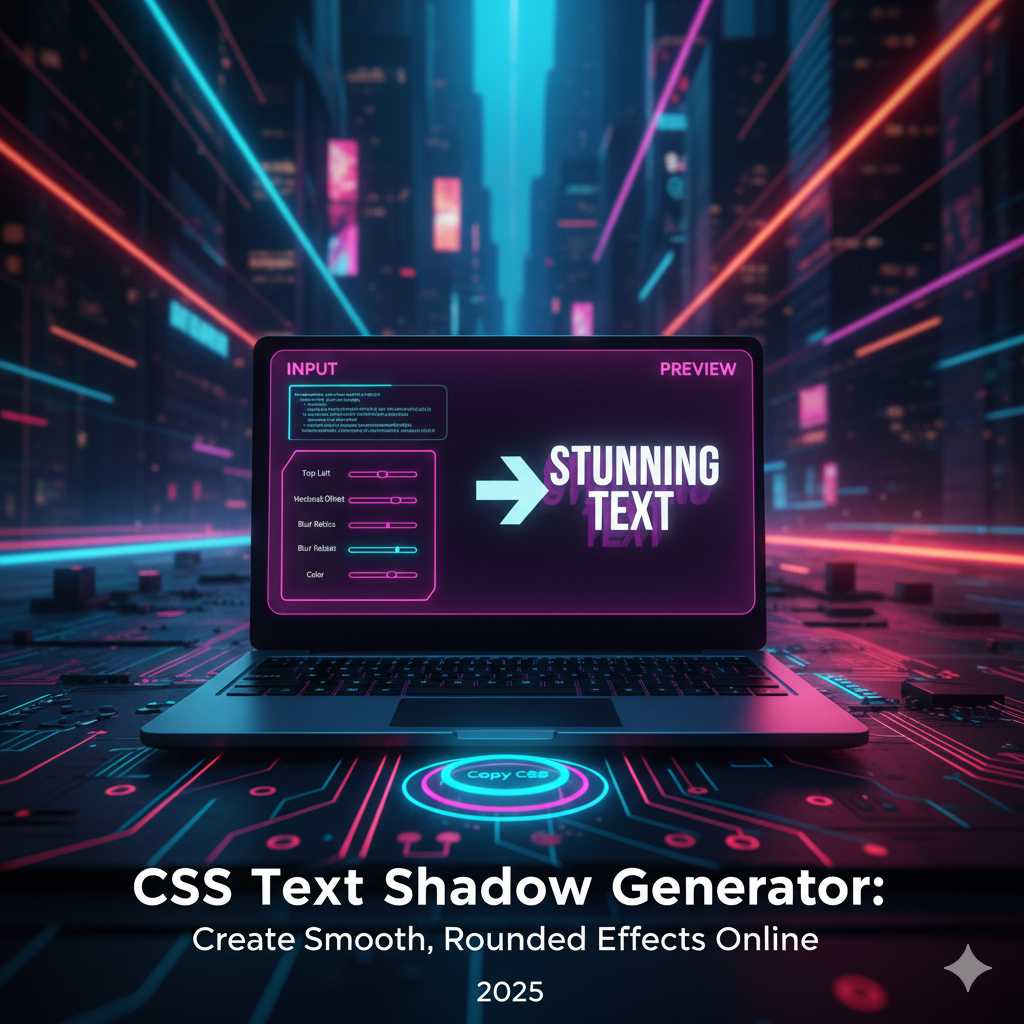
The CSS Text Shadow Generator is an online tool that helps you create visually stunning text effects without writing a single line of code. It allows you to control parameters such as horizontal shadow offset, vertical offset, blur radius, and color to design glowing, neon, embossed, or 3D-like text shadows instantly. With just a few clicks, you can experiment with shadow depth, glow intensity, and multiple layers to create professional-grade typography for websites, banners, and digital content.
In web design, text shadows play a major role in adding realism and depth to flat typography. They help emphasize titles, buttons, and call-to-action text — making it more readable and visually appealing. Whether you’re building a futuristic neon design or a subtle embossed interface, the CSS Text Shadow Generator makes the process quick and creative.
Understanding the CSS Text-Shadow Property
Before diving into the generator, it’s important to understand how the text-shadow property works in CSS. It follows a simple syntax:
text-shadow: horizontal-offset vertical-offset blur-radius color;
Here’s what each part means:
- Horizontal offset (X-axis): Moves the shadow left or right.
- Vertical offset (Y-axis): Moves the shadow up or down.
- Blur radius: Determines how soft or sharp the shadow looks.
- Color: Sets the color of the shadow — can be solid or transparent.
You can even apply multiple shadows to the same text by separating them with commas:
text-shadow: 2px 2px 5px #000, -2px -2px 5px #ff00ff;
This is what makes tools like the KnowAdvance CSS Text Shadow Generator extremely useful — they let you visualize and layer multiple effects easily without having to manually test combinations in your CSS file.
Why Use a CSS Text Shadow Generator?
Creating text effects manually in CSS can be time-consuming, especially if you’re trying to perfect blur radius and positioning. A generator tool offers visual control and efficiency. Here are the main advantages:
- Instant visual feedback: Adjust values with sliders and see live results.
- Multiple shadow layers: Combine different offsets and colors for depth.
- Copy-ready CSS code: Get clean, optimized CSS instantly for your projects.
- Browser-based and free: No software installation or login required.
- Inspires creativity: Experiment with new effects in real time.
Whether you are a designer, developer, or student, this tool saves you hours of trial and error and helps you create unique text effects that capture attention.
Popular Types of Text Shadow Effects
Text shadows are versatile and can fit almost any design theme. Let’s explore some of the most popular and trending shadow effects you can create with our generator:
1. Classic Drop Shadow
The drop shadow is a timeless design element used to lift text off the background. It gives a subtle 3D effect and improves readability, especially on light or textured backgrounds.
text-shadow: 2px 2px 4px rgba(0,0,0,0.3);
2. Soft Glow Effect
Glow effects create a luminous text appearance — perfect for dark themes or sci-fi designs. Adjust the blur and color to simulate neon light or LED-like glow.
text-shadow: 0 0 10px #00e6ff, 0 0 20px #00e6ff;
3. Neon Text Shadow
Neon text is one of the most searched design trends in 2025. You can layer multiple shadows with vibrant colors to make glowing, realistic neon typography.
text-shadow: 0 0 5px #ff00de, 0 0 10px #ff00de, 0 0 20px #ff00de;
4. 3D Depth Shadow
This effect simulates the appearance of depth by stacking multiple shadows with incremental offsets. It’s commonly used in logos, gaming sites, and creative titles.
text-shadow: 1px 1px 0 #333, 2px 2px 0 #333, 3px 3px 5px rgba(0,0,0,0.3);
5. Embossed or Engraved Effect
This subtle shadow style gives the illusion that the text is pressed into or raised above the surface — great for elegant, minimal designs.
text-shadow: 1px 1px 0 #fff, -1px -1px 0 #ccc;
6. Retro and Outline Text Effects
By carefully layering colored shadows, you can recreate vintage typography or outlined styles commonly used in 80s and 90s inspired designs.
text-shadow: 3px 3px 0 #ff0057, 6px 6px 0 #00e6ff;
How to Use the KnowAdvance CSS Text Shadow Generator
The KnowAdvance CSS Text Shadow Generator is designed with simplicity and performance in mind. Here’s a quick step-by-step guide to using it:
- Visit KnowAdvance CSS Text Shadow Generator.
- Enter your custom text or use the default preview.
- Adjust X and Y offset sliders to control shadow direction.
- Modify the blur radius to create soft or sharp shadows.
- Pick a shadow color using the color picker tool.
- Optionally add multiple shadows for advanced effects like neon or 3D.
- Copy the generated CSS code with a single click and paste it into your stylesheet.
Within seconds, your typography transforms into an eye-catching design element. The generator works perfectly on desktop and mobile, ensuring accessibility for all users.
Real-World Use Cases of Text Shadow Effects
Text shadows aren’t just for fancy effects — they’re practical and enhance usability when applied properly. Let’s look at some scenarios where you can use them effectively:
- Landing Page Titles: Add subtle depth to make the headline pop without being overwhelming.
- Logos and Branding: Neon and glowing shadows bring futuristic or high-energy vibes to brand elements.
- Buttons and CTAs: Slight shadows improve clickability and highlight interactivity.
- Hero Sections: Use text shadows over images or gradients for better readability.
- Dark Mode Websites: Light-colored glow shadows enhance visibility against dark backgrounds.
Best Practices for Designing with Text Shadows
While the text-shadow property offers creative freedom, it’s easy to overdo it. Here are some expert tips for maintaining design balance:
- Keep readability first: Avoid excessive blur or contrast that makes text hard to read.
- Use color wisely: Choose shadow colors that complement, not overpower, your text color.
- Stay consistent: Maintain the same style of shadow across similar components.
- Combine effects sparingly: Mixing too many glow or shadow layers can make your design look chaotic.
- Check accessibility: Always test your contrast ratios for readability on different screens.
Consistency and restraint are key to professional-looking UI design. A single, well-crafted shadow can elevate your entire layout’s appearance.
Using Text Shadow with Other CSS Effects
When combined with other CSS properties, text shadows can create layered and immersive effects. Pair them with the following:
- CSS gradients: For colorful, glowing text.
- CSS animations: To make glowing text pulse or flicker like neon lights.
- CSS filters: To blur or intensify the glow for artistic touches.
- Transform and scale effects: To make 3D shadows appear dynamic.
Using tools like CSS Gradient Generator or CSS Animation Generator from KnowAdvance, you can combine visual effects seamlessly for stunning results.
Advanced Tips for Mastering Text Shadow Effects
Once you understand the basics, you can start experimenting with more complex techniques to produce advanced results. Here are some professional tips for mastering the text-shadow property in CSS:
1. Use Layered Shadows for Realistic Depth
Instead of relying on a single shadow, stack multiple layers with slight variations in opacity and color. This gives your text a realistic drop or glow effect that appears more natural. For example:
text-shadow:
  1px 1px 0 #555,
  2px 2px 2px rgba(0, 0, 0, 0.4),
  3px 3px 4px rgba(0, 0, 0, 0.3);
This technique is ideal for titles, banners, and hero sections where you want subtle yet impactful typography.
2. Combine with CSS Transitions or Animations
Text shadows can be made dynamic using CSS transitions or animations. For instance, glowing text can pulse softly by animating the blur radius or color value. Example:
@keyframes glow {
  0% { text-shadow: 0 0 5px #ff00ff, 0 0 10px #ff00ff; }
  50% { text-shadow: 0 0 20px #ff00ff, 0 0 30px #ff00ff; }
  100% { text-shadow: 0 0 5px #ff00ff, 0 0 10px #ff00ff; }
}

.glow-text {
  color: #fff;
  animation: glow 2s infinite alternate;
}
This simple snippet can create a visually engaging neon pulse effect without any JavaScript.
3. Adjust Shadows for Different Backgrounds
Shadows behave differently depending on your background color or texture. Always test your text-shadow effects on both light and dark backgrounds. For dark themes, lighter shadows (white or neon colors) work better, while darker shadows suit light interfaces.
4. Use RGBA for Transparency
Using RGBA values instead of solid hex colors allows for better blending with the background. Transparent shadows often look smoother and more professional:
text-shadow: 2px 2px 6px rgba(0, 0, 0, 0.25);
5. Optimize for Performance
Excessive shadow layers can increase rendering load, especially in animations. Limit the number of layers and avoid overly large blur radii to ensure your text remains smooth on all devices.
Common Mistakes to Avoid with Text Shadows
Even though text shadows are easy to apply, small mistakes can harm your design’s readability or aesthetics. Here are a few pitfalls to watch out for:
- Too much blur: A high blur radius can make the text appear fuzzy or unreadable.
- Low contrast: Shadows that blend too closely with the background color lose their visibility.
- Overuse of effects: Applying multiple flashy shadows everywhere can overwhelm users.
- Ignoring mobile readability: Some shadows look fine on desktop but break on small screens — always test responsiveness.
Remember, less is often more. Subtle shadows can look elegant and refined, while exaggerated ones may distract users.
SEO Benefits of Optimized Visual Design
While text shadows primarily enhance aesthetics, they also contribute indirectly to SEO. A well-designed and readable website improves user engagement, which signals quality to search engines. Here’s how good text design helps SEO:
- Improved user experience: Readable, visually appealing text keeps visitors on your page longer.
- Lower bounce rate: Good typography encourages users to explore more pages.
- Better accessibility: High-contrast text improves inclusivity for visually impaired users.
- Higher conversion rates: Clear calls-to-action with visible text boost clicks and sales.
Thus, while text shadows themselves don’t affect rankings directly, their impact on usability and design quality can positively influence your SEO performance.
Alternatives and Enhancements to CSS Text Shadows
If you want to explore other creative options, CSS offers more than just text-shadow effects. Here are some enhancements and alternatives:
- CSS Box Shadows: Add depth to containers, cards, and buttons with the
box-shadowproperty. - SVG Filters: Create complex shadows, glows, or distortions with scalable vector graphics filters.
- Canvas and WebGL: For advanced motion or 3D effects, HTML5 canvas and WebGL give full control over lighting and shadow rendering.
- Text Stroke and Fill: Combine shadows with text-outline techniques for bold display typography.
These techniques can be used alongside the CSS Text Shadow Generator to produce cutting-edge visuals without any plugins or image editing software.
Why Designers Love KnowAdvance CSS Tools
The KnowAdvance CSS Tool Suite is built for speed, creativity, and ease of use. From gradients to shadows, all tools are free, browser-based, and developer-friendly. Designers love using KnowAdvance tools because they provide:
- Real-time previews: See how every adjustment affects your design instantly.
- Code-ready snippets: Copy clean, production-ready CSS in one click.
- Cross-browser compatibility: All outputs are optimized for modern browsers.
- No registration needed: Jump straight into creating beautiful designs.
By centralizing design utilities in one place, KnowAdvance empowers both beginners and professionals to work faster and smarter.
Practical Examples with Code
Below are some ready-to-use CSS text-shadow examples you can copy directly into your projects:
Example 1: Minimal Drop Shadow
.text-minimal {
  color: #333;
  text-shadow: 1px 1px 2px rgba(0,0,0,0.3);
}
Example 2: Electric Blue Neon
.text-neon {
  color: #00e6ff;
  text-shadow: 0 0 5px #00e6ff, 0 0 10px #00e6ff, 0 0 20px #00e6ff;
}
Example 3: Gold Metallic Text
.text-gold {
  color: #ffd700;
  text-shadow:
    0 0 5px #fff,
    0 0 10px #ffd700,
    0 0 20px #ffa500;
}
Example 4: Subtle Embossed Effect
.text-embossed {
  color: #444;
  text-shadow: 1px 1px 0 #fff, -1px -1px 0 #000;
}
Example 5: Multicolor Retro Text
.text-retro {
  color: #fff;
  text-shadow:
    3px 3px 0 #ff0057,
    6px 6px 0 #00e6ff,
    9px 9px 0 #ffea00;
}
Who Should Use the CSS Text Shadow Generator?
This tool is perfect for:
- Front-end developers who want ready CSS effects.
- UI/UX designers seeking visual inspiration.
- Students and learners practicing web design concepts.
- Freelancers building client websites faster.
- Marketing teams designing landing pages or banners.
Even if you’re new to CSS, the generator’s live preview makes it intuitive to learn by doing — no coding experience required.
Frequently Asked Questions (FAQs)
1. Can I use multiple shadows on the same text?
Yes. You can add multiple text shadows by separating each layer with commas in your CSS code. This is great for neon or 3D effects.
2. Does text-shadow affect performance?
Not significantly for small amounts, but too many layered or animated shadows can slow down rendering on low-end devices.
3. Are text shadows supported in all browsers?
Yes. The text-shadow property works in all modern browsers including Chrome, Edge, Firefox, and Safari.
4. Can I export my design from the generator?
Absolutely. You can copy the generated CSS instantly and paste it into your stylesheet or design editor.
5. Is the KnowAdvance Text Shadow Generator free?
Yes — it’s 100% free and doesn’t require registration or downloads. You can use it anytime from your browser.
Conclusion: Make Your Typography Stand Out
Typography is more than just text — it’s a visual statement. The CSS Text Shadow Generator allows you to transform ordinary fonts into captivating visuals that enhance your design and capture user attention. With easy customization, multiple shadow layers, and live preview capabilities, this tool bridges the gap between creativity and code.
Start experimenting with shadows, glows, and depth today using the KnowAdvance CSS Text Shadow Generator. Whether you’re building a sleek corporate site or a colorful creative portfolio, this tool helps you add personality and polish to your typography — all without touching complex CSS code.
Design smarter. Code faster. Stand out with KnowAdvance.