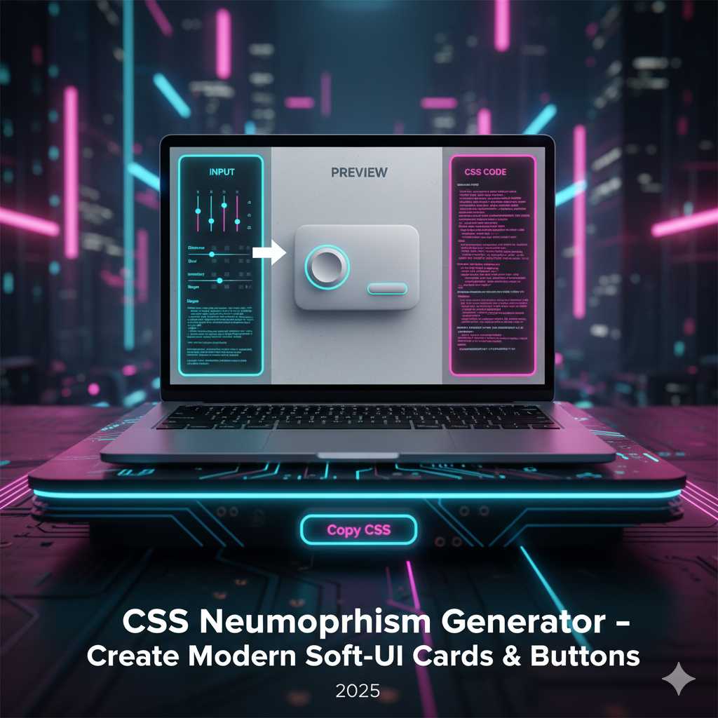
CSS Neumorphism Generator – Create Modern Soft-UI Cards & Buttons
Introduction
Web design trends keep evolving, and one of the standout styles in recent years has been soft-UI, often referred to as neumorphism. This design approach blends subtle shadows, highlights and flat surfaces to create UI elements that appear to be emerging from the background, giving a gentle 3-D effect. :contentReference[oaicite:0]{index=0}
Yet crafting the perfect neumorphic effect manually can be time-consuming: choosing the right light shadow, dark shadow, blur radius, offset distances and hover states can involve a lot of trial and error. That’s why our CSS Neumorphism Generator tool is a game-changer. It lets you visually adjust all those parameters, preview how your element will look, then instantly copy the clean CSS code ready for your project.
What Is a CSS Neumorphism Generator?
A CSS Neumorphism Generator is an online utility designed to help you build the “soft UI” or neumorphic style CSS quickly and accurately. Typically it provides:
- A base background color or surface color.
- Shadow offset values for light and dark shadows (to simulate emboss/deboss effect).
- Blur radius, spread radius and sometimes shadow color pickers.
- Support for hover or pressed states (inset shadows) or transitions.
- Live preview and one-click “Copy CSS” output.
For example, instead of writing:
.button {
  background: #e0e0e0;
  border-radius: 12px;
  box-shadow: 8px 8px 16px #b3b3b3, -8px -8px 16px #ffffff;
  transition: box-shadow 0.3s ease;
}
.button:active {
  box-shadow: inset 4px 4px 8px #b3b3b3, inset -4px -4px 8px #ffffff;
}
You could use the generator, set your values visually, and get the exact snippet in seconds.
Why Use a CSS Neumorphism Generator?
Here are some key advantages:
- Faster workflow: You skip guess & test loops for shadow values and hover states.
- Accurate and consistent output: The generated CSS is clean and ready for production, reducing the chance of typos or logic errors. :contentReference[oaicite:1]{index=1}
- Design cohesion: Using the same base values across cards, buttons and toggles creates a consistent soft UI feel.
- Modern aesthetic: Neumorphism gives your site a fresh, modern look that stands out from flat or material design trends. :contentReference[oaicite:2]{index=2}
- Engagement boost: Attractive UI leads to longer dwell times and improved user experience, indirectly helping SEO and monetization.
Understanding Neumorphism (Under the Hood)
To get the most out of the generator, it’s helpful to know what neomorphic styling actually does. According to Neumorphism’s definition, it is a “soft and light look… where elements appear to protrude from or dent into the background.” :contentReference[oaicite:4]{index=4}
The key CSS property involved is box-shadow, often with two shadows: one light (highlight) and one dark (shadow) to give a sense of depth. Example:
.card {
  background: #e0e0e0;
  border-radius: 16px;
  box-shadow: 10px 10px 20px #bebebe, -10px -10px 20px #ffffff;
}
For a pressed (inset) effect:
.card:active {
  box-shadow: inset 5px 5px 10px #bebebe, inset -5px -5px 10px #ffffff;
}
And for hover states you might animate the shadow offset or blur for an interactive effect. Designers at sites like GeeksforGeeks show how neumorphism uses dual shadows and color schemes. :contentReference[oaicite:6]{index=6}
Step-by-Step: Using the CSS Neumorphism Generator Tool
Here’s how to make the most of our tool on KnowAdvance:
- Go to https://knowadvance.com/css-neumorphism-generator.
- Select your base background color (this will also be the background of your container). Neumorphism works best on surfaces where elements have minimal contrast to the background.
- Choose the light shadow color (often near white or a lighter variant of the background) and the dark shadow color (normally a darker shade of the same base). Adjust offsets and blur values.
- Set the shadow distance and blur—higher offsets create deeper depth; higher blur softer edges.
- Pick border-radius, element width/height and optionally any hover or pressed states (inset shadows) if the generator supports them.
- Preview the result live. Test how it looks in normal, hover and active states.
- Click “Generate CSS” (or equivalent) to copy the snippet. Then paste it into your stylesheet or component styles and apply the class (e.g.,
.soft-ui-card).
Best Practices for Using Neumorphism
Neumorphism looks stunning when used well—but misused it can hurt accessibility or performance. Here are recommended practices:
- Maintain sufficient contrast: Since neutered UI elements often minimise color difference, make sure text or icons remain readable.
- Use minimal elements: Neumorphism is best for key UI components (cards, toggles, buttons) not entire page backgrounds.
- Test hover & active states: Elevation changes, inset shadows and transitions add interactivity and clarity.
- Keep colors consistent: Use a cohesive palette so shadows and highlights look natural relative to the background.
- Be mindful of performance: Complex shadows and animations can impact mobile performance—use sparingly and test on devices.
Advanced Neumorphism Techniques
Once you’re comfortable creating simple neumorphic buttons and cards, you can push your designs even further. The CSS Neumorphism Generator gives you full control to fine-tune details that make your UI truly stand out.
1. Adding Inner and Outer Shadows Together
Neumorphism really shines when you mix box-shadow and inset box-shadow to simulate real depth. For instance, a switch toggle can appear pressed on one side and raised on another, giving a realistic 3-D illusion.
.switch {
  background: #e0e0e0;
  border-radius: 25px;
  box-shadow: inset 4px 4px 6px #b8b8b8, inset -4px -4px 6px #ffffff,
              8px 8px 16px #b3b3b3, -8px -8px 16px #ffffff;
}
The generator helps you visualize and balance these shadows perfectly so you don’t have to manually test each value.
2. Combining Neumorphism with Gradients
Adding subtle gradients to your base background color enhances realism. Gradients mimic the way light diffuses across a surface. Example:
background: linear-gradient(145deg, #ffffff, #d1d1d1);
The CSS Neumorphism Generator can guide you in finding harmonious gradient angles and color stops, ensuring your design stays soft and elegant.
3. Interactive Hover and Pressed States
A hallmark of great UI is interactivity. With neumorphism, hover and pressed effects can be subtle yet engaging. Consider a raised button that slightly insets when clicked:
.button {
  background: #e0e0e0;
  box-shadow: 8px 8px 16px #b8b8b8, -8px -8px 16px #ffffff;
  transition: all 0.3s ease;
}
.button:active {
  box-shadow: inset 8px 8px 16px #b8b8b8, inset -8px -8px 16px #ffffff;
}
Use your generator to preview these states instantly, then copy the code for smooth, responsive UI feedback.
Integrating Neumorphism into Popular Frameworks
Our CSS Neumorphism Generator plays nicely with modern front-end frameworks like Bootstrap, Tailwind CSS and React.
Using with Tailwind CSS
While Tailwind doesn’t natively include neumorphism utilities, you can extend it with custom shadows. Copy the generator’s shadow output and add it to your Tailwind config under boxShadow:
theme: {
  extend: {
    boxShadow: {
      'neumorphic': '8px 8px 16px #b3b3b3, -8px -8px 16px #ffffff',
    }
  }
}
Using with Bootstrap
Simply assign the generated CSS to a custom class and use it on Bootstrap components:
<button class="btn neumorphic-btn">Click Me</button>
This instantly transforms standard flat Bootstrap buttons into elegant soft-UI elements.
Using in React or Vue Components
For React or Vue, create reusable components that apply your generated styles. Example:
function NeumorphicCard({ children }) {
  return <div className="neumorphic-card">{children}</div>;
}
This way, your design system remains consistent and easy to maintain.
Performance Tips for Neumorphism
Neumorphism can be performance-heavy when overused. Each shadow adds to browser rendering workload. Keep these optimization tips in mind:
- Limit deep shadows to key UI components, not the entire layout.
- Use lower blur and smaller offset values for mobile views.
- Compress background gradients and avoid heavy animations.
- Test on low-end devices to ensure fluid performance.
You can even use media queries to simplify shadows on smaller screens:
@media (max-width: 768px) {
  .neumorphic-card {
    box-shadow: 4px 4px 8px #b3b3b3, -4px -4px 8px #ffffff;
  }
}
SEO & User Engagement Benefits
While CSS effects don’t directly improve ranking, a refined, modern interface improves dwell time and user satisfaction. Visitors stay longer on pages that feel smooth and visually pleasant—both positive signals for search engines. Also, publishing detailed how-to content about your Neumorphism Generator helps attract front-end developers searching for “free neumorphism CSS generator” and similar keywords, expanding your organic reach and potential AdSense revenue.
Common Mistakes to Avoid
- Low contrast text: Ensure text is readable on soft backgrounds.
- Over-embossing: Too many shadows can make elements appear unrealistic.
- Ignoring accessibility: Always maintain adequate color contrast and visible focus outlines.
Real-World Use Cases
Some excellent implementations include:
- Login & Signup Forms: Gentle shadows for input boxes and submit buttons.
- Dashboard Cards: Soft raised stats panels that give a tactile sense.
- Toggles and Switches: Debossed toggles that look physical and intuitive.
- Widgets: Minimalistic weather or profile widgets using subtle depth.
Conclusion
The CSS Neumorphism Generator simplifies the art of soft-UI design. Whether you’re a designer prototyping new layouts or a developer integrating neumorphic cards into a production app, this tool removes complexity and helps you maintain a modern, cohesive visual theme.
Try it today on KnowAdvance – CSS Neumorphism Generator and start crafting smooth, elegant interfaces effortlessly.
Frequently Asked Questions (FAQs)
1. What is Neumorphism in CSS?
Neumorphism (or soft-UI) is a design style that combines flat design and skeuomorphism to create elements that look extruded from the background using dual shadows and highlights.
2. Which CSS properties are used for Neumorphism?
The main properties are box-shadow, background-color, border-radius, and sometimes inset shadows for pressed effects.
3. Does Neumorphism work in all browsers?
Yes, modern browsers fully support box-shadow. Just ensure consistent color values and testing for different display types.
4. Can I use Neumorphism on mobile devices?
Yes, but use smaller shadow values and test performance on low-power devices. The generator helps you preview and adjust accordingly.
5. How can I monetize a Neumorphism generator?
By targeting keywords like “free neumorphism generator” and “CSS soft-UI builder,” you can attract steady developer traffic and earn from AdSense impressions or clicks.
6. What’s the difference between Neumorphism and Glassmorphism?
Neumorphism uses solid backgrounds and shadows for depth; Glassmorphism uses transparency and blur to simulate frosted glass.
7. Are there similar tools on KnowAdvance?
Yes, explore related tools such as CSS Box Shadow Generator, CSS Gradient Generator, and Border Radius Generator.
Start designing with the CSS Neumorphism Generator today—build beautiful soft-UI buttons, cards and components in seconds.