CSS Filter Generator – Create Stunning Image Effects with CSS Filters
Introduction
In today’s web design world, visuals matter more than ever. Whether you're creating hero-images, card layouts, background elements or interactive hover states, the right visual effect can make your site feel polished and modern. One of the unsung heroes of these effects is CSS filters. With a simple filter property you can apply blur, brightness, contrast, hue-rotate, saturation, sepia and more — all via code instead of heavy image-editing tools.
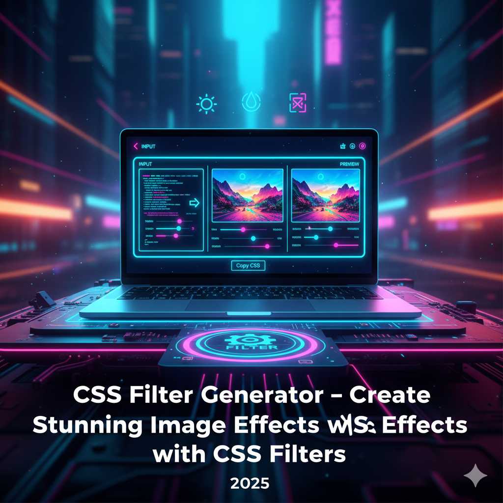
The good news? You don’t need to manually craft each filter value and figure out the syntax. With the KnowAdvance CSS Filter Generator, you get an intuitive visual tool that lets you tweak the effect in real-time, preview it live, and instantly copy the generated CSS code. No guesswork — just instant results.
What Is a CSS Filter Generator?
A CSS Filter Generator is an online utility that helps you build CSS filter declarations for your HTML elements or images by selecting and combining multiple filter functions. These tools typically allow you to:
- Select filter types (blur, brightness, contrast, etc.)
- filter: blur(5px) brightness(120%) contrast(110%);
For example, instead of writing:
.hero-image {
  filter: blur(8px) brightness(110%) contrast(120%);
}
You can use the generator, adjust sliders for blur, brightness, contrast, apply it, preview the result and then copy the exact code into your stylesheet.
Why Use a CSS Filter Generator?
Here are some reasons why using a CSS Filter Generator makes sense:
- Speed & convenience: You skip the trial-and-error of manually adjusting values and previewing by refreshing your browser repeatedly.
- Live visual feedback: The generator shows you how the effect looks immediately, so you can fine-tune until it's just right.
- Combining filters easily: Many developers forget the correct order or syntax when chaining filters — the generator handles that for you.
- Better consistency: Use the same filter effects across your components and keep a unified visual style.
- No dependencies: You don’t need Photoshop or large image-editing tools — everything happens in the browser and via CSS.
Given how important fast page load times and mobile performance are today, using CSS filters instead of static heavy images can significantly improve your site’s performance and visual appeal.
Understanding CSS Filters (Under the Hood)
Before using the tool, it’s helpful to know how CSS filters work. The CSS filter property was introduced in CSS3 and allows you to apply graphical effects like blur, brightness adjustments, color transformations, drop shadows and more. :contentReference[oaicite:1]{index=1}
The basic syntax:
.element {
  filter: none; /* default — no effect */
}

.element.filtered {
  filter: blur(4px) brightness(120%) contrast(110%) sepia(30%);
}
Here’s what some of the common filter functions do:
blur()— Applies a Gaussian blur to the element. Higher pixel values create heavier blur. :contentReference[oaicite:2]{index=2}brightness()— Adjusts the brightness of the element; less than 100% darkens, more than 100% brightens. :contentReference[oaicite:3]{index=3}contrast()— Changes the contrast; 0% is completely gray, 100% is normal, values above improve contrast. :contentReference[oaicite:4]{index=4}grayscale()— Converts an image to shades of gray; 100% means fully grayscale. :contentReference[oaicite:5]{index=5}hue-rotate()— Rotates the hue of the element by a specified angle (e.g., 90deg); useful for color shifts. :contentReference[oaicite:6]{index=6}invert()— Inverts the colors of the element; looks like a negative. :contentReference[oaicite:7]{index=7}saturate()— Changes the saturation; values above 100% intensify color, below reduce it. :contentReference[oaicite:8]{index=8}sepia()— Applies a vintage brownish tone, like old photos. :contentReference[oaicite:9]{index=9}opacity()— Controls transparency; similar to CSS opacity property. :contentReference[oaicite:10]{index=10}drop-shadow()— Adds a shadow effect around the element, often used for PNGs with transparency. :contentReference[oaicite:11]{index=11}
When you chain multiple filters, the order matters. For example, applying a heavy blur then contrast may yield a very different result than contrast then blur. :contentReference[oaicite:12]{index=12}
Step-by-Step: Using the CSS Filter Generator Tool
Here is how you can easily use the KnowAdvance CSS Filter Generator on your site:
.my-image {
  filter: blur(10px) brightness(130%) saturate(150%) hue-rotate(45deg);
}
- Go to https://knowadvance.com/css-filter-generator.
- Upload an image (optional) or use the default preview element.
- Use the sliders or inputs to adjust filter values: blur, brightness, contrast, grayscale, hue-rotate, invert, saturate, sepia, opacity, drop-shadow.
- See the live preview change as you adjust each value, allowing you to judge the effect in real time.
- Click “Generate” (or similar button) to copy the output code, typically something like:
- Paste the copied CSS into your stylesheet or
<style>tag, apply the class or selector, test on multiple devices.
Example snippet you might get:
.card-hover img {
  filter: brightness(120%) contrast(110%) sepia(20%);
}
.card-hover:hover img {
  filter: brightness(150%) contrast(130%) saturate(200%);
}
This way, you can create hover states, transitions, or static visual effects quickly using code rather than heavy image editing software.
Best Practices When Using CSS Filters
Even though the generator simplifies things, following best practices ensures your effects look great and perform well:
- Start subtly: Filters like blur or saturation can easily go overboard; moderate values (e.g., blur 2-5px, brightness 110%) often work best.
- Use hardware-friendly properties: Filters like
blur()ordrop-shadow()may trigger repaint/reflow issues on mobile; test on slower devices. - Avoid heavy chains on large images: Multiple filters stacked on big images can impact performance; use optimized images or a blurred background technique.
- Maintain consistency: If you’re applying filters across a brand site, use the same values or CSS variables to standardise effects.
- Provide fallback: For older browsers that may not fully support CSS filters, consider a fallback style or image alternative. :contentReference[oaicite:13]{index=13}
Advanced Techniques with CSS Filters
Once you’re comfortable with the basics, you can explore advanced creative applications of CSS filters. These techniques help you build sophisticated visuals, animations and interactive experiences without relying on JavaScript libraries or external graphic assets.
1. Combine Filters with Transitions
One of the best ways to make filters dynamic is by using transition. For example, you can create hover effects that smoothly animate between normal and filtered states:
img {
  filter: grayscale(100%);
  transition: filter 0.4s ease;
}
img:hover {
  filter: grayscale(0%) brightness(120%);
}
This effect gradually shifts the image from black and white to full color with a brightness boost when hovered, giving a refined interactive experience.
2. Layer Filters with Pseudo-Elements
You can also apply filters to pseudo-elements like ::before and ::after for creative overlays. For example:
.image-wrapper::after {
  content: "";
  position: absolute;
  top: 0; left: 0; right: 0; bottom: 0;
  backdrop-filter: blur(10px) brightness(80%);
}
The above code creates a blurred glass-like overlay on any background element — a design pattern often called “glassmorphism.” Using the generator, you can fine-tune the blur and brightness values for that perfect translucent effect.
3. Use Filters in Backgrounds and UI Components
CSS filters aren’t limited to images. You can apply them to background videos, icons, and even entire sections of a webpage. For instance, applying backdrop-filter can produce blurred navigation bars or modal backgrounds that maintain readability while letting colors bleed through softly.
4. Combine Filters with Animations
By pairing filters with CSS keyframes, you can build subtle animations that draw attention without overwhelming users:
@keyframes pulse {
  0%   { filter: brightness(100%) }
  50%  { filter: brightness(130%) saturate(150%) }
  100% { filter: brightness(100%) }
}
.icon {
  animation: pulse 2s infinite;
}
This creates a gentle pulsating glow effect on an icon or button — perfect for call-to-action elements.
SEO and Performance Benefits of Using CSS Filters
From an SEO and AdSense perspective, CSS filters provide indirect but valuable advantages:
- Improved performance: Eliminating multiple edited image files reduces load time, a crucial ranking factor in Google’s Core Web Vitals.
- Lightweight pages: CSS filters add negligible weight compared to large image assets or scripts.
- Better user engagement: Visually engaging pages keep users longer on your site, improving dwell time and reducing bounce rate — both positive behavioral signals for SEO.
- Creative flexibility: With tools like the KnowAdvance CSS Filter Generator, you can rapidly produce diverse effects across blogs and tools, keeping your content visually appealing for users and advertisers.
Practical Examples for Real-World Projects
Here are some scenarios where CSS filters shine:
- Thumbnail Hover Effects: Use
blur()andbrightness()to create attention-grabbing image hovers on galleries or portfolios. - Dark Mode Adaptation: Apply
invert()orbrightness()to dynamically adjust visuals when switching between light and dark themes. - Video Overlays: Use
contrast()andsaturate()to make text overlays stand out on moving backgrounds. - UI Enhancements: Employ
backdrop-filterfor translucent modals, cards or navigation bars.
Each of these can be quickly tested and generated using the online tool before you integrate the code into your production environment.
Accessibility Considerations
While filters can enhance visual appeal, always consider accessibility:
- Ensure sufficient color contrast for readability after applying filters.
- Avoid excessive brightness or saturation that may cause strain for some users.
- Provide alternative visuals or descriptive text for users with color vision deficiencies.
Modern browsers handle CSS filters well, but checking your effects on multiple devices and contrast-checking tools ensures your designs remain inclusive.
Browser Support
CSS filters are supported by all major modern browsers — Chrome, Edge, Firefox, Safari, and Opera. However, Internet Explorer has partial or no support. For full compatibility, you can include fallback colors or simplified designs for older browsers.
Integrating the Tool into Your Workflow
Here’s how developers and designers typically use the KnowAdvance CSS Filter Generator in daily work:
- Designers preview the intended look using the generator’s live preview interface.
- Developers copy the CSS filter output and integrate it directly into stylesheets or inline styles.
- Teams test the result across browsers to ensure consistency.
- SEO or performance auditors verify that the effect doesn’t harm Core Web Vitals metrics.
This workflow makes the generator a valuable asset for both beginners and professionals.
Tips for Getting the Most from the Generator
- Experiment with combining subtle
blur()andbrightness()to mimic realistic depth. - Save frequently used filter sets as snippets for design consistency.
- Pair filters with CSS transitions or animations for richer interactivity.
- Use
backdrop-filterfor background blurring effects on semi-transparent overlays. - When optimizing for performance, prefer fewer filter functions or use optimized images as base elements.
Conclusion
The CSS Filter Generator from KnowAdvance is a practical and powerful tool that empowers web designers and developers to experiment, preview, and deploy visually appealing effects in seconds. With full control over parameters like blur, brightness, contrast, hue-rotation, and more, you can create sleek UI components, banners, hero sections, and image hover effects without relying on heavy image-editing software.
By using this generator, you not only save time but also improve your website’s performance and SEO potential. Try the tool today at KnowAdvance CSS Filter Generator and make your designs stand out effortlessly.
Frequently Asked Questions (FAQ)
1. What is a CSS Filter Generator used for?
It’s an online tool that lets you visually create and preview CSS filter effects like blur, brightness, contrast, hue-rotate and more, then copy the exact CSS code to use in your project.
2. Can I combine multiple filters at once?
Yes. The tool allows you to chain several filters together — for example, blur(5px) brightness(120%) contrast(110%) — and preview the combined effect in real time.
3. Do CSS filters affect website performance?
Minimal use of filters has almost no impact, but heavy combinations on large images can slightly increase rendering time. Always test performance on lower-end devices.
4. Are CSS filters supported on all browsers?
All major modern browsers support CSS filters. However, Internet Explorer may have limited support for certain functions like backdrop-filter.
5. How can I use CSS filters with transitions?
You can apply a transition to the filter property to create smooth hover or animation effects, e.g. transition: filter 0.4s ease;.
6. Is the KnowAdvance CSS Filter Generator free?
Yes, it’s completely free to use and designed to help developers and designers quickly create modern visual effects without writing complex code manually.
7. Can I use CSS filters for background blur?
Yes. You can apply backdrop-filter: blur(10px); to a semi-transparent overlay element to create a beautiful glass-like background blur effect.
8. Where can I access the CSS Filter Generator?
Visit https://knowadvance.com/css-filter-generator to use the free tool instantly.