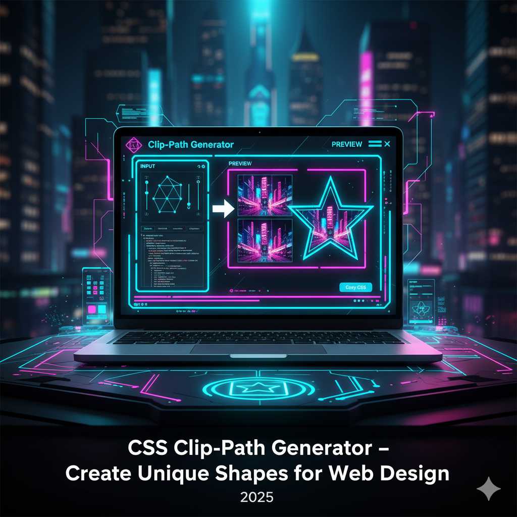
CSS Clip-Path Generator – Create Unique Shapes for Web Design
Introduction
Modern web design looks very different from what it used to be. Flat rectangles and simple boxes are no longer enough to make a website stand out. Instead, designers and developers are using advanced techniques to create unique layouts, interesting masks, and dynamic shapes. One such technique is using the CSS property clip-path, which allows you to “clip” an element into a custom shape—whether that's a circle, polygon, star, hexagon or completely custom shape.
But writing the code manually for clip-path shapes—especially polygons with many points—can be tedious, time-consuming, and tricky to make responsive. That's where our CSS Clip-Path Generator comes in. With it, you can visually create and preview the shape, adjust the control points, and instantly copy the production-ready CSS code. No guesswork, just creativity made easy.
What Is a CSS Clip-Path Generator?
A CSS Clip-Path Generator is an online tool that simplifies the process of creating the CSS clip-path property. It usually provides:
- Preset shapes like circle(), ellipse(), inset(), polygon().
- A visual interface to drag and adjust shape points or sliders.
- A live preview of the element being clipped so you can see exactly how the shape looks.
- Instant generation of CSS code (and often vendor prefixes) that you can copy and paste into your stylesheet.
So instead of writing by hand:
.image-mask {
  clip-path: polygon(50% 0%, 100% 50%, 50% 100%, 0% 50%);
  -webkit-clip-path: polygon(50% 0%, 100% 50%, 50% 100%, 0% 50%);
}
You just use the generator, pick a diamond shape (for example), adjust any points if needed, copy the code, and you’re done.
Why Use a CSS Clip-Path Generator?
Here are several compelling reasons to use this kind of tool:
- Faster workflow: Visual editing means you don’t have to manually calculate percentage coordinates or fine-tune them by trial and error.
- Better accuracy: The generated code is precise, includes vendor prefixes (e.g.,
-webkit-clip-path), and is ready for production. - Responsive design friendly: Many generators produce percentage-based coordinates so the shapes scale across different screen sizes and containers. :contentReference[oaicite:1]{index=1}
- Creativity unleashed: Instead of being stuck with rectangles, you can build unique shapes for images, section dividers, call-to-action overlays or buttons—giving your site a distinctive look. :contentReference[oaicite:2]{index=2}
- Better performance: Using CSS for masking and clipping is often lighter than relying on multiple image assets or heavy design elements.
Understanding CSS Clip-Path (Under the Hood)
To make the most of the generator, it helps to grasp how the clip-path property works. Essentially, it defines a region of the element that remains visible, and hides everything outside that region. It supports several functions:
circle()— define a circular clipping region.ellipse()— an elliptical region.inset()— similar to clipping by inset (margins) with optional rounded corners.polygon()— the most flexible: define a shape by listing its vertices (percentage coordinates) e.g.,polygon(20% 0, 100% 0, 80% 100%, 0 100%). :contentReference[oaicite:3]{index=3}
Example usage:
.mask-shape {
  clip-path: polygon(0% 0%, 100% 0%, 100% 80%, 0% 100%);
  -webkit-clip-path: polygon(0% 0%, 100% 0%, 100% 80%, 0% 100%);
}
Important considerations:
- Use percentage values for better responsiveness. If you use fixed
pxvalues, the clipped shape may distort on different screen sizes. :contentReference[oaicite:4]{index=4} - Include vendor prefixes such as
-webkit-clip-pathfor Safari compatibility. :contentReference[oaicite:5]{index=5} - The ordering of points in
polygon()matters — you must create a closed shape and list the vertices in a logical order. Otherwise you may see odd behavior. - Animations of
clip-pathare possible, but require the shape types to have matching numbers of points—otherwise transitions may jump or behave unexpectedly. :contentReference[oaicite:6]{index=6}
Step-by-Step: Using the CSS Clip-Path Generator Tool
Here’s a walkthrough of how you can use our clip-path generator on KnowAdvance:
- Visit https://knowadvance.com/css-clip-path-generator.
- Select the shape type you want—circle, ellipse, inset, polygon, or custom.
- If using polygon or custom shape, drag the control points in the visual editor to adjust the shape until it looks right on your preview element.
- Optionally set width/height parameters or toggle “show outside” effect (depending on tool features) to preview how the clipped area reveals/hides the content. :contentReference[oaicite:7]{index=7}
- Once satisfied, click on “Generate” or “Copy CSS” to get the code. The code will typically include both standard and vendor-prefixed versions, e.g.:
.my-shape { clip-path: polygon(50% 0%, 100% 50%, 50% 100%, 0% 50%); -webkit-clip-path: polygon(50% 0%, 100% 50%, 50% 100%, 0% 50%); } - Paste this code into your stylesheet or inline style, apply the class to your HTML element (image, div, section) and test it on various screen sizes to ensure it behaves responsively.
Best Practices for Using CSS Clip-Path
Even though the generator simplifies things, following best practices will ensure your design is both visually attractive and performs well:
- Use percentage values: This ensures your clipped shapes scale with container size rather than being fixed to a pixel value.
- Avoid overly complex shapes: A polygon with too many points may become hard to maintain and could confuse future edits.
- Maintain readability: If clipping text containers or background sections, ensure the visible region keeps content accessible and legible.
- Test across devices: Because the clipped shape may reveal/hide content differently on different screen sizes, verify on mobile, tablet and desktop.
- Provide fallbacks: For older browsers (or Safari versions) that may not support certain clip-path features, provide a simpler shape or no clip-path at all. :contentReference[oaicite:8]{index=8}
Advanced Uses of CSS Clip-Path
Once you’re comfortable creating basic shapes, the real power of the clip-path property begins to shine through in creative layouts and animations. Designers often use clip paths to build visual storytelling experiences, to create angular section dividers, or to emphasize call-to-action areas on landing pages.
1. Shaping Section Dividers
Instead of using static images to divide sections of a page, you can use clip-path to design angled or curved transitions between color blocks. This improves site performance by reducing image usage while maintaining a sleek look.
section.hero {
  background: linear-gradient(45deg, #4facfe, #00f2fe);
  clip-path: polygon(0 0, 100% 0, 100% 85%, 0 100%);
}
This produces a beautiful diagonal effect that separates one section from another without needing SVGs or extra graphics.
2. Image Masks and Hover Effects
You can easily apply clip-path to mask images into unique shapes like hexagons, circles, or stars. Combine it with transitions to create interactive hover animations:
.photo {
  clip-path: circle(50% at 50% 50%);
  transition: clip-path 0.5s ease;
}

.photo:hover {
  clip-path: polygon(0 0, 100% 0, 100% 100%, 0 100%);
}
As a result, your images morph dynamically from a circle to a rectangle on hover—perfect for portfolios and creative designs.
3. Animations with Clip-Path
CSS Clip-Path can also be animated to produce smooth transitions between shapes. However, both start and end shapes must have the same number of points for polygons. You can use the @keyframes rule to morph between two polygons:
@keyframes morph {
  0% { clip-path: polygon(0 0, 100% 0, 100% 100%, 0 100%); }
  100% { clip-path: polygon(50% 0, 100% 50%, 50% 100%, 0 50%); }
}
Pair this with the animation property to bring attention to elements or build smooth reveal effects.
4. Clip-Path and Scroll Animations
Combine clip-path with JavaScript libraries like ScrollTrigger or simple scroll event listeners to create scroll-based reveals. For example, as a user scrolls down, the clip-path changes its coordinates—making it appear as if an image is “unveiling” itself.
SEO & AdSense Benefits of This Tool
Although CSS Clip-Path is a visual technique, your CSS Clip-Path Generator tool page can bring serious organic traffic if optimized properly. Here’s why:
- High search intent: Many developers search for “CSS clip-path generator”, “create clip-path online”, “CSS polygon tool”, etc. This means your tool satisfies a strong, recurring need.
- Low competition, high CTR: Since these are practical coding tools, they often have fewer competitors compared to blog keywords—allowing your page to rank faster.
- Global audience: Designers, frontend developers, and freelancers from every country use such generators, so you attract international AdSense clicks.
- Long visit duration: When users interact with visual editors like your tool, they spend more time on page—boosting engagement metrics and ranking signals.
- Internal linking: You can link related tools like CSS Gradient Generator or CSS Transition Generator inside the content for SEO synergy.
Best Examples of Creative Clip-Path Usage
Here are some real-world design ideas where clip-path brings visual impact:
- Hero banners: Diagonal or curved edges create a dynamic header background.
- Profile cards: Mask images into hexagons or circles for team pages.
- Portfolio layouts: Asymmetrical grids stand out better with polygon masks.
- Product highlights: Create custom clipping shapes that match your brand aesthetic.
- Animated reveals: Combine
clip-pathwith CSS transitions for smooth content appearances.
Integrating the Code Into Your Project
Once you’ve generated the code using the tool, integrating it is simple:
- Copy the generated
clip-pathCSS code. - Paste it inside your stylesheet or add it inline to your HTML element.
- Test the shape responsiveness on multiple devices.
- Use developer tools (F12) to adjust live and tweak if needed.
Tip: You can also combine multiple clipping techniques by nesting elements. For example, apply one clip-path to an image and another to a containing div for layered effects.
Performance Considerations
While clip-path is GPU-accelerated in most browsers, remember these guidelines for smoother rendering:
- Avoid animating complex polygons continuously; use easing and delay for smoother transitions.
- Keep point counts low when possible—fewer vertices mean faster repaint times.
- Test on older browsers or mobile devices to ensure no lag occurs during animations.
- Combine with
will-change: clip-path;for improved performance when you plan to animate frequently.
Final Thoughts
The CSS Clip-Path Generator is a must-have for modern web developers and designers who want to elevate their projects without wasting hours on manual coordinate tweaking. It bridges creativity and practicality—letting you focus on design rather than math.
At KnowAdvance, our generator empowers you to create innovative, professional-looking shapes instantly. Combine it with other free CSS tools on our platform to build beautiful, responsive websites that load fast and look stunning on any device.
FAQs About CSS Clip-Path Generator
1. What is the CSS clip-path property used for?
The clip-path property defines the visible region of an element, allowing you to show only a specific portion while hiding the rest. It’s used for creating unique shapes and layouts in web design.
2. Can I animate CSS clip-path?
Yes, clip-path supports animations between shapes that have identical numbers of coordinates. You can use @keyframes or transitions for hover and scroll effects.
3. Does clip-path work in all browsers?
Most modern browsers support clip-path. Safari requires the -webkit-clip-path prefix. Always check browser compatibility or include fallbacks for older browsers.
4. Is CSS clip-path better than SVG masks?
Both are powerful. CSS clip-path is simpler for shapes defined directly in CSS and is great for lightweight designs. SVG masks offer more complex control and blending options.
5. How do I create complex shapes easily?
Use a visual tool like KnowAdvance’s CSS Clip-Path Generator. Just drag, shape, and copy the CSS code instantly—no need to calculate polygon points manually.
6. Can clip-path improve my website design?
Definitely. It gives your layout a professional and modern look, helps emphasize visual hierarchy, and can drastically increase engagement time—benefiting SEO and AdSense RPM indirectly.
7. Are clip-path shapes responsive?
Yes, as long as you use percentage coordinates rather than pixels, your shapes will scale across devices.
8. What are some alternatives to clip-path?
You can use mask-image, border-radius, or SVG paths for similar effects, but clip-path is often the simplest and most efficient for pure CSS layouts.
Conclusion
Whether you’re creating dynamic hero banners, stylish dividers, or animated masks, the CSS Clip-Path Generator from KnowAdvance will streamline your workflow. Start experimenting with new shapes, bring creativity to your website, and attract more visitors by offering professional-grade results—all within seconds.
Try it now → https://knowadvance.com/css-clip-path-generator